Quantcast
Channel: Inkdependence!
Viewing all 528 articles
Browse latest View live

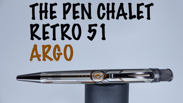
Pen Chalet's Retro 51 Argo

$
0
0


The Argois a new exclusive pen from Retro 51. These spacey pens are a future-take on ship that Jason sailed through Green mythology in search of the Golden Fleece. These futuristic pens come in two flavors. The orange that Pen Chalet sent out for me to review, and a really cool bright green.

I had to go for the orange, but that green is really cool. Check it out on their site. Check this one out below and then don't dilly-dally if you want one of these. There were only 250 in each color, and there aren't that many left of either at this point.

(There's a video review down at the bottom of the post.)

Close-Ups and Details


The first thing I noticed about this pen is that it looks better in person than it did in the pictures that I'd seen. The body is a slightly metallic, taupe-gray color that's a little hard to describe. The orange is much more reflective than I thought it would be, too. In the light it is almost as if it's lit from within. I hope space ships are this cool in the future.


The top is sort of sunburst, but it could also be the flame from an engine. Either way, I really like a cool finial, and this one is pretty sweet.


Each pen in the set is individually numbered along the band near the finial.


Watch the video below to see it unboxed, examined, and compared to a couple of other pens.


**This pen was sent out for my honest appraisal and review. No money changed hands, no assurances were given. Honesty is all. Have a good day.**

Sailor Shikiori Yonaga

$
0
0

This is the first of the Shikiori inks that I've tried, and it's an instant hit. Well, instant in that I inked it up in one pen, and I used up pretty much the whole sample in this TWSBI Eco T. It only took me since January. I'll confess, I have too many pens inked right now. I'm working on that. This ECO got put in a drawer and forgotten about. BUT: it has never had any issue starting back up and writing perfectly. It's a great pen, and this is a really nice ink. As you'll see below, it's not perfect. It's a little prone to misbehavior on bad office paper, and it's a little expensive, but the color and feel of the ink makes it worth it.

Thanks for letting me try it out, Anderson Pens! (Here's the link to the ink.)

BEHOLD:

Written Review


Close Ups


Copy Paper Test


Inky Fingers Currently Inked: Wheat Paper


Ink Journal: Tomoe River


Chromatography


Water Test & Video


Bonus Time!


Color Comparisons!


***This ink sample was provided, free of charge, by Anderson Pens in exchange for this honest review. What you see is what I got. Free ink samples don't sway my reviews in any way that I'm aware of.***

KWZ's Meet Me in St. Louis

$
0
0

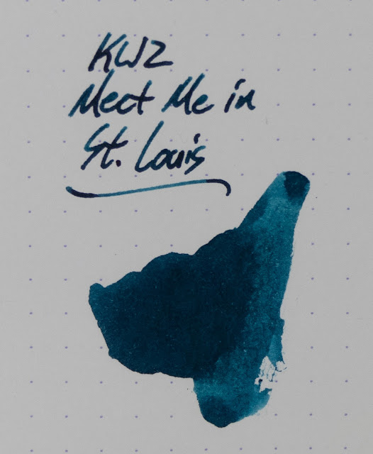
The first St. Louis Pen Show will be this weekend, and I hope it's a big success. The show is set to be pretty darn big, with 150 tables putting it in the same weight class (I think) as shows like Chicago. That's a big deal for a first-year show, and I really hope that people show up. I wanted to go, but it's just not in the cards this year. Maybe next summer will work out, though.

This ink was created by KWZ for the pen show and, as far as I know, it'll be an exclusive to the show. So, if you like what you see below, you'll want to get someone to mule you a bottle or hope that there's enough left over for another vendor (like Anderson or Vanness) to get some stock to sell after the show.


Written Review


Close-Ups!


Copy Paper Test


Inky Fingers Currently Inked: Wheat paper


Ink Journal: Tomoe River


Chromatography


Water Test and Review Video


Yeah...no resistance.

Color Comparisons!


***This ink sample was provide, free of charge, by the show's promoters for promotional purposes. What you see is what I got. ***


Kyo-Iro Stone Road of Gion

$
0
0

**I meant for this post to go up ages ago, and I totally forgot about it. Sorry about that.**

So, Stone Road isn't an ink that I really like. I tried to like it for so long and we just don't get along. It's an interesting brown color, and I love browns. Unfortunately, it is just too undersaturated and too dry for my tastes. I tried it in a few pens (and pretty well exhausted the sample I had), but it ended up being in this Conway Stewart for entirely too long when I wrote the review. I was actually a little anxious to get it out of this pen so that I could enjoy this Conway again.

Anyway, if you've got a very wet nib or if you just like pale inks, I'd say give this one a try. If not, then give it a sample or a pass.


Written Review


Close Ups!


20 lb Copy Paper Test


Currently Inked (Wheat Paper)


Chromatography


Water Test and Video Review


Color Comparisons


**This sample was sent out by Anderson Pens for my review. No money changed hands, and my review is my own. Your mileage may vary. Et cetera, et cetera. **

It's been quiet around here.

$
0
0

Hey folks.

I know it's been quiet around here. Partly, that's because I forgot to finish a couple of reviews that I meant to post. Partly, it's because I was on vacation. Partly, it's because I was really depressed by the death of my good friend Jim Rouse. Partly, it's because I was doing some reviews that are much better in video so they live on YouTube and not here.

Sorry about that.

So: Current News:

The DC Pen Show 2018 is in the books. It was a busy show, and I've got lots of pictures that I'll endeavor to post this week. I'm not home quite yet (visiting my aunt in the DC area for a few days), but I'll look at those pics and videos when I get home. I hope they're good. I think at least some of them will be. It was a hard show for those of us who were great friends of Jim. He was missed all the time, and the loss was felt by many. He wasn't much for memorials, so raise a glass and toast him when you get a chance. He'd like that.

I got a logo designed for the blog and YouTube channel, and I really like it. HeyMatthew did a great job with very little help from me. I'm no designer, so I let him give me some ideas, and they were really good. It'll be here, it'll be on the YouTube, it'll be on merch eventually. EVERYWHERE. Here it is below:


Uh...that's about it, I guess. Check out my YouTube channel. Join a live chat on Fridays at 4pm over on YouTube.

See ya there!
Mike

My First Bag Review: Mystery Ranch 3-zip Urban Assault

$
0
0
Hey folks! I've been meaning to do bag reviews for a while now, but I hadn't figured out the details of shooting that sort of video. Well, I went for it, and I think it came out pretty well.


The 3-zip style is really pretty cool. I' haven't seen any of these out in the wild before, but it's a really comfortable and useful bag. Check it out in the video below.


All manner of cases from Nock Co.

Platinum's Procyon

$
0
0

This is a new pen from Platinum that iterates on the success of the Preppy and the Plasir. This one doesn't take the same nib/section, but the shape is unmistakable. Check it out in the video below.


Robert Oster Frankly Scarlet

$
0
0

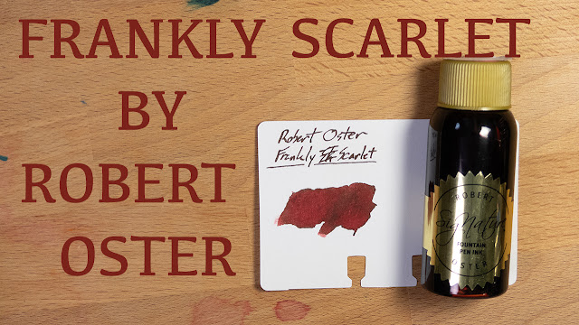
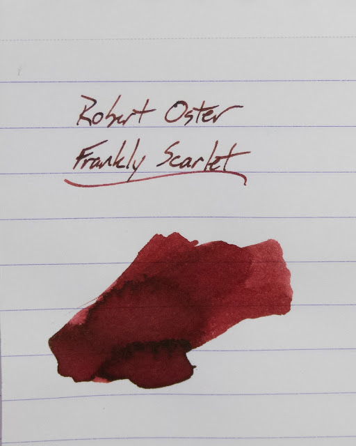
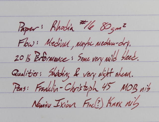
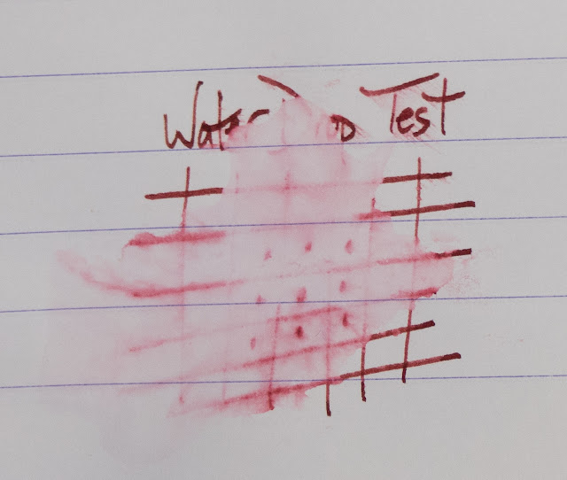
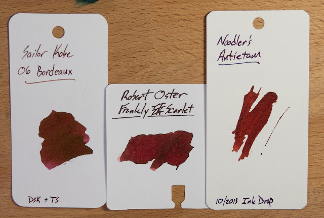
Federalist Pens was the first US vendor for Robert Oster inks, and they marked their first anniversary with an ink called Frankly Blue. This year, for their second anniversary, they marked it with the release of Frankly Scarlet. As you can see in these images, Frankly Scarlet is a very dark red that's really more of a maroon to my eye. It's nicely saturated, and a little bit dry, but it flows just fine in the nibs that I used. I'd go for a wetter nib with this ink, though.

If you dig this ink, you can find it at Federalist Pens (link above) or at most other Robert Oster vendors. 


The Bottle:

Robert Oster's inks always come in these tall 50ml bottles. They're good bottles, with a big enough mouth to fit any fountain pen, though their shape means that you might have a hard time reaching the bottom when the ink gets low enough.


Written Review:


Close-Ups!


Staples 20lb Copy Paper:


Tomoe River InkJournal:


Inky Fingers Currently Inked:


Water Test:


Chromatography:


Video Review:


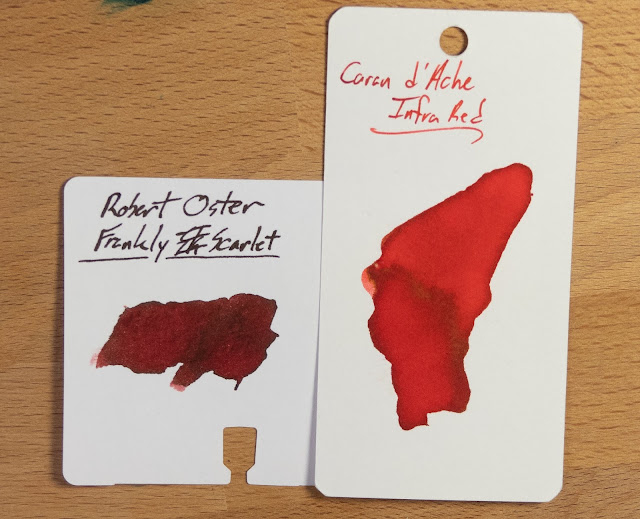
Color Comparisons:


This last one is more like what I think of when I think of scarlet.


**This bottle of ink was provided for review by Federalist Pens. No money changed hands, and no promises were given. WYSIWYG, YMMV, etc.**

Monteverde Erinite

$
0
0

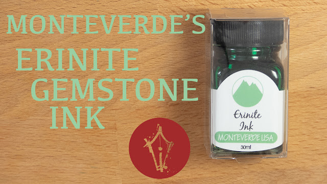
Monteverde is one of those ink companies that seems to fly under the radar. I'm not sure why that is. Perhaps it's because the inks are widely available and not all that expensive? Scarcity and a steep price seem to get the attention these days. Anyway, they're generally really good inks.

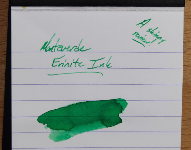
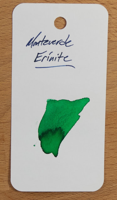
Contrary to form, one is only okay, and it's not really my cup of tea. It's a nice enough match for the gemstone that it's supposed to emulate, but that gem is fairly light and so the ink ends up being too pale for me. I think that if it were about 1/3 more saturated I'd really like it.

Check it out below and look for it at any of the Monteverde vendors you shop with. It's available in 30ml and 90ml bottles as well as samples. I'd go with a sample on this one but, at $8 for the smaller bottle, it's cheap enough to try out for fun.

Written Review:


Close-Ups!


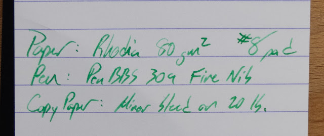
Staples 20lb Copy Paper:


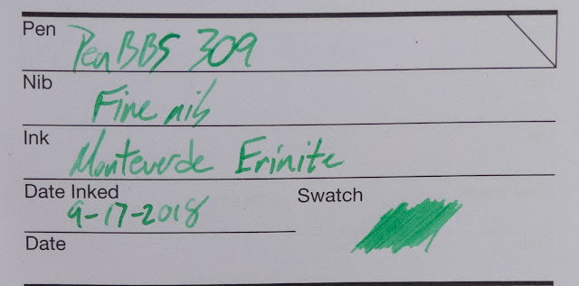
Tomoe River Ink Journal:


Inky Fingers Currently Inked:


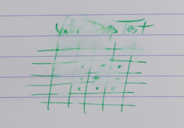
Water Drop Test:


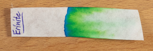
Chromatography!


Video Review:


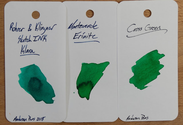
Color Comparisons:


**I picked this ink up at the Pay It Forward table at a pen show. I'll be returning it to the PIF project for someone else to pick up and enjoy.**

Monteverde Moonstone

$
0
0


Written Review


Close-ups


20lb Staples Copy Paper


Inky Fingers Currently Inked (Wheat Straw Paper)


Tomoe River Inkjournal


Video Review


Chromatography


Water Test Results


Color Comparisons


Taccia's Ebi (Purple-Red) (Shrimp)

$
0
0

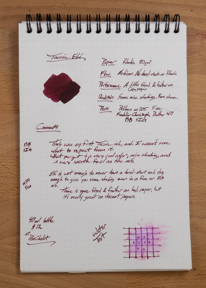
Check out this interesting ink from a brand that has just started selling ink. The ink is labeled Nakabayashi, but I don't think they actually make it. I don't know who does, but I like this ink. Check it out below (alongside all sorts of other inks).


Written Review!


Close Ups!


The shading on this ink is pretty great. It's there, but the ink is saturated enough to be readable and unsaturated enough to be interesting. 


And the price is very nice. At a time when Sailor is shrinking their bottles to 20ml and raising their prices to $15, this is a good deal. 


Copy Paper Test


There's some bleed on this paper, but it performs so well elsewhere that I can totally overlook it.


Inky Fingers (Wheat Paper)


InkJournal Tomoe River


Video Review


Water Test

Cool lookin' smear left over when you put water on this ink, eh? It turns purple, but it's totally readable. I think this might make for some really near art-uses as well. 


Chromatography
 Annnnd that's really neat.


Color Comparisons


Pen Chalet sent this ink out for review, and I do my best to keep that sort of thing from lending bias to my reviews. No money changed hands, and not assurances were given aside from my honest review.

Pilot's Custom 823 review!

$
0
0

Pen Chalet sent this pen out for review, and it's a great pen! Thanks, Pen Chalet!

Find yours here.

(If you buy stuff through the links on this page, Pen Chalet will know you came through my blog, and I'll get a little credit for it. Sort of like an affiliate link?)

Blank Slate Paper!

$
0
0

Blank Slate Paper Co is one of my very favorite new projects to hit the web. David and his wife designed a web tool to build almost any design you'd like, they print it and bind it into pads of great paper, and ship your custom pads of paper to your house.

It's pretty awesome, and it's getting better. Check out the video, and then go play with their design tool yourself!


**I bought the pads shown here, at a discount, during their beta run of the site. No promises or considerations were given beyond a chance to get this paper into my hands early and I reviewed it because it's great.**

The 22pen: A Multipen for your Notebook

$
0
0


The 22pen is a unique thing. It's a multipen that is meant to live inside of your favorite notebook. Let's take a look at the prototype that Mario sent me for review. 


It feels really small in the hand, but the 22pen is about the same length (4.5") as other pocket pens. You'll see it above with a Lamy Pico and a Schon DSGN pen. Both of those are more substantial in the hand. Unlike those two, the 22pen is flat, and it isn't capped. Mario tells me that he's working on a solution for those of us who like to carry pens in our pockets, but I'm not sure what form that will take.


The 22pen uses a pair of D1 refills, and those come in a variety of tip sizes and ink colors from many different makers. My favorites come from Uniball's Jetstream and Monteverde.

This two refill system is pretty great. I love a multipen, but you have to do some twiggling to get a standard multi pen to switch refills. The 22pen just sort of flips over in your grip. It's quick, easy, and intuitive. Very useful when you're taking quick notes and notes about those notes. I do that sort of thing all the time, and this has been a neat pen in a couple of meetings where I needed to work quickly and use multiple colors.

The little color bands at the bottom of the refill do tend to wear off, but that's a really minor issue, I think.


You'll also notice that the clip of the 22pen is quite small. That clip is plenty strong to hold on to your paper, your notebook cover, or your pocket (if you're a little brave). It's attached with spring tension, so you can remove it and tighten it if you need to. I did, and it wasn't difficult at all.


As you can see below, it's just a little short in my hand. Keep in mind that I have large hands, but Mario assures me that he's going to work up a long version to compensate for those of us with big ol' mitts. I can write with this pen fairly comfortably, but a little extra length would keep it from slipping while I write.


So, this is the intended use of the pen. It's meant to go inside your pocket- or passport-sized notebooks so you can keep them in your pocket with a convenient pen for notes or drawing.


Alright: Time for some stats:


So, I was dubious about this pen when I first saw it online. It's a bit weird. It's small. And it's a little expensive. Once I got it in my hands, though, it turns out to be a really good idea that just needs a couple of tweaks to be a really useful tool.

Check out the video:


**This pen was provided as a prototype for review. There might be changes before the Kickstarter is over, but that's the nature of prototypes. Free testers don't sway my reviews. I'm as honest as possible in these things.**

Krishna Lyrebird Blue Black

$
0
0


  Braden over at Pen Chalet saw someone ask me about this ink on a live chat, and I'd not heard of it so he sent out both the Blue and the Blue Black inks for me to try. They're reasonably priced, and meant to be used day-to-day. No crazy colors or anything. Just solid inks. Check this one out below, and I'll have the other ink reviewed in the near future.

Full-Page Review:


Close-Ups:

You find some nice sheen and shading in the close-ups on Rhodia. You won't really find this kind of thing on lesser papers, but it can show off pretty well when you give it a chance.


Tomoe River Ink Journal:


Inky Fingers Wheat Straw Paper:

This wheat paper is closer to what you'll see on non-coated papers. A touch of sheen, a little shading, but some really nice coloration.


30% Recycled 20lb Crappy Copy Paper:


This paper shows some bleed and just a little feathering here and there. It's not good paper. It's pretty bad, actually.


Color Comparisons!


These are just some vanity shots of that sheen. Lyrebird can't compete with Quasar or Tchaikovsky, but that's not really its goal, anyway.


Video Review:


Water Test Results!


Not bad! Not great, but it's something.


**This bottle of ink was sent out for review by Pen Chalet. I don't let such things color my reviews, and what you see is that you get. YMMV, etc.**

3 Oysters Doldam

$
0
0

I have a few of these 3Oysters inks from South Korea to review (most of them sent out for review by the company), and this one is a strange one. As you'll see below, the color is awesome. As you'll also see below, it's got a couple of behavioral issues that might put you off. Check it out below and let me know what you think of this rocky grey.

Written Review:
As I hear it, Doldam is the name of a district in Seoul that is known for these stone walls. In the pictures I saw online, this color looks pretty consistent with the old, stone walls. It's a good match.


Close-Ups: 


Lots of color depth in this swatch of ink. And an eyelash on the page below.


It's a bit thin, this ink. You can see the dark-to-light shading in these writing samples, and that's because the ink sort of follows the nib across the coated paper before pooling where the nib stops. You can sort of see how I form my letters, if you look at where it's lightest.


This one isn't great at resisting water, but it does leave behind a mustardy yellow where the lines were.


Chromatography

This is pretty special. Look at all of the colors in that strip! It's a grey ink with brown tones, and there's no brown or grey in this chromatography. Crazy, right?


Staples 20lb Copy Paper


This is where it starts to go wrong. It's bleedy. It's feathery. It spreads. It's doing all of the bad things on this (admittedly terrible) paper.


Wheat Straw Paper:

It does okay here even though this paper is uncoated.


Ink Journal Tomoe River Paper:

Of course, it's fine on Tomoe River. Everything is.


Some Staples Sugarcane Paper:

This paper is usually pretty good at handling fountain pen inks, but Doldam feathers and spreads and bleeds on it. It does this on several other uncoated papers of good quality, too.


Color Comparisons:


Video Review: 


** 3 Oysters sent this ink over from South Korea for review. No promises were made, and no guarantees given. Just my honest review. YMMV, etc. **

Robert Oster's Pygmy Hippo

$
0
0

This bright magenta is brought to you by Hippo Noto, and it's part of their newest Kickstarter project.  The original Hippo was an A5ish notebook with 500 pages of Tomoe River in various colors, rules, and a couple of different paper hues. The ink with that project was a Robert Oster in a unique hippo color that is sort of maroon/brown/purple.

The newest version is in full A5 or the smaller "Pygmy" A6 size with the option to add on a bottle of this Pygmy Purple ink. Check it out below, and let me know what you think of this one!


Written Review


You get a lot of character in this ink. It's not going to be one that everyone can use on a regular basis, but it's got a bright color, nice shading, and some mild sheen on the right papers. Pretty darn cool, if you're into the color. 

Close Ups


Chromatography
 I wouldn't have thought that the chromatography would be so monotone, actually. This color just sort of is what it is, I suppose.


20lb Copy Paper 


Not bad. Just a little bit of bleeding here. Should be expected from a paper like this. 


Wheat Straw Paper


It looks really good on this wheat paper, I think. Good shading, but no real sheen observed. 


Tomoe River Ink Journal


Color Comparisons


Andrinople is an ink that I hear people like, but it's way too dry for me. Pygmy Purple is pretty close to the hue, but it feels better on the nib.


Video Review


***This bottle of ink was sent out free of charge for my review, and your enjoyment. No assurances are ever given, aside from the promise of a truthful review. YMMV, etc.***

Write Notepads Pocket Ledger

$
0
0


 I've been a fan of Write Notepads for a long while, and this new generation of notebooks and tablets is really good. I bought a couple different styles of notebook while I was at the Baltimore Pen Show, and it's about time I review them! I bought mine from Points Pens or Write Notepads, but I can't remember which. They were next to one another at the show, and I know I got paper from both of them. Anyway, it's the same price at each place, and both are good places to get things.

 Check out this 3x6" pocket ledger below.

 The Covers: 

The pocket ledger comes in three different covers. A 40 point board stock cover in black and pistachio, and this kraft cover with a 60 point board stock cover. This thing is quite stiff, and you'll have no issue writing on this pad while holding it in your hand. It's also made from 100% post-consumer waste. Environmentally responsible!


The double wire bindings are nice and stiff. I haven't had them get bent out of shape in the time I've been using it, and a double wire is always better than a single one. I never liked those single bound wire notebooks that I had to use when I was in grade school. The wires always bent and twisted and made it difficult to turn the pages. And those wire ends came loose and stabbed you. Man. This is so much better than that!


On the back you'll see the Write logo, the Born in Baltimore, and their social media handles. Follow them on your favorite social media and tell them I sent you. (Instagram and Twitter)

 The Inside:

 The paper in this notebook is 70lb paper, and it's quite good at handling all sorts of inks. Below you'll see Poor Man's Sapphire (a Strait's Pens ink), some other blue, and a really cool ink from Birmingham Pen Co that was in my friend's super wet and wide OMAS nib.


 The page below is the back of the previous page. I just used ballpoint on that page, but all that fountain pen ink was on the back of the page. You can just see some show through around the middle of the page ("made from cotton..."), but it didn't bleed through and neither did the rest of it. Pretty good start, I think.


So, let's test it with a bunch of different pens!


Everything worked perfectly. Ballpoints, gels, fountain pens, and pencils had zero issues. The addressing pen was less bleedy than I thought it would be. The Sharpie was predictably a little bit bleedy, but even that one didn't have much of an issue. 


Oh, and the ruling on the page is a light green and printed in vegetable-based inks. Environmentally responsible!


Video Review: 


Midori Traveller's Diary 2019

$
0
0


So, I've been using a pair of planners for the last 6 months. The first is a Kokyo Jibun Techo and the second is this one from Midori. It's a little exhausting (and redundant) using two planners each week, but I did it for you. You're welcome! So, let's take a tour of the planner. Don't forget to scroll all the way to the bottom for a chance to win the second half of this planner!

The Outsides

The Midori planner comes as a pair of thin books. This keeps the thickness down, I suppose, but it wouldn't be all that thick to begin with. It is convenient that I can give away the second half of the year to a reader, though. That's cool. Perhaps this is also because the Traveller's notebooks are generally kept in their covers with other notebooks, and those are generally pretty thin.


The outer cover of the Traveller's Diary is fairly thick paper and coated so that it will be pretty durable. I kept mine in a Roterfaden Taschenbegleiter between two other notebooks, so it was pretty safe, but it still doesn't really show any wear. the coating makes it so that  you can't really write on it, though, so I used this little strip of sticky tape to label it.


The Insides

I really like the paper that Midori uses, and this MD paper is quite fountain pen friendly. In fact, it's pretty well everything-friendly. Other planners that use papers like Tomoe River can bleed when used with gel pens, but the MD paper is just fine with them. It's a cream paper, though, and not plain white. Not a big deal, but worth knowing in case you're a stickler for bright white pages. I'm not.


Your first page tells you which months are covered and you can write some things on it if you want to, I suppose. Perhaps you use different planners for different purposes and need to be able to tell which is which?

I also keep a few Post-It tabs on that first page so that I can locate particular pages when I want to. 

Beyond the first page you'll find a yearly calendar layout. I've highlighted a few important dates in each month, but I don't know that I ever came back to this page to check them.


Next, you'll find a few pages with each month and a little space to write things like anniversaries. This replaces the larger calendar layouts that you'll find in other planners. (I like the larger layouts better.)


Next up: This is the part of the planner that I used the most. The weekly layout is Monday-Sunday, and that's a really nice layout once you're used to it. It took me a little while, but I prefer this now. It puts my weekends together instead of bookending the work week, and that really makes more sense.


I like to block my time this way. I chose a page without too much stuff on it because I use this for work and regular life. The blocks for class have a bit of room for notes I might need to make about them, and this is a good way to visualize your day. There's a little bit of room at the bottom for notes.


Sometimes I use that space for making general notes about the day (as shown below). It's good for all-day things like birthdays and such. There's also some room at the header for that, but I didn't find myself using that much.


The last page is just your basic "If found, please return to:" sort of thing in the style of a flight plan. I clearly didn't put much there.


Video Review:


How to Win:

This is what I'm giving away. It's a 6-month book, new and unused. Scroll down a bit more to enter!


Midori Traveller's Diary Giveaway

**Everything here was bought with my own money. The links aren't affilliates, and JetPens isn't a sponsor. It's just an online store that I like a lot.**
  
Viewing all 528 articles
Browse latest View live