Quantcast
Channel: Inkdependence!
Viewing all 528 articles
Browse latest View live

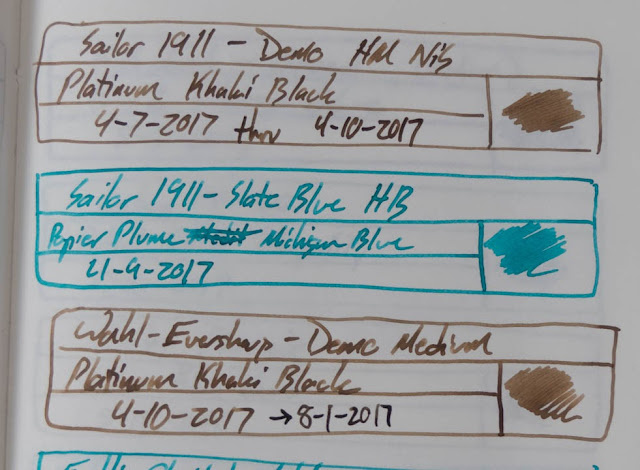
Platinum Classic Khaki Black

$
0
0

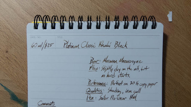
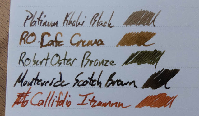
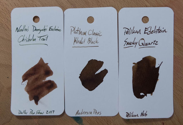
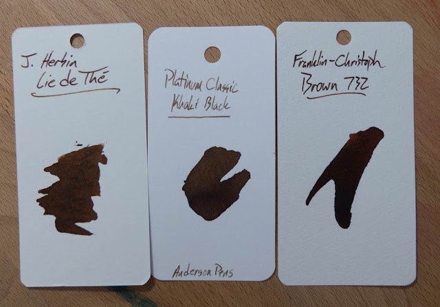
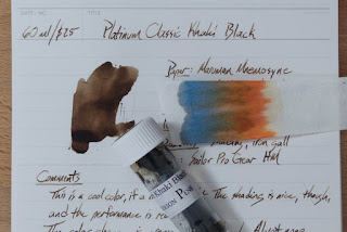
These iron gall inks in the Platinum Classic line sure are interesting. This one reminds me of oak, and it doesn't really change color as it cures. It has the other characteristics of the iron galls, though. It's a little dry on the nib, it's water resistant, and it behaves perfectly on cheap papers. If you can get over the draggy nib-fell, it's a really cool ink.

Check it out below (don't skip the chromatography on this one), and let me know what you think.


Written Review

 Yep. I forgot the do the swatch before I took the pictures.

Close Ups!


There's that swatch! I found it!


Chromatography!
This is a really cool one, right? I don't think I've seen anything like this.


Color Comparisons


Copy Paper Test


Currently Inked (Now Inky Fingers)


InkJournal (Tomoe River)


Water Test and Video Review


 That's some pretty serious water resistance.

Bonus Picture!


**This ink sample was provided free of charge for the purpose of this review. It doesn't affect my reviews or the images you just saw.**

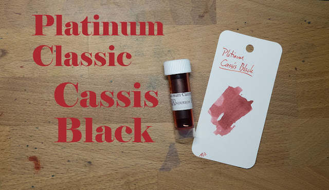
Platinum Classic Cassis Black

$
0
0
Thanks for the ink sample, Anderson Pens!

 Another iron gal ink!? Yep!

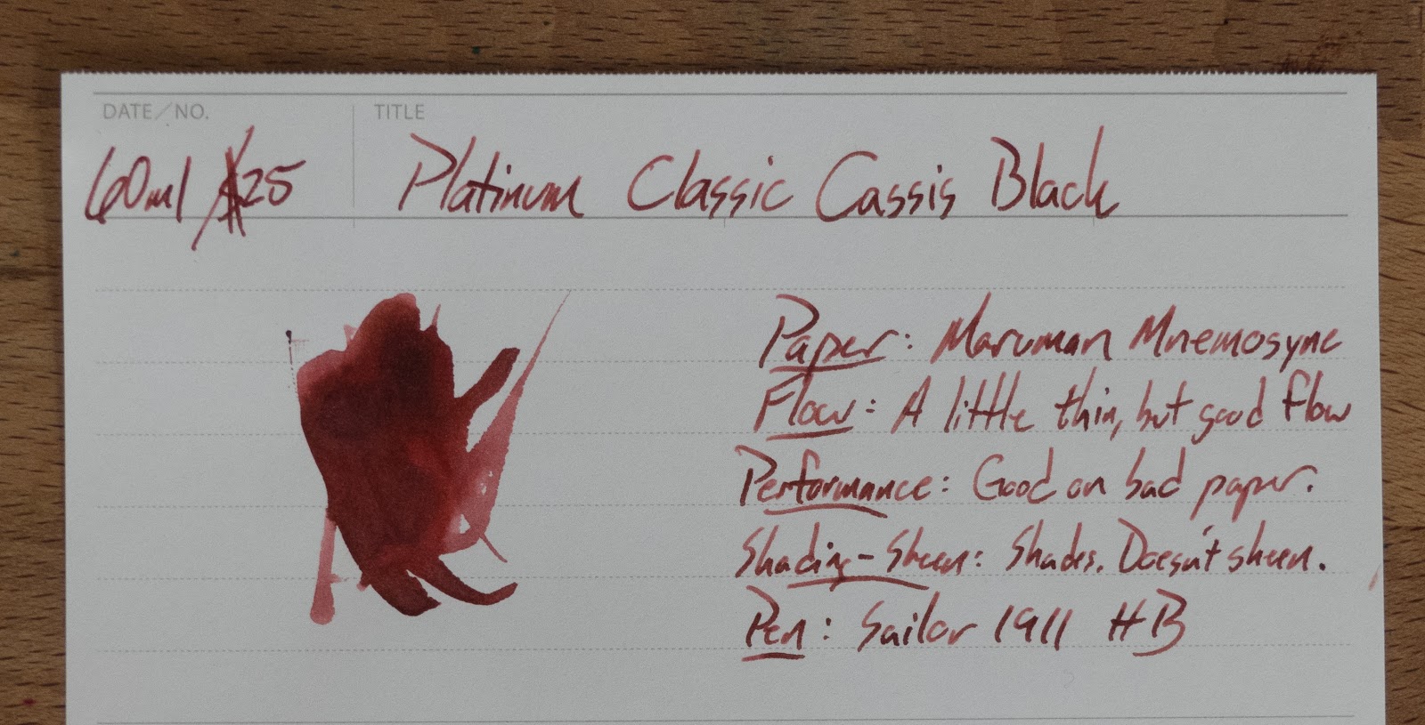
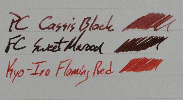
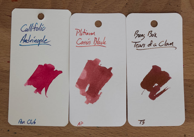
This interesting maroonish ink is named after the cassis liqueur that's made from black currents. The color of this ink does remind me of a berry juice stain, now that I know what I'm looking at. Really, this ink is a little on the light side for me. It darkens from a slightly pinker color to the sort of burgundy that you see in the pictures. It's not a very dramatic change, but it's there.

On the positive side, this ink's behavior on cheap copy paper is perfect. No bleeding, no feathering, and no spreading. It's also got some water resistance. It dries quickly, and it doesn't feel quite as dry on the nib as the other iron galls in this set. It's a perfectly good ink if you're into this color. If only it were a little more saturated...


Written Review


Close Ups


Tomoe River InkJournal


Inky Fingers Currently Inked Journal


Staples 20lb Copy Paper


 See? Perfect. In fact, I really like the way that it looks on this paper as opposed to the fancier ones.


Color Comparisons


Chromatography


Water Test and Video Review


**This ink sample was provided, free of charge, for review by Anderson Pens. No money has changed hands, and nothing was promised. As always, what you see is what I got.**

Robert Oster's Frankly Blue

$
0
0
Ink provided for review by Federalist Pens! Thanks!

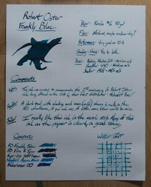
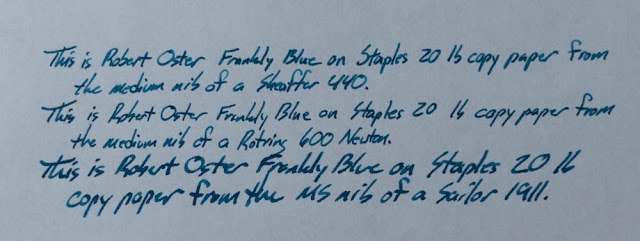
 This is the ink that Robert Oster made to celebrate the first anniversary of Robert Oster inks in the USA. Federalist Pens was their first distributor, and that shop is owned by a really nice guy named Frank. What else would Robert Oster make to mark this occasion, but a dusky blue ink with some sheen! I tell ya, he's really got the market cornered on that sort of ink.

Check out this neat ink in the pictures below, the differences in the look of this ink from different nibs, and a whole raft of color comparisons! And, not for nothing, the video for this ink has a pretty good blooper at the end. Just sayin'.


Written Review


Close Ups:


Copy Paper Test

 A little bit of bleed from the Sailor Music Stub, but that's to be expected.

Other Papers!

Inky Fingers wheat paper:

 Ink Journal's Tomoe River


 Inky Fingers wheat paper:


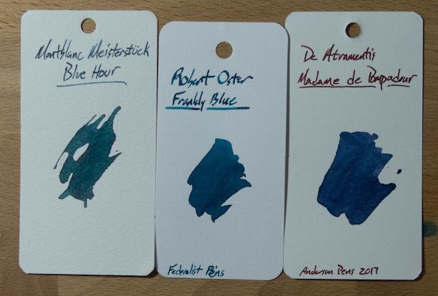
Color Comparisons!


 Looking for a more expensive way to get this ink? Mix your own with Sailor's Storia inks!

Chromatography 


Water Test and Video Review


***This ink was provided free of charge for the purpose of this review. All opinions expressed are mine, and all of the pictures are mine. Your mileage may vary. No guarantees were given, no money changed hands, and none of these are affiliate links.***


Kyo-Iro Soft Snow of Ohara

$
0
0


I think this is the first Kyo-Iro ink I've reviewed, and I hope all of them are as cool as Soft Snow of Ohara. This is a pretty new line of inks being carried by Anderson Pens, and they provided the sample for this review. I've got a couple more of these inks in the pipeline, and they're a cool new brand to have around. These inks are all made for the TAG stationary store in Kyoto, Japan. I think I have samples of all of the inks in the Kyo-Iro and Kyo-no-oto line, so let me know which ones you'd like to see reviewed.

Written Review


Close-Ups!


Copy Paper Test


There's a little bit of bleed on this paper, but it's not too bad. Also a little bit of feathering from the Cleo Skribent pen, for some reason. The FC's broad stub puts down more ink, but it behaved a little better.


Ink Journal Tomoe River


Inky Fingers Journal (Wheat straw paper)


Color Comparisons!

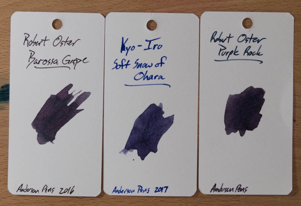
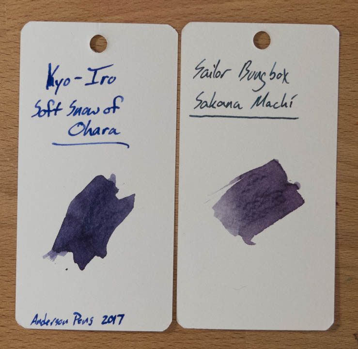
I didn't have anything in a pen that was all that close to Soft Snow, so I've got a bunch of cards to compare.


I thought it was going to be pretty close to the Purple Rock from Robert Oster, but it's not really all that close. Oh well.


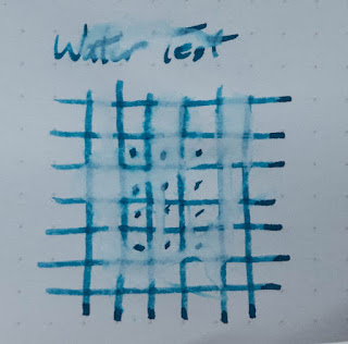
Water Test and Video Review


Bonus Shot!


"Where've you been, Mike?!"

$
0
0
I just realized that it's been a few weeks since I posted to this part of the blog. If you're a person who only experiences Inkdependence in this medium, then it probably seems that I've just dropped off of the radar. For that, I apologize. I haven't quit pens and ink, or anything. I'm still here!

So, where've I been? Well, I've been on YouTube, mostly. The last couple of weeks have been full of unboxing videos and quick-looks at some things that I've bought, or been sent, for review. I'll link them into this post just in case you don't subscribe to my YouTube channel.

Also! I do a live hang-out on Fridays at 4pm Eastern Time.

My posting schedule will be a little bit erratic right now. It's the end of the semester, and this college lecturer has a bunch of stuff that has to be done now. I haven't even gotten my Christmas lights up yet! Sheesh.

See ya soon!

Here are the links to what I've been doing lately:


Kyo-Iro Flaming Red of Fushimi

$
0
0

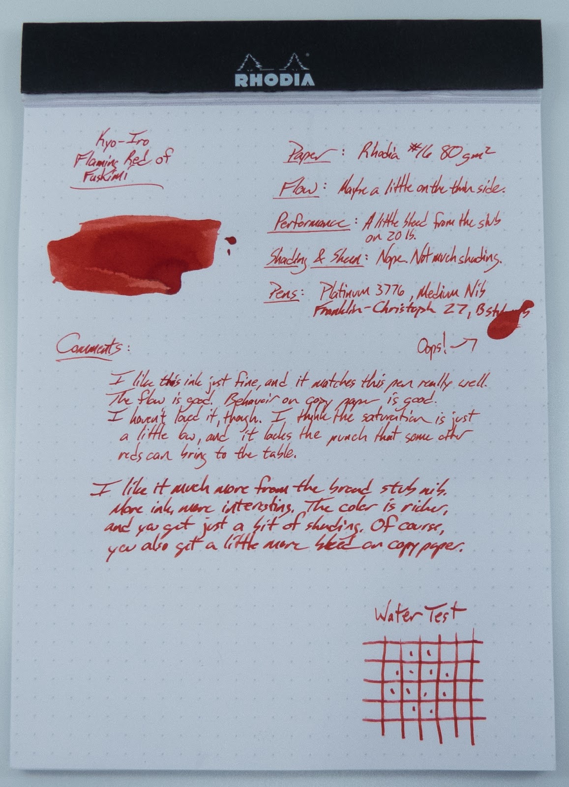
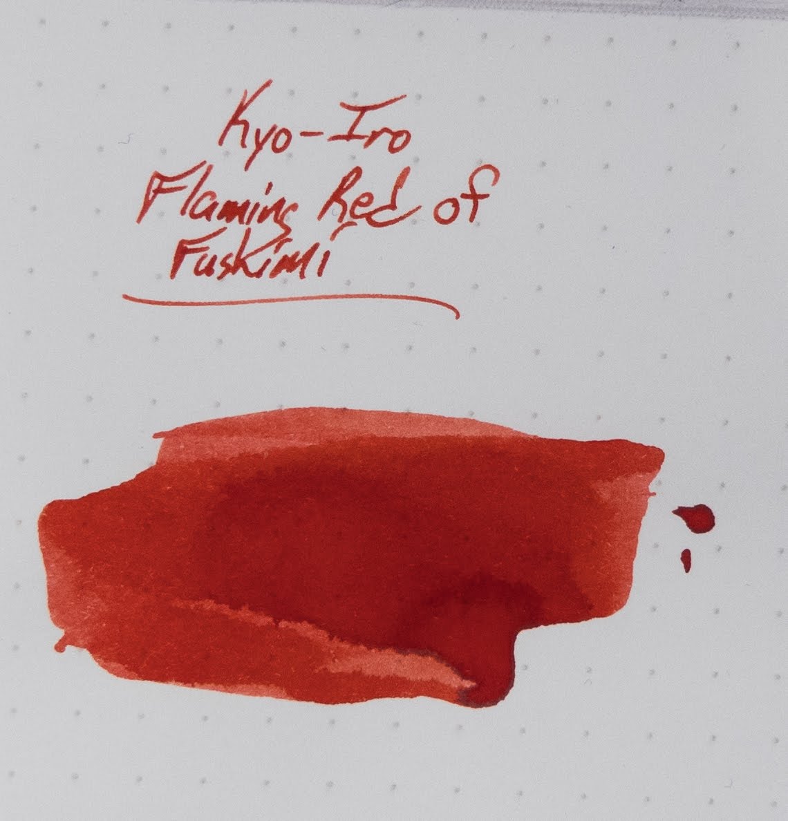
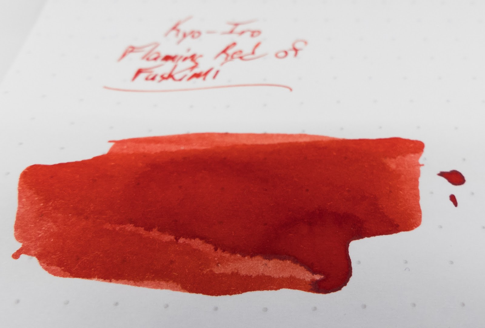
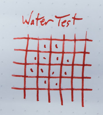
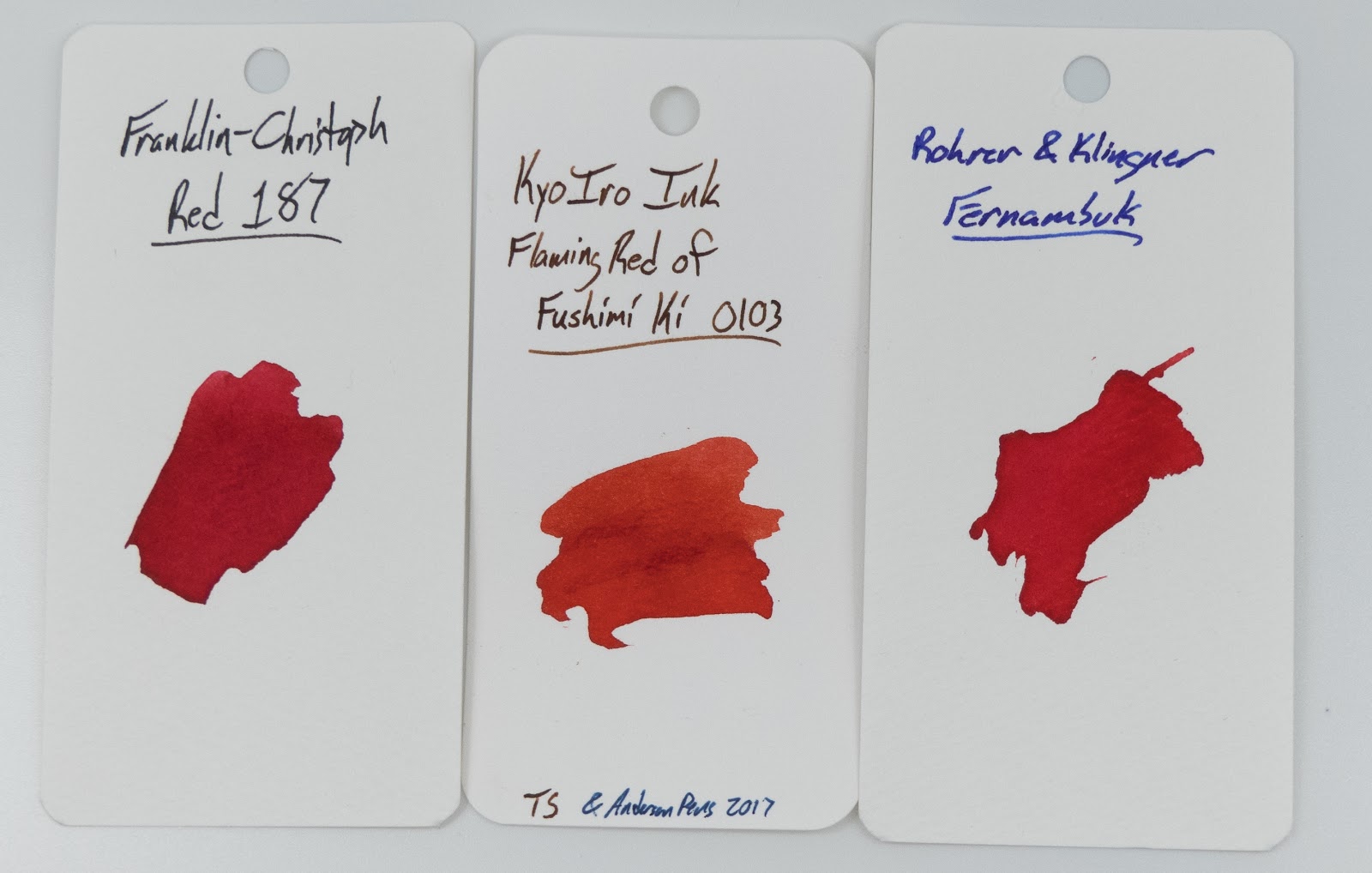
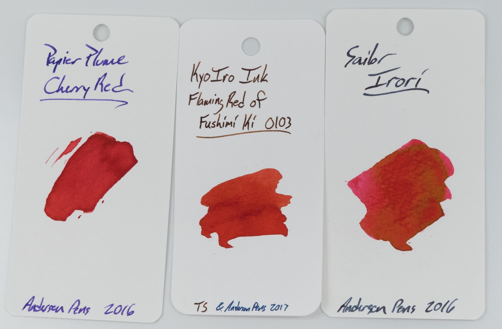
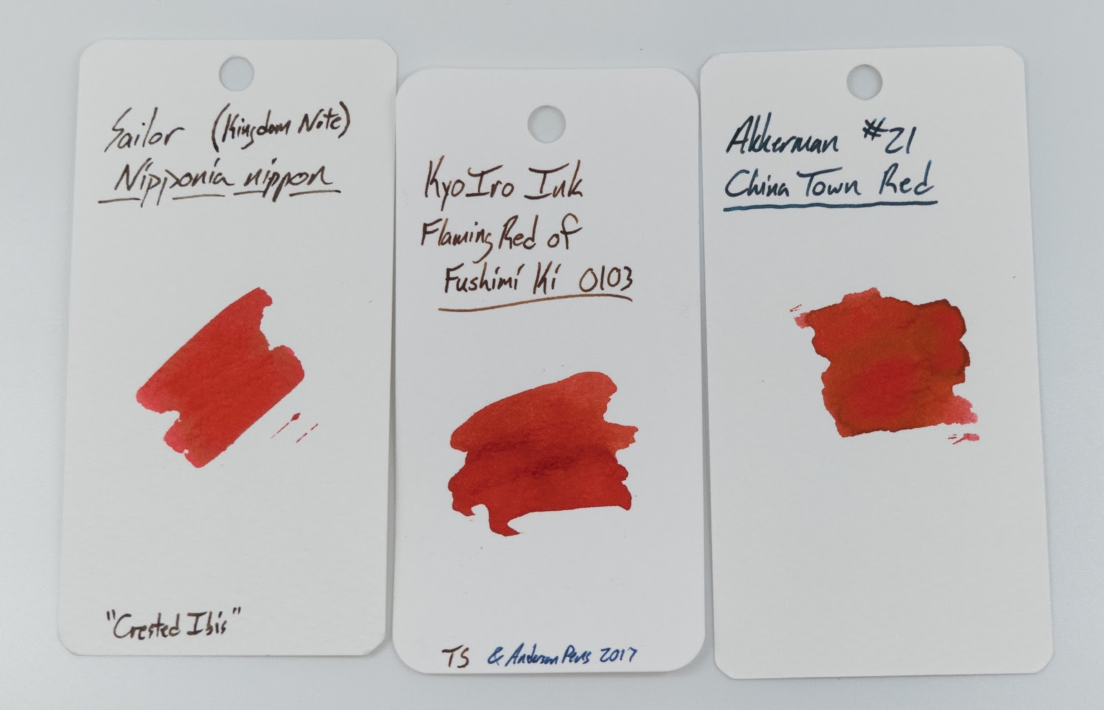
Red inks are some of my favorites. It's a really good color for lists, notes, grading, letter writing, and signing holiday cards. The thing about being a fan of red inks is that there are SO MANY red inks, and they cover a surprisingly wide spectrum. This one seems to me to be a real middle-red. I don't have any problems with this ink. It's got good flow, but it's not out-of-control. It works perfectly well on copy papers, though there's a little bit of bleed when you use it in a broad stub (not that this is a surprise). It doesn't really shade or sheen, so it doesn't need any special paper to look good and it doesn't require any special care or cleaning. It's a perfectly nice ink.

This sample was provided for review by Anderson Pens, and you an find it on their site here.

I don't think it's going to make it into my regular red rotation, though. It just doesn't have the umph that I see in Sailor's Irori or Sheaffer's Skrip Red. I know those are too pink or too dark for some folks, so this might be right up their alley!

Written Review


I've just gotten a new light box, and these are the first review photos done in it. The pic above looks a little blue to me, but I got it figured out for the rest of the pictures.

Also! You'll notice that there aren't any color comparisons on that sheet. Scroll all the way down to find a bunch of color comparisons. Col-o-Ring cards are great, (and make good gifts to that ink-lover in your life).


Close-Ups:


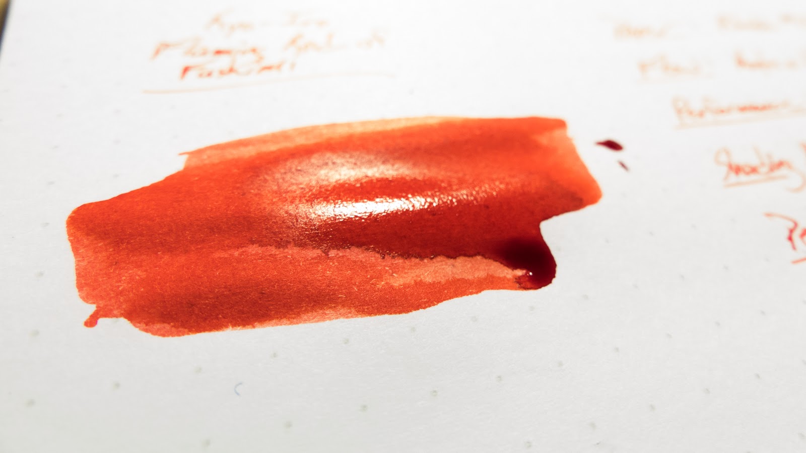
These next couple are taken while the ink swab was wet. Pretty, right?


Copy Paper Test


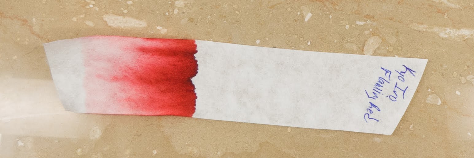
Chromatography


Water Test and Video Review


Watch the video above to see even more color comparisons and a few more papers!


Okay: Color Comparison time!


Whew! If you made it down here, you're a trooper. And a true fan! Thanks! Maybe you're the sort of person who would be interested in supporting the blog through Patreon or PayPal. Follow those links to find out more!

**This ink sample was provided for review by Anderson Pens. Free ink doesn't sway my reviews, and what you see is what I got.**

Franklin-Christoph Honeycomb

$
0
0
I hope the list puts you at the top quickly.

Ink was provided for review by Franklin-Christoph.


It's time for another Franklin-Christoph ink! This one was introduced at the Ohio Pen Show back in November, and I found out about it a little bit after that. In the interest of full disclosure, my wife Audrey works at F-C. I try not to let that affect my reviews, so what you see is what you get.

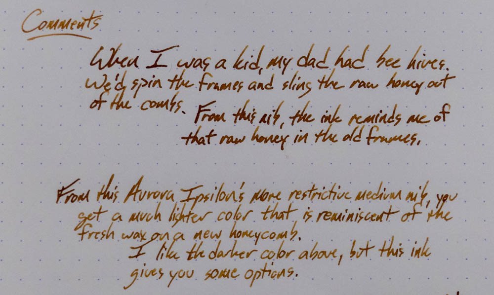
So, how's this ink? It's pretty darn cool. I like brown inks a lot, and that's especially true if the brown is a little odd. As you'll see below, I used this in two very different nibs, and I got some very different results. The Franklin-Christoph Flex nib (this one is a "fine") is a wet nib, and so you get a darker caramel color on the page. The Aurora Ipsilon (here and here) has a comparatively dry nib, and so you get more of the light honey color on the page. You've got options with this one.

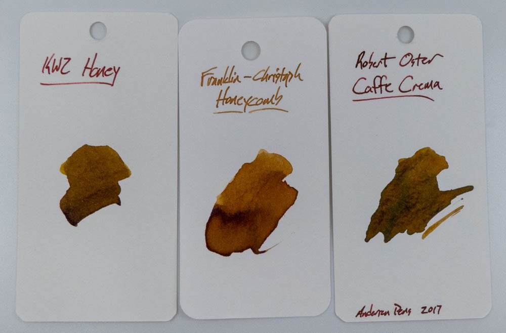
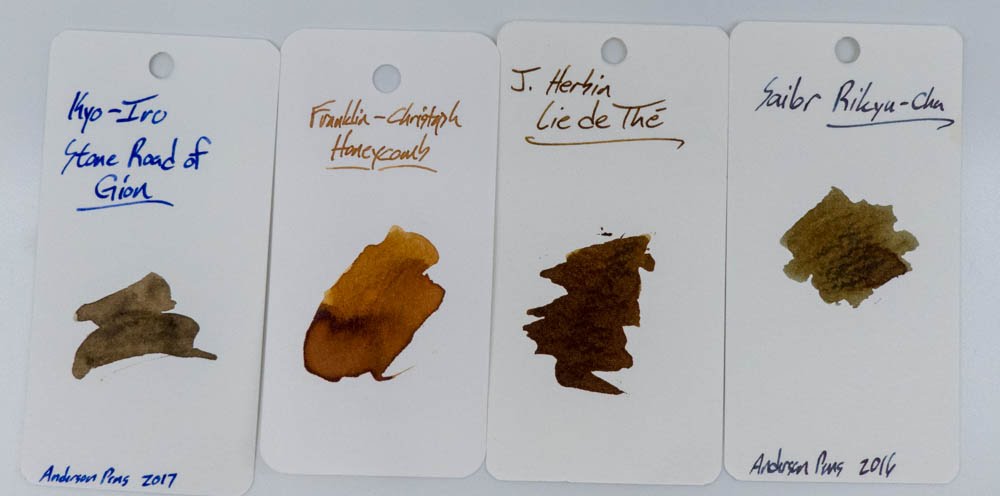
If you're looking for comparisons to this ink, then you'll have to scroll down to the end. That's where I'm keeping them these days. Also, there are a lot of them. Like I said, I like brown inks.

Written Review


Close-Ups


Copy Paper


You get some bleeding from the flex nib on this paper, but tht's to be expected when you use a wet nib on a thoroughly average paper. 


Pen Habit's Inky Fingers Notebook


Tomoe River InkJournal


Chromatography


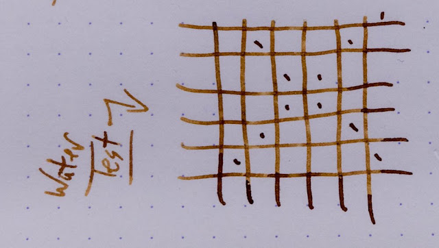
Water Test and Video Review


Yeah, not a lot of water resistance, but you can still make out the words and lines. So...could be worse!


Color Comparisons


Oddball Pictures...
Sometimes I just take off-kilter pictures. Here are a few of those. 


Rickshaw Bagworks Pen Paraphernalia!

$
0
0

Rickshaw Bagworks

Whew! I'm a little bit behind in posting this blog because Blogger had some issue for a while that wouldn't let people upload images to their blog posts. That's sort of a problem for us, right? Yeah.

You know what's not a problem? Reviewing cool products! These are some cool products, I think.

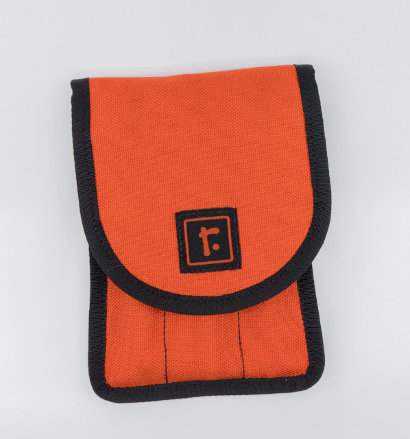
Mark at Rickshaw sent these to me over the course of a few months*, and I've been using them quite a lot. They're all made in their shop in San Francisco, CA by a small staff.

As you see in the group shot above, there are several different types of case to look at, so let's look at them in groups.

Pen Sleeves!

Rickshaw Bagworks
I love the herringbone!

These are the cases that you'll put a pen in and then throw it into your pocket or purse and leave the house. They come in lots of sizes from extra short to extra long, and they can be made skinnier to fit your very thin pens. There is a huge variety of colors available, and they can be made in your custom configurations, as well. What you can't see in the photos (though I try to show it in the video), is that the insides of these pen sleeves are made of a plush material. Think of a baby's toy or one of those blankets that you keep on the couch for when you're a little chilly. That stuff. It's a really great feature, and I'm glad that someone thought of it. That plush interior comes in a wide array of colors, too, and you can customize that as well. Very nice touches, I think.

The Duo case is probably my favorite one. It's wide enough that it stays upright in your pocket, and I generally use it to carry a fountain pen and a "regular" pen with me. I'd usually carry a couple of pens anyway, and this keeps them from flipping all around in your pockets and getting lost or poking you in odd places or whatever. 

Below, I've stacked the 4-pen Clover, the Duo, and the Solo sleeves. There's also a trio, but I don't have that one.

Rickshaw Bagworks

These are all the medium size sleeves, I think, and they can hold some pens of very different sizes just fine, I think. As you'll see there, I've got Franklin-Christophs, Bexleys, Platinums, a Retro 51, a Pelikan, and a Kanilea in those sleeves, and they all fit just fine. I'd like a slightly longer one for the huge Kanilea, but it's the biggest pen in my collection.

Below, you'll see the Clover case. This is one that I'm glad he sent out because I kept getting questions about it from pen-folks. I had the fear that it'd be too bulky once you filled it with pens, but that wasn't the case. It's about like holding a hotdog bun in your hand. I don't put this in my pants' pocket, but it goes fine in a bag or backpack.

Rickshaw Bagworks

The Waldo!

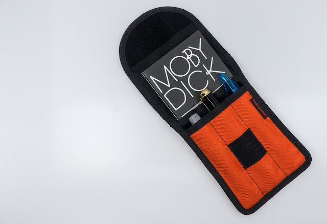
This one comes in a variety of different configurations, and stays closed with some pretty aggressive Velcro.

Rickshaw Bagworks

Like the pen sleeves, this case is customize-able, and the pen slots are lined with the plush material. There's also a slot in the back of the case for keeping whatever you like. I tend to carry a small notebook back there, but it comes with a plastic taco for carrying all sorts of things from change to tickets or credit cards. Really useful. The only drawback might be that velcro, because it's going to be pretty loud if you're trying to stealthily switch pens in a meeting.


Rickshaw Bagworks


The Hemingway Deluxe Pen Roll!

Rickshaw Bagworks

The Hemingway is a really nice version of the pen roll that is becoming ubiquitous right now. It carries 6 pens, and there's plenty of plush to keep your pens comfy and protected. The outside is 420D Nylon, and it feels light but tough. Check out this video that Mark made for some tips on the pen roll. Turns out that I've been using it "wrong".

This is the one that I've used the least. That's not because it's not good, but because I only really use pen rolls for traveling. They're a great way to bring a bunch of pens with you to the office or on a long trip, but I don't generally take that many with me unless I'm going to a pen show.

Video Review!

Want to see these in action? Check out this video where I run through the line-up.


*These were free samples sent out for review and enjoyment. Their free-ness doesn't affect my reviews in any way that I can detect, and (as always) no promises were made.
Robert Oster Caffe Crema

$
0
0

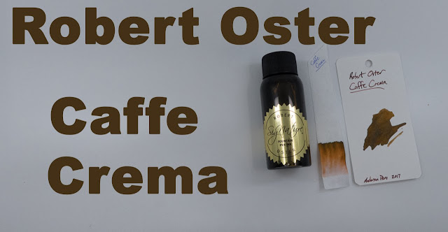
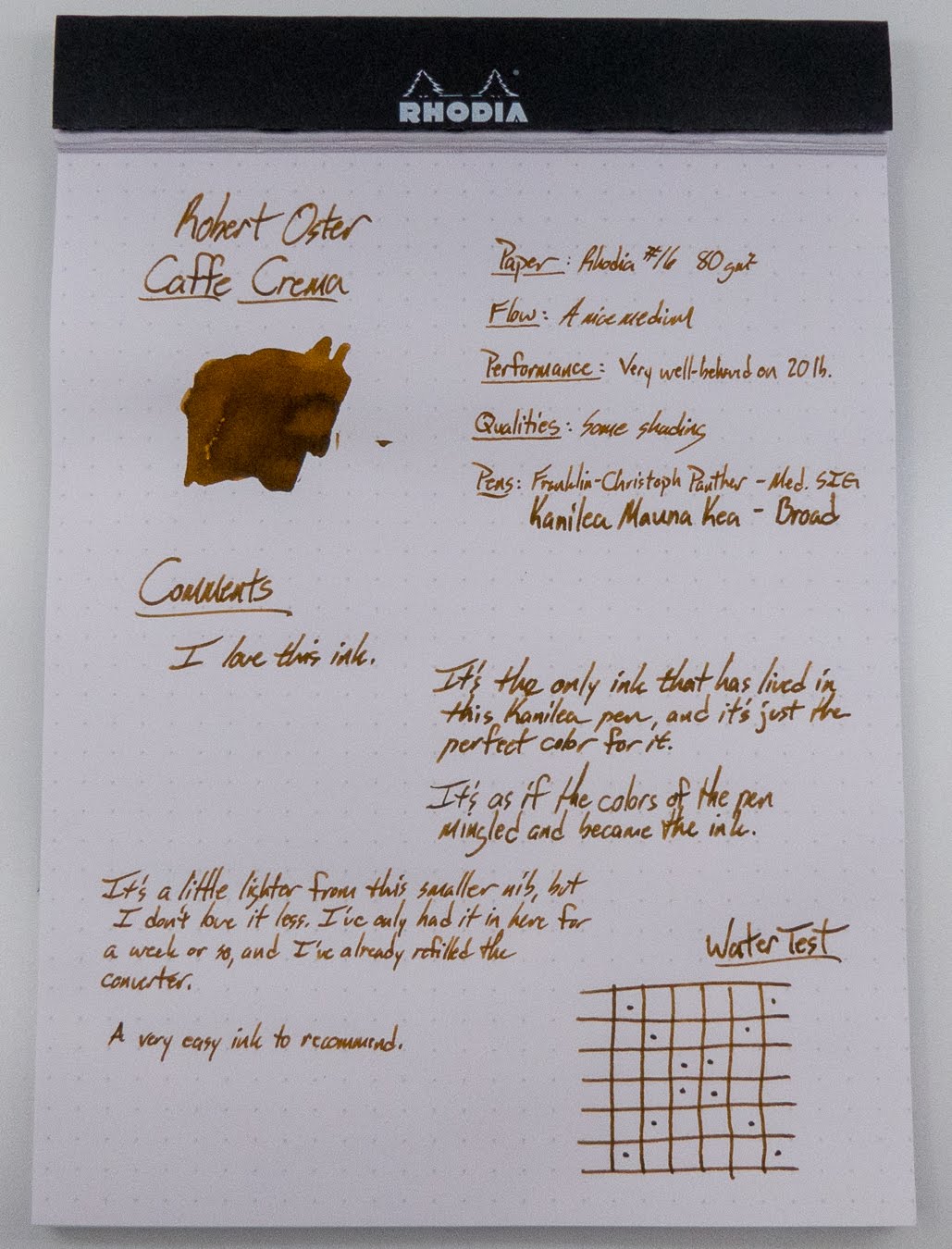
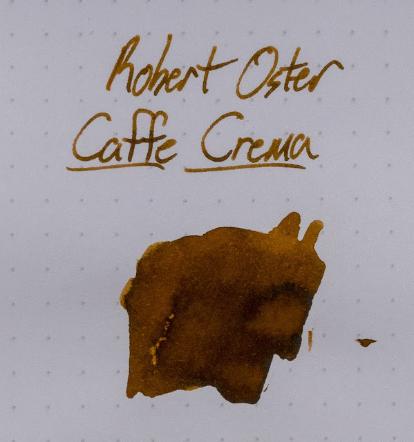
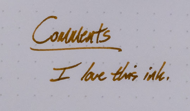
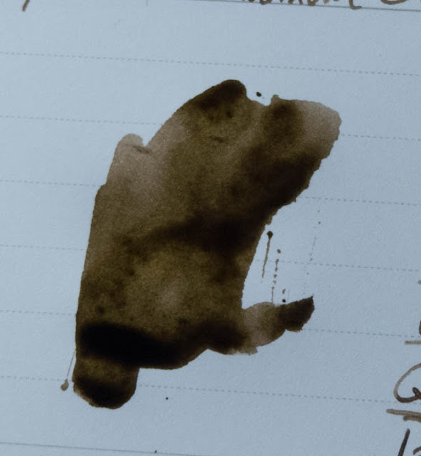
Anderson Pens sent me the sample that I started using for this review, but I liked it so much that I had to get a bottle. This is one that I've got no reservations about recommending. It's a sort of creamy brown that looks like coffee with cream. (Thus the name.)

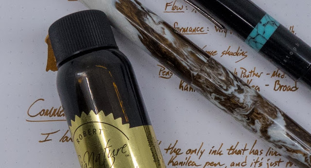
The first pen that I put this in was a Kanilea Mauna Kea, and it matches the pen really well. It's sort of like the colors on the pen are coming together to make the ink. Corny? Yeah. It's true, though.


Check out the images below to see this ink in action, and let me know what you think of it. I'm a big fan of brown inks, and this one is near the top of the list for me.  At the end of the post you'll see a bunch of color comparisons for this ink.

Written Review

Close-Ups!


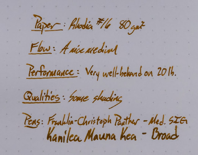
I've got it listed as "medium" flow here, but it's a little on the dry-medium side. I haven't had any issues with flow or hard starts, but it doesn't exactly flood the page. 


Copy Paper Test

 This is a really good ink for copy paper. There's only a bit of show-thru on this paper, even with a broad nib.
InkJournal Tomoe River


Inky Fingers Currently Inked


Chromatography


Water Test and Video Review


Color Comparisons!


Some things I've posted recently on YouTube:

$
0
0
Hi folks,

It's been a super busy semester for me so far. In a lot of ways, I feel that I've just been running from one thing to another thing to the next thing. That always makes the blogging slow down, and I always feel a little guilty about not providing as much content as I'd like to put out. If you're just a blog-reader, and you don't subscribe to my YouTube channel, then it's been really quiet.

It hasn't been all that quiet over on YouTube. I do a weekly hang-out live with anyone who wants to show up and chat. Those are almost always at 4pm Eastern Time. Come on over!

I've also done a couple of pen reviews recently, and those just work better in moving pictures than they do in static-pictures. So, I'll post those at the bottom of this post. I've got one more pen review coming out very soon, and another on some nibs I've been using for a while. Inks will be back very soon, too, as I have some that I've been loving and some others that I've been really frustrated with.

Thanks for being a part of this blog adventure! It's been just over 6 years so far, and that's pretty awesome.


Kyo-Iro Moonlight of Higashyama

$
0
0


These Kyo-Iro inks are really interesting. This is the third one that I've reviewed on this blog, and I think I like it the most, so far. It's definitely more interesting than Flaming Red, and on par with the really cool Soft Snow of Ohara. Like Ohara, this ink is difficult to categorize. It's sort of a red, but it's also sort of an orange. It's a little pale in the smear on Rhodia, but it's plenty saturated from the nib. It's a bit weird, but I really like it. In fact, as you can see above, I've used up almost the entire sample that Anderson Pens sent me for review. They've got it in stock in bottles and samples, and you should check this one out. It's neat.

Check it out below and let me know where you stand on this interpretation of Moonlight. Also, there are a whole slew of color comparisons down there for you to see. A SLEW.

Also, after I'd done the video and taken all of the pictures, I noticed that I misspelled the name of the ink. I forgot the little hump on an "h" and I feel a little dumb about that. Oh well. It happens.

Written Review


Close-Ups

This one looks way different in the two pens I used it in. The flex nib is darker and finer, and it seems to put a lot more of the ink the same place. I really like it both ways, though.


Copy Paper Test

This is really good. You see a touch of bleed from the flex nib, but only a couple of dots here and there from the broad SIG, and no feathering.

Inky Fingers Currently Inked Notebook

Find these really helpful little books here.


Ink Journal Tomoe River

Find THESE helpful little notebooks here.


Life Notecards

I picked these up on a whim from JetPens a while ago because I'd recently been introduced to Life paper, and they're really nice. Also, they come with a hole punched in them so that you can easily put them on a ring.


Chromatography


Water Test and Video Review


This one has a little more resistance than I thought it would, but I wouldn't call it water-resistant.


Color Comparisons

Okay, so I've tried to find some things that are close to Moonlight, but none of them really are. These swatches run the gamut from reds, to oranges, to browns.


Montegrappa Ducale Grande Emperador Brown Limited Edition

$
0
0


Kenro sent this huge limited edition our for review, and it's totally worth a look. There are only 200 of these, so make sure you jump on it if you're interested.

You should be able to find it at most Montegrappa dealers including:

Pen Chalet

Fountain Pen Hospital

and Anderson Pens (who may not have it on their site, but can almost certainly get it for you).


Krishna's Jungle Volcano

$
0
0

 A new brand on the blog! I ran into Tom from Inkjournal at the Philly Pen Show this January, and he showed me this new (to me) line of inks that he was selling. Dr. Sreekumar of Krishna Pens has been making pens and inks in India for quite a while, and he has some really nice looking work. Alongside inks with really interesting colors (and interesting sheens), there are hand-made ebonite pens painted in layers of lacquer with some really pretty nibs. It seems like he makes the pens to order, and can mix up inks in various ways, too.

Anyway, this one is a really interesting ink. Super-sheen inks are pretty hot right now, but there aren't any others out there (that I'm aware of) which have a bright  orange base with this kind of awesome green sheen on top. It's a striking combo. While I love the color of the ink, and the price is pretty good, I had some problems with hard starts in both of the nibs I used this ink with. I think you'll want to have a really wet nib for this one, or else just add a touch of water to it to thin it out a tiny bit. I ended up dipping the nib in water to get it flowing, sometimes. Once you've got it going, though, it's pretty great.


Check out the images below, and let me know what you think of this one.


The Written Review


Close Ups!


InkJournal Tomoe River

Oddly, I didn't get as much sheen on Tomoe River as I did on the Rhodia (or even the copy paper). It's weird how different inks react to different papers. Usually, Tomoe River is all sheen. Not this time. Just some shine.

Find these journals here.


Inky Fingers Currently Inked

You can find these helpful little journals here.


20 lb Copy Paper


This ink, in contrast to other super-sheeners, is really great on copy paper. You get a little sheen, but not too much. You also get zero bleed, feather, or spread. That's always impressive. Perhaps that's because it's just a little dry?


Chromatography

Flames!
Water Drop Test and Video Review


Like a Mogwai, don't get this one near water. It'll be a mess.


Color Comparisons!

It was really hard to match this orange through all the sheen on the word card, but it's somewhere between Diamine Pumpkin and Nemosine Solar Storm, I think. Sorta? It's a cool orange, anyway.


Bonus Sheen!


Rohrer & Klingner SketchINK Lilly

$
0
0

 Another newcomer to the blog, Rohrer & Klingner's SketchINK series is pretty new. These inks are all nano-pigment inks that are supposed to have really good flow as well as being lightfast and water resistant. I can say that this ink is pretty wet. I had great flow in the Pilot Custom 74, and really nice flow in the Pilot Kakuno. I can't really test for light-fastness, but you can scroll to the bottom to see the water test.

I was a little leery of these inks, and they weren't on the list of things I asked Anderson Pens for, but Lisa handed me a bag of samples that I didn't have yet, and this set was in there. Some of the vials showed a little bit of nano-pigment that had fallen out of solution, and I swirled the vial until it was all suspended again. That made me think that this would happen in the pen's converters, too, so I put it in the Custom 74 since those are really easy to clean out. When that one worked just fine for a while, I decided to really test it and put it in the very fine nib of a Kakuno. No problems at all.
 
The only thing to be aware of is that the odd pictures on the bottles aren't all safe for work. Check 'em out. You'll see what I mean. Maybe don't take these bottles to work with you. 

The colors are varied and interesting, and I'm looking forward to using them all.

Written Review


Close-Ups!


I may have gotten a little ambitious with the smear on this one. 


Staples 20lb Copy Paper Test


The only problem with this ink is that it bleeds when you use it in a wet pen. It's a pretty wet ink, and so this wasn't a great combo on this very average paper. It behaved itself much better from the finer, drier nib. 


Inky Fingers Currently Inked Notebook (Wheat Paper)


InkJournal Currently Inked (Tomoe River Paper)


Chromatography

I think this one is pretty cool. It did make me worry about the water resistance, though. Water moved most of the green up the strip. 


Water Test and Video Review


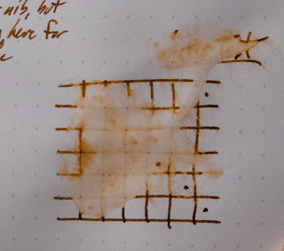
Now...check this out.


I swear that this bottom one has had water all over it. I haven't seen water resistance like this in a long while. Maybe ever. Well done, R&K!


Lots of color comparisons:


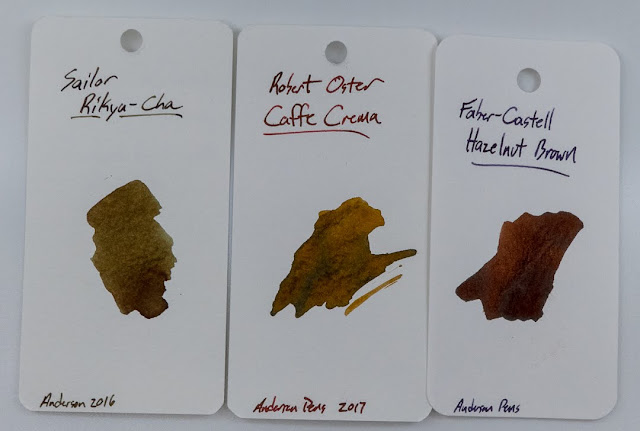
I know that this one is supposed to be a brown, but it didn't look even a little like any of the browns in my catalog. I thought it would look like Sailor's Rikyu-Cha or Diamine Salamander, but it's not even close. Looking back through my cards, I should have included Iroshizuku Yama-Guri, but I didn't. It's only a little close to that one.


Franklin-Christoph's Model 451 Fountain Pen


Papier Plume House of the Rising Sun

$
0
0
Ink provided for review by Papier Plume

 This is the newest ink to become part of the Papier Plume ink line. It's not released yet, but it will be coming out concurrent with the Atlanta Pen Show on April 13th. As you can see, it's a red-orange ink with plenty of saturation and a little bit of shading. You'll see some nice edge-shading when you use it on good paper, and a bit of bleed if you use it on bad papers.

You can also get some interesting color variation by using it in different nibs. In this fairly fine and fairly wet nib, you get a very red hue. When you use a broader or drier nib, you'll get a little more orange. It's a really interesting ink, and the price on these inks is great. Check it out.


Written Review


Close-Ups!


Nope. No sheen. 
 Beautiful shading, though.

Chromatography

Check this out! What a color range!


Water Test and Video Review


Copy Paper Test


Inky Fingers Currently Inked Notebook


Currently Inked Tomoe River Edition


Color Comparisons

I've got a bunch of comparable colors to show you on the orange and red sides of the spectrum. 


Papier Plume's Chicago Inks: 2018 Edition

$
0
0
Provided for review by Papier Plume!


**Okay, I put this post together before the Chicago Pen Show, and I forgot to hit the "Publish" button. I'm a dumb. Or maybe I was just too busy to think straight at the end of the semester. Anyway, enjoy!**

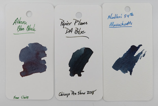
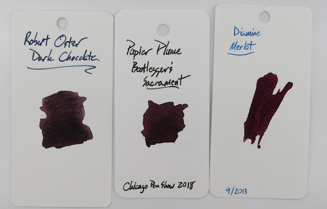
These two inks are made specially for the Chicago Pen Show this year. Last year, they used the ivy from Wrigley Field and the turquoise of Lake Michigan.This year, we've got the Bears and wine (inspired by this article).

I'm pretty sure that I like the burgundy a bit more than Da Blue, but both of these are pretty cool colors. Both of them are fairly well-behaved, but they do bleed a little bit on 20lb office papers. That's not unusual, but it's worth noting.


These are a part of a limited edition that will be made available at the Pen Show, and thereafter (while supplies last) on their website. Check them out below, and let me know which one you like best.

The Written Reviews


Close-Ups!


The Bottles


Copy Paper Test


Inky Fingers Wheat Straw Paper


Ink Journal Tomoe River Journal


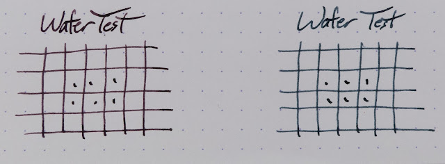
Water Test!


Video Review


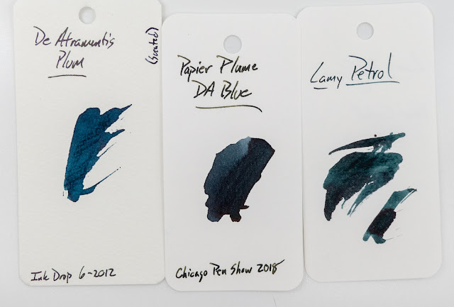
Color Comparisons!


J. Herbin Lierre Sauvage

$
0
0

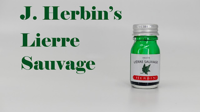
I've said a couple of times that I'm not a huge fan of J. Herbin's regular line of inks. Their glittery editions are usually pretty cool, but the regular line tends towards being undersaturated and dry. Those aren't things that I'm into.

(In fact, looking back, I think that the last time I reviewed a standard Herbin ink was back in 2014 when I declared that Bleu Pervenche was "fine.")

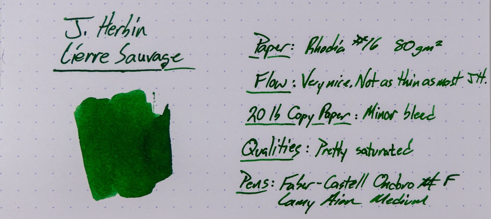
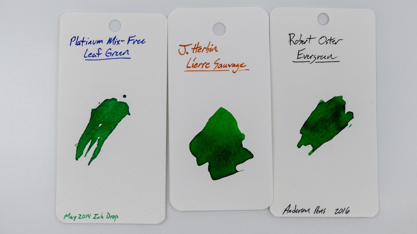
This ink, though, is going to be one of my favorite greens. It's a great color, it writes really nicely, and it behaves fairly well on bad office paper. It's not perfect, but I've been liking it a lot. So much so, that the little bottle is almost drained.

I can't remember where I picked this up, but I'm pretty sure I got it at the Philly Pen Show, so it was probably Anderson Pens.  Maybe? Could have been JetPens? They seem to have the little bottles. Anyway, you should definitely check out this ink.

 Check out the ink below, and let me know what you think. What's your favorite green?

Close-Ups!


 Inky Fingers Wheat Straw Paper
 Find them here.

InkJournal Tomoe River Paper
 Find it here.


Staples 20lb Copy Paper


This is the only place where this ink falls a little short. It's not great on bad paper. Still, it's not bad, and you won't really notice the issues if you're not looking for them. It's great on better papers.


Chromatography


Video Review


Water Test


Bottle and Review Pens


Color Comparisons


A slew of paper reviews!

$
0
0
Hi-ya, Loyal Blog Readers!

I've been busy checking out papers over on the YouTubes. I'll probably post some short reviews here on the blog, as well, but I haven't gotten around to that yet.

So, until then, check out the videos below and don't forget to join me, live, on my YouTube channel for a beer and a chat on Fridays at 4pm Eastern.

Best,
Mike


Kyo-no-oto Nurebairo

$
0
0

I've reviewed a couple of the inks from the TAG shop in Kyoto before, but none from this line. There are two lines of inks that they make (Kyo-Iro and Kyo-no-oto), and this is the first from the Kyo-no-oto line that I've tried. It's a somewhat deceptive ink, actually, and I've been using it off and on since about January of this year. In fact, I've used up just about every drop of this sample that Anderson Pens was kind enough to send out to me.

I've got it in three pens right now, and it's only really working well in one of them. They're all fine once they get going, but this ink has a habit of drying out in the nib if you pause in your writing for too long. More details below, but I think this is an ink that is best used in a broader, wetter nib.

Written Review


This ink has been in the 3776 for the longest. I kept trying to like it, but I just don't think I do. It's a little dry and it gives me hard starts even in the Platinum. That's pretty unusual. Weirdly, every time I'd go to give up on it, wash it out, and move on with my life I would hit a stretch where it's working well and the color/sheen combo is really rad.

It's better in the bigger nibs, but it's only really been reliable from the music nib.

The biggest issue with this one is that it's really expensive at $28 for 40mls. Combined with the sketchy performance, I don't think this one will be making it into my collection.

Close-Ups


This is a pretty deep black (or at least it looks like one), but it's also got a good amount of sheen when you get it in the right light. And the sheen is a really neat color, too. Sort of a bronze or something.


20lb Copy Paper Test


It's really good on the copy paper, and even from the music nib.


Inky Fingers Currently Inked Journal


InkJournal Tomoe River


Chromatography

Huh. It's blue??


Col-o-ring Card


Sheen! Neat bronze sheen.


Water Test


No water resistance on this one. Keep it away from possible spills and don't address a letter with it. The water really brings out the blue in the ink, though.


Video Review


Viewing all 528 articles
Browse latest View live