Quantcast
Channel: Inkdependence!
Viewing all 528 articles
Browse latest View live

Sheaffer Skrip Red

$
0
0

This is one of my favorite reds, and it's certainly one that I recommend whenever someone asks for a great red. It's a true red, it behaves itself in every pen I've tried it in, and it doesn't bleed, feather, or spread on bad papers. It's sort of the ideal red ink for graders.

The hue is a true red, and that's pretty great. I know that true reds aren't the most exciting ones to some folks, but the simplicity of a true red is really what I'm looking for when I want to do some grading. It stands out on the page, but does nothing to distract from the words. Good stuff.

Check it out below, and give it a shot if you're in need of a red, red ink.


Written Review


Close Ups


Some Papers!

 First, have a close-up of the ink swatch on Rhodia. It's showing off the many tones of this ink. There appears to be a bit of sheen around the edges, but I've never seen that from any of my pens.


 The picture below is from a Pen Habit Currently Inked book, and this ink looks particularly good here.


The two below are from an Ink Journal with Tomoe River paper, and the lack of absorbtion makes the ink look more orange than it actually is.


Copy Paper Test

 The fine nib on the Unica is oddly wet and sharp, and that combination causes it to create bleeds and such with pretty much every ink on copy papers. It's a weird nib.

Chromatography!


Bottle Service

I thought these pictures came out well, so there you have it. 


Color Comparisons!
 I've got several more color comparison cards at the end of the review.


Water Test and Review Video


Conclusions:

It's great. Get it.


SO MANY COMPARISONS!


A Q&A Video

$
0
0
Hey folks!

It seems, from my YouTube analytics, that people who come to my photo-blog don't usually watch my videos on the blog. If you're a blog-reader who doesn't care for video, that's cool. If you're someone who checks out both of these, let me know in a comment or something. I'm really interested to know what y'all are into and how I can make the blog and channel better.

Nonetheless, here's a little Q&A video that I made for my YouTube channel. It was fun to do, and I'm hoping that folks will hit me with more questions so that I can make more of those. Maybe make it a weekly thing?

Anyway, here's the link:


The TiScribe Bolt

$
0
0


I've done a few reviews of Urban Survival Gear's TiScribe products, and they just seem to be getting better and better. The first pen was a little pocket-sized fountain pen that I reviewed back August 2015. It was a pretty good little pen.


Second was a really interesting project: The TiScribe HL. You don't really see machined highlighters, and this one is really cool.


Now, we've got a bolt-action-style gel pen. This TiScribe Bolt is a solid copper pen (just like the others), though it's also available in brass and titanium. Thanks for sending this pen out, Kelvin!


You can also get extra tips and finials that can change up the look of your pen. Tastes vary, but I really like the Ti pen with copper ends. It's a really cool look.

This image is from the kickstarter page.
Kelvin (at Urban Survival Gear) listed this as a "fidget pen" on the kickstarter, and it's got a lot of fidget-potential. Check out this gif from the kickstarter page:


 It's pretty tough to stop doing that, actually. The bolt action on this pen is so smooth that you might have a hard time not-messing with it. It also doesn't make much noise, so that'll be a little gift to your coworkers.

New! 

So, this is what the pen looked like when it was brand new out of the packaging. It was so shiny that I had a little trouble balancing the brightness for photography. Like a new penny!


The clip and carrier in this pen is made from titanium, regardless of the metal of the pen. It looks good against the copper of this pen, and I bet it looks good against the brass, too.


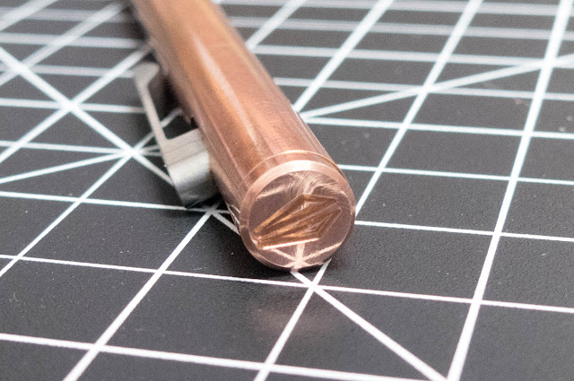
This is the emblem that's engraved in the finial, and it's the only bit of branding on the pen. I like that minimalism. 


A bit more used...

I took pages and pages of notes with this pen, and it's starting to tarnish a bit. I tend to leave the tarnish on the metal, but this one might get a polishing. I really like the look of this pen. 


These ridges are comfortable and secure in your hand, so it doesn't slip even though it's an all-metal pen.


The fit and finish on the TiScribe Bolt is  really on point. As you can see in the photo above, there's very little gap between the edge of the pen and the tip of the cartridge. So little that there's no tip rattle at all. I hate tip rattle, so that's a great feature.

More used...

Yep. More tarnish. 


The only place that isn't touched is the finial, which is still bright and shiny. 


 Parts and insides

These pens are designed to use a gel refill, like the Pilot G2, though you can get a conversion kit which will allow you to use Parker-style refills if that's your preference. I replaced the G2 that came with the pen with this Signo 307 refill.


There aren't many pieces to this pen. Body, refill, spring, and tip. That's about it. It appears that you can remove the finial, but I haven't tried to do that yet. 


Next to the TiScribe HL


Final words and a video review:

Check this pen out. If you like the bolt-style pens, then this one is an excellent version of the type. If you're into the EDC style, then check out this pen. It's bomb-proof. If you like pens that look like bullets, then check out this pen. It looks like a big bullet.

See? Plenty of reasons to use a non-fountain pen.


**This pen was sent out for review in return for my honest review. That's what you've got above.**

Montblanc Lucky Orange

$
0
0
It looks like there's sheen in this image, but you can't see that with your eyes.


A Limited Edition Montblanc! And a good one, this time!

You know I love an orange ink, and this is the kind of orange that I love. Bright, saturated, and happy. The perfect thing to use in the dead of winter to cheer yourself up.

While the color on this one is awesome, it's not a perfect ink. I had some issues with this one drying out in my nib when I didn't use the pen for a couple of days, and it was doing that in a Franklin-Christoph nib that never has that issue. Weird. Once it gets going, the ink is fairly wet, but that drying-out issue is a problem.

Check it out below, and grab a bottle before it's all gone.


Written Review!


I wrote the whole top bit out, and then spelled "disappointment" incorrectly. So I left it. Call me lazy, but I wasn't writing it again.

Close Ups!

The ink is still wet in the pic above. I like the way ink looks when it's wet. I bet you do, too.
As you'll see below, this ink works really well on copy paper. That's a big point in its favor.


Copy Paper Test!


Look at that! No bleed through, even with a broad stub nib. That's seriously good performance.

On Tomoe River:
As expected, beautiful.

In a Currently Inked Journal:

Not quite as nice as it was on the Tomoe River, but still awesome.


Color Comparisons


Bottle Service.

These LE bottles always come with a little hat. Gotta protect that snowflake.


You can see some flaky precipitates around the threads in these pictures. It's just dried ink, and nothing to freak out about, but it does say to me that this ink might be just a little over-saturated. It looks awesome, but that is probably why it's drying out in my nib.


Video Review and Water Test!


The orange doesn't stand up to water. It's kind of a mess after you clean the water off of it.

So, while not a perfect orange, it's a darn good one. You can find it at your favorite Montblanc retailer, and my favorite Montblanc retailer is Anderson Pens where I bought this ink for $19.

Another Q&A Video

$
0
0
Hey folks,

I posted this Q&A video a couple of days ago, and totally forgot to post it here. Sorry about that!

Here's the video:


Aurora 88 Pen Review

$
0
0


This is a review that I've been working up to for a couple of months. In that time, I've used up the entire volume of ink that this thing holds. It's got a fine nib, and that's a lot of use for me on a single pen. This is one of those pens that I just kept reaching for.

When Cary (from Kenro, these days) offered to send me this pen, I wasn't all that excited. I didn't know much about the modern 88, and I'm not usually into black and gold pens. They're sorta subtle for me. Well, they used to be. Since I've gotten this pen, I've gotten two other black and gold pens. I guess I caught the bug.

Read on, check out the pictures, and watch the video for more info and such.

***This pen was sent out to me for review, and I'm sending it back. Regretfully. With no particular haste. It's awesome.***

Specs

Lengths:
Capped: 5.36"   (136mm)
Uncapped: 5.12"  (130mm)
Posted:  6"    (152.4mm)

Diameters:
Body:  .54"   (13.9mm)
Section:    .46" - .4"  (11.8mm - 10.3mm)

Nib: 14k gold
Feed: Ebonite

Filling System: Piston. A really nice piston.

Cost: $695 $550 (MSRP) or $495 (at Pen Chalet)

Appearance


There's a really nice ink window that hides underneath the cap. It's a little hard to see in this picture due to the . The threads are small and unobtrusive. The section has a nice taper that changes about 1mm from top to bottom, and there's a great flare at the base of the section that is really comfortable to rest your fingers against. I've written pages at a time with this pen, and there's no strain.


Notice the finger prints. You can't keep your prints off of this pen. It's not a problem of this pen, but of all glossy black pens. I bet the matte version of this pen would solve this problem.


The picture above shows the piston partially unscrewed. I wasn't really out of ink at this point, but it was getting close. The knob isn't loose, and the piston feels as good as any other piston I've ever used.


You can see through the ink window in the pic above and below. It's pretty much out of ink, now. A very useful window. Big and only a little bit off-clear. Slightly smoky, I'd say.


Nib and Performance


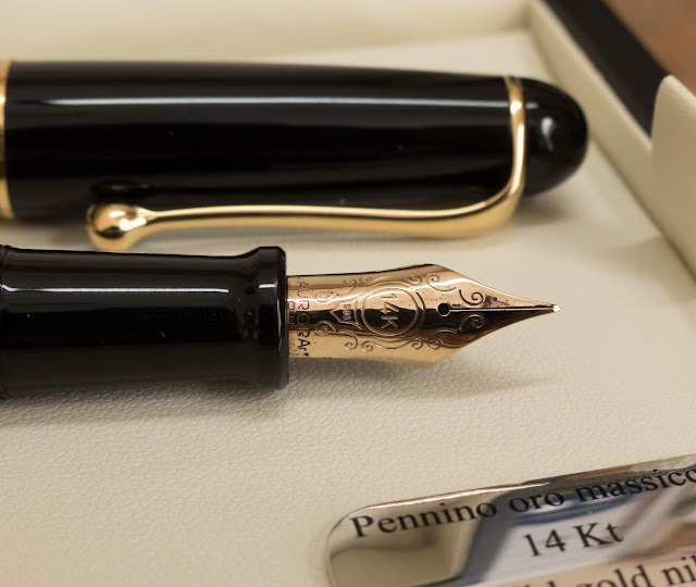
The nib on this one is difficult to tear your eyes away from. It's a beautiful counterpoint to the black body, it perfectly matches the hardware, and it curves around the slightly-red ebonite feed. (At least, I think it's an ebonite feed. It certainly looks like one.)

The nib size isn't anywhere on the nib, but you can find the size on the feed. It's a little hard to see, but you can make it out in the picture below.
There's that curve on the side of the nib. I don't know why, but I really love that curve.

Performance? Awesome. No skips. Hard like a nail, but smooth.


How's it feel?

Great. Audrey and I both hand-modeled this pen, and it's a good fit for both of us. She's clearly a better hand-model than I am.
Is that the new Aurora Blue Black in the background? Yep.


Comparisons


Pens: Tactile Turn Gist, Sailor ProGear, Aurora 88, TWSBI ECO, Lamy 2000, Sailor 1911L, Pilot Custom 74, Pelikan m1000.

I've never had more trouble taking a picture of anything than a tray of glossy black pens.


Wrap Up

This pen is great. If you're looking for something wilder, you can check out their other patterns. There's a really swirly orange one if that's what you're into.

The only drawback to this pen is the price point. I wish it were way lower. Unfortunately, this sort of pen is going to command a pretty steep price. At this level, though, you're in upper-tier Pelikan territory. These aren't anything like Pelikans, though, so they're likely to appeal to very different audience.

Anyway, check one of these out if you have any chance to do so. They're worth the time, and the price if it doesn't scare you off.

Video Review


Somethings borrowed!

$
0
0

So, I ran into my friend Greg at the Philly show and he loaned me a few really cool pens. I don't have terribly many pictures of these pens, but you can find the video on my YouTube channel. I really suggest watching that video for a better idea of what these pens are like.


Quite the assortment, huh? Let's talk about them from left to right.

The first one is an ST Dupont Olympio. This pen comes in a variety of styles and in large and small sizes. Obviously this is the gold one, and it's the larger size. It's actually a really big pen. Dupont pens always catch my eye at shows. They've got an interesting style, their nibs are always beautiful, and they have one of the best slip caps in the biz. Seriously. Listen to the cap snap on in the video. The pen posts.


As cool as the Olympio is, though, it didn't really click with me. It's just too ostentatious. It's huge and gold, and it feels like I'm driving a Bugatti to a pawn shop. It doesn't make it less rad. It just makes me a little uncomfortable.


Of all of these pens, the Dupont has the best nib. For sure.


The second pen is a Sailor Pro Gear Regency Stripe. That's basically a Sailor Pro Gear with a metal shell around the barrel. It looks really cool, and the weight is probably a plus if you think the regular Pro Gear is a little too light for you. That weight is in the middle of the pen, and that's kinda odd to me. It's a nice pen, but the weight is a little weird compared to the regular Pro Gear, and I can't see any way to justify the price-hike. It's a big hike.


The last pen is a Waterman Carene. I've had this pen on my list for a long time. They're kind of expensive, though, and that has kept me from getting one without testing one out. I'm also a little leery of inlaid nibs after my experiences with the Sheaffer Targa. That said, I'm a big fan of this pen. The shape is awesome. The slip cap is great. The nib is unique, pretty, and writes perfectly. The clip is articulated. There's nothing not to like. Well, you won't like it if you want a bouncy nib. It's a nail. A nice, reliable nail.


Thanks for letting me borrow these cool pens, Greg, and I hope we can do this again soon!


Here's the video:


The New Aurora Flex Nib

$
0
0
This nib is coming out soon, and I'm glad that I got a chance to check it out for a few days. Thanks for this review (and the YouTube video to go with it) go to Cary and Kenro. I had to send this back to them all too soon.

The pen that this nib is fitted to is the same sort of Aurora that I reviewed a couple of weeks back: the Aurora 88. This one is an upcoming limited edition of Anniversary pens. There will only be 188 of these in each of 8 (at least, I'm pretty sure there will be 8) colors. You can find the blue and red ones right now, but they're only available for pre-order at this time. They should be out soon, but I've heard that the demand for these $650 pens is pretty high so you should get in contact with your favorite retailer.

The nibs at Aurora are all made in-house at their Italian facility, and this one is no exception. According to Cary at Kenro, this one required some special new equipment to fashion. It's a 14k gold nib, and it's shaped differently than the regular 88 nibs. You'll see that below, but it would be a good idea to check out the video for this pen so that you can see it in action.


Here's some more of this awesome yellow pen. I hear that there's going to be an orange one, as well, and that's rad. 


 Below you see the standard nib (top) compared to the flex nib (below). (I had both of these pens at the same time for about a day before I had to return the black to Kenro.)

As you can tell, the flex nib has longer, skinnier tines than the standard fine nib and a lower shoulder. That difference is part of what makes this nib flex while the standard nib is a solid nail. They're very different writing experiences.


Here's a view from the bottom. Both of these feeds are marked "F", but their line weights aren't really the same. The flex nib writes about a size larger than the regular fine nib, I think. You can also see how much longer the tines are on the flex nib.


A few writing samples:

These writing samples were done with the new Aurora Blue Black ink. The flow of the flex nib really allows the Blue Black to show its great shading. I didn't have much trouble from this pen with this ink in my every day writing. I took many pages of notes with this pen, and I can say that it's a very usable every day driver. There's some flexing while you write, but it's not irritating and there's none of this stuff where the  inside of the nib is scratchy and it catches on the paper.

The tines didn't have any problem returning to the right place after flexing, either. There were zero misalignments in my time testing this pen, and I'm a total noob when it comes to flex nibs.


None of this is to say that it was problem-free. There were some railroads in that top line below, and I attributed it to the pen running out of ink. It was. The 88 can hold a good amount of ink, but the wet nib goes through a decent amount of it. I re-inked, and the bottom set of squiggles were much better.

I did have an issue with railroading when I was flexing while making the video review, and it appeared that the surface tension of the ink between the tines was too weak under flex. When you flex a nib, you're basically doing something like when you blow bubbles with a bubble wand. You can't let the surface tension pop or it's game over. That made me think that maybe the ink just wasn't ideal for this use.


As a result, I decided to flush it out and re-ink with Aurora Black. That's one of the best inks when you need a wet ink, and it performed super well. Once I started using Black instead of the drier Blue Black, the pen was pretty awesome.

Remember, folks, it's not just the pen. It's the pen, the ink, the person, and the paper that determine the way a pen performs. If a pen isn't working the way you'd like, you might just be able to alter one or two of those variables instead of sending the pen off for expensive alterations.


I think this nib is actually pretty great. It's not vintage flex. It doesn't flex as soon as it hits the paper. If you want that, you're going to have to go vintage or you're going to have to go for a dip pen. 

This one is usable by anyone, it's tough enough to make it through the hands of a few hundred people at events before it came to me, and it is a pretty worry free experience. Use the right ink, and this pen and nib will really shine.


Col-o-ring Ink Testing Books: Coming Soon from Well-Appointed Desk!

$
0
0

Just like the rest of you ink-nerds, I'm into keeping track of my inks and swatches. It's super-helpful to be able to go back and see what an ink looks like without needing to put it in a pen. There used to be a pretty cool product from Maruman that gave us small cards on a ring. The paper was pretty good, but not perfect. It was a little too absorbent and a little rough on one side. Not perfect, but good enough.


Then they cancelled the product. Bummer.

Ana (at the Well-Appointed Desk) has been working on a replacement for these cards-on-a-ring, and they're finally ready for public consumption. The paper looks better than its predecessor. And the name is rad. I bought the first ones, and I'm excited for them to arrive for testing.

That's Ana's picture. Not mine.

Check out Ana's post about them!

Aurora Blue Black Ink ** And A Give-Away! **

$
0
0

This is the new ink from Aurora's line, and I'm glad to bring it to you so close after its release. It's been out for 2 or 3 weeks, I think, and I've used it in a variety of pens.

It's a little bit of a mixed bag. I really like the color of this ink. It's a great blue black. Just the right balance of blue and black, if you ask me. It also works really well on copy paper. No feathering or spreading, and just a few dots showing through. Excellent performance on this kind of paper from some really wet nibs.

On the other hand, it's a little bit too dry for me. I'm pretty sure that I have some pens which could benefit from a dry ink, but it doesn't really like my Pelikan m800, and that's a pretty wet pen. It works about as well in my Sailor HB nib as in that Pelikan's fine nib. The Pelikan actually feels a little rough with this ink. Kind of like a pencil. It's consistent, but I prefer a wetter ink with a smoother nib-feel (if you know what I mean).

Like I said, it's a mixed bag. I can't give it a whole-hearted endorsement, but it's got some great qualities. Check out the images below, and let me know what you think.

Oh! I've got a bottle of this ink to give away, courtesy of  Kenro Industries. Scroll all the way to the end to enter to win! (USA shipping only. Sorry, but I'm sure you understand.)

Written Review


Close-Ups!


Copy Paper Test

This is really good performance on the copy paper. This ink is in some really wet nibs, and it's not going crazy in any of them.


Tomoe River Paper

You can see some of the sheen in the photo above, as I took it at a slightly different angle to the others.


Currently Inked Journal (Wheat straw paper)


Col-o-Ring Book

This is the new Col-o-Ring ink testing books made and sold by Well-appointed Desk. You can see my review of these cards here.


Color Comparisons
 These are the ones that I had inked up. There are lots more of them at the end of the post. You can also look through lots of blue/black inks using the AndersonPens Ink Tool.


Chromatography


Water Test and Video Review


The turquoise and the red splotches here came from the other side of the paper towel I used to blot away the water. I'm a professional. That's what that is. Professionalism.


Extra Color Comparisons!


The Give Away! 


The Give-Away!
 
To get yourself a free bottle of this ink, mailed anywhere in the USA (no international shipping), use the Rafflecopter above to enter. The give-away will run until 12am on April 2nd, and I'll contact the winner. They'll have 24 hours to send me their contact info, or I'll have to pick another winner.


Giveaway winner has been drawn!

$
0
0
Thanks so much for entering my give away. With about 500 entries, I think it was a really successful giveaway, and I'm excited to plan my next one.

Congratulations to:

Maria M. of Florida!


Franklin-Christoph Sweet Maroon

$
0
0


A new Franklin-Christoph ink! When Audrey told me that the new color was called "Sweet Maroon" I wasn't sure what to think about that. I wasn't sure there was room between the Urushi Red and the Terra Firma and the Red 187. They found a space, though, and it's a cool space.

Sweet Maroon is a beautifully shading ink with dark reddish tones and pinkish highlights, and (if you put down enough of it) a green sheen. This is an ink that can really change its character according to the pen you put it in. Below, you'll see it in a range of medium nibs, but they're very different medium nibs.

The short story is that I really love this ink. I just kept putting it in pens. It's in at least 4 of them right now, and maybe more. Check it out below and let me know what you think.

Since my wife works at the company, all of the usual disclaimers apply.*


The Written Review!


Close Ups!


Chromatography!


Ink Comparisons

Here's a link to a whole album of other comparisons for Sweet Maroon.


Tomoe River Paper - Ink Journal

Tomoe river paper is pretty good at showing the character of inks that shade and sheen, so it's really good for this ink.

I left in the sample of the Robert Oster Hippo ink because it's pretty cool (and limited to this kickstarter), and I'll have a review coming out for it in a few days.


Pen Habit Currently Inked Journal

Find the current version of these books here.


Staples 20lb Copy Paper

This is a really common sort of paper to find in offices and schools, and the Sweet Maroon performs very well on it. The only real bleeding/feathering/and spreading issues came from the massively wet OMAS nib. Even there, though, it does better than a lot of other inks. It's pretty impressive.


Col-o-Ring Paper

These new Col-o-ring books are pretty great. Check them out.


Water Test and Review Video


This isn't the most water-resistant ink, but it does leave behind a readable remnant in a sort of pink hue once you soak up the water.


**Disclaimers: My wife works for FC, but I'm not paid or employed by them. This isn't advertising, it's a review. Not even an officially solicited review. Just a review of an ink that I happen to like.**

Montegrappa Game of Thrones

$
0
0

Hey folks! 

I've just reviewed one of the Montegrappa Game of Thrones pens, and I'd like to thank Kenro for loaning it to me for review. Check out the review below, and on YouTube. Videos are often better at showing off a pen, so I suggest checking that out if you're interesting in this one.


The Pen and Box

This is the pen for House Baratheon, and it was sort of my second choice. I'd hoped to get the Stark pen, but that one was apparently the victim of some sort of heist. Or white walker attack. Or the Greyjoys. Or something. Anyway, I didn't get it. In a way, I'm sort of glad. The colors on that one are very cool, but the clip is a little odd. This one, on the other hand, has the best clip in the bunch, and black and gold are a classic combination.


The box (which you'll see a good deal of in the video review) is a really nice presentation. The outside is covered in the sigils of houses from the Game of Thrones and the inside is what you're seeing here. Appropriately red, given the source material. Under the pen you'll find the little hollow space with a thick book of instructions. I bet it comes with cartridges, too, though there weren't any with my pen. Not a surprise in a loaner pen.


Details

This pen has some really nice details. I like the patterns in the cap and on the barrel of the pen, though I wish the lines in the barrel would line up with the clip when the cap is on. It's a small thing, but it's the only bit of design that I don't like, here.


The cap band has Game of Thrones engraved on one side, and Montegrappa on the other.


The finial is probably my favorite part. They made it simple, elegant, and cool. I was curious to see if it worked as a wax seal, but I never tried it.


The square threads on the section are efficient and comfortable if you happen to put your fingers on them.


The section is a brushed gold-plate with a barely perceptible texture. It does keep the section from becoming slippery, anyway.


Size Comparisons

Here' the pen next to a bunch of others for scale. It's a pretty normal size, really.


Writing Samples


The street price will be a bit lower than this, likely. More like $300ish, I'd bet.


Other Designs

Not into the Baratheon pen? Check out these other three that are also available in the line.


Check out the video review on YouTube or watch it below:


Chicago Pen Show Exclusives from Papier Plume!

$
0
0
Chicago Pen Show Hype Train!

I hear that there are going to be lots of inks being made just for the Chicago Show, and that's pretty cool. I hope I have time to hunt them down while I'm there!

These two bottles were sent out a couple of weeks back by Papier Plume for review, and I especially like the one on the right. Y'all know I can't turn down a rad green ink.

Check out the images below, scroll to the bottom for the video, and start making your shopping list!


A pair of cool bottles!


The Pens and Review


I had each of these in two pens, and it turns out I had them in some wide, wet nibs. I imagine they'd be a little different in smaller, drier nibs but you'll have to use your imagination.


Close-Ups!

These are cool colors. The Lake Michigan Summer is more greenish than you might expect, but perhaps there's a cyanobacteria bloom going on in that lake. Totally believable. The Ivy 108 is reminiscent of the ivy-covered wall at Wrigley Field, and it's a very lush green.


Copy Paper Test


You can see some feathering and some bleed in these writing samples on the Staples 20lb copy paper, but keep in mind that most of these nibs are wide and wet. The medium SIG on the Franklin-Christoph 20 is a much more "normal" width and flow, and that one had minimal issues even on this paper.


The Pen Habit Currently Inked journal:


Inkjournal's Tomoe River Edition


Video Review:


Water Test Results: 

It appears that I completely forgot to take "before" pictures of this page, so you're only getting the "after" images. I bet you can get the right idea from what you see below, though.


The Namisu Studio

$
0
0

This pen was loaned out to me by my friend Andrew from the PenAddict Slack channel. Originally, I just wanted to try out a titanium nib, but this pen is one that I hadn't tried out either, so he sent the whole pen. I'm really glad that he did.


Namisu is a UK pen maker that I'm not all that familiar with. They've been around since 2013, and I've seen the name around the internet, but I don't think I've seen any of their pens in person. Probably I've come across their aluminum version of this pen, the Nova, but I hadn't seen the Studio yet. In fact, the version of the pen that I'm showing today seems to be in pre-order on their website. If the aluminum version is nearly as nice as the ebonite then, at about $60 (shipped to the US), it would be a steal.

Let's check out the ebonite Namisu Studio.  (I'll link the video at the end of this post, and you should totally check that out if you like videos of pens.)

The Pen

 Its' a beautiful pen if you're into simplicity. the lines are clean, and the finish has that beautiful (and sort of matte) shine that you really only get from ebonite. It's a hard rubber, and it'll oxidize over long periods of time but you can always clean it up. The ends are capped in titanium, and you can get a titanium nib, as well. It ought to last forever with those materials.


The image below shows the only bit of branding on the pen. A simple engraving on the finial. Slick and unobtrusive.


Here's the finial on the bottom of the pen. Slightly pointed but unadorned.  In this close-up you can see the slight pattern left in the ebonite by the machining process.


When you take off the cap you'll find titanium threads an an ebonite section. The threads are square cut, smooth, and it doesn't take many twists to remove the cap. That ebonite section is really comfortable, too. There's something about ebonite that just feels warm to the touch.


This side-shot makes the nib look a little bit out-of-proportion, but that wasn't my experience with it. 


The Nib 

 Andrew got this pen with a titanium nib. I think it was supposed to be an "extra fine", but it didn't feel like one, and it wasn't marked. It wrote more like a medium, really. 

I wasn't sure what to expect from a titanium nib. I'd heard, variously, that they had a little bit of flex to them, that they were hard like a nail, that they were too wet to use, and that they were prone to getting "sprung" because Ti can't remember what shape it's supposed to be. 

In my experience with this pen (I had it for about a month), the Ti nib is great. There's a little bit of bounce to it when you're writing normally, but if you apply just a little bit of pressure you can get some really decent line variation. If you're braver than I am, you could push it harder. This wasn't my pen, though, so I wasn't taking any big chances on it. It was totally serviceable for regular writing, too. I wrote pages and pages (and a few converters full) of notes with it using the Sailor Rikyu-Cha ink that you see below, and I never had any problems. It's one of my favorite inks, and the nib on this pen really let it show off.

The picture below was from the  writing sample that I did in the video. Check out that video around the 2:30 mark to see the writing sample being done.


In the Hand

I've got pretty large hands, and this pen fit me perfectly. The website at Namisu says that this pen was designed to be used without posting, but this version posts perfectly. I probably used it that way more than any other mode. The clip-less cap meant that if I just set it down it would roll away, so I'd either post it or I'd set it upright on the desk. Length and balance are great either way.

I didn't get my own measurements before I sent this pen back, but Namisu has them on their site, and I've no reason to think they're incorrect. It feels light and substantial at the same time. Good stuff.


Comparisons to Other Pens

Full-Disclosure: I was in a hurry when I took these pictures, and the glare and balance and focus are all off. Since the pen is gone, though, I don't get a do-over. These pics will serve, but they're not my finest work. 


From left to right:
Pelikan m800, Lamy Al-Star, Namisu Studio, TWSBI Eco, Platinum 3776, Franklin-Christoph 20, and a Pilot Vanishing Point.


Video Review


Conclusion


So, should you buy this pen? Sure. I totally should have bought it from Andrew. The only things holding me back were some recent pen show expenditures and the fact that it didn't have a clip. I like to take my pens with me, and I really prefer a clip. I don't think they should ever add one to this pen, but I don't know if I could have turned it down if they'd had one on there. Looking back, though, I've got regrets about letting it go. The look, feel, and performance of this pen were great. Ah, well. Who needs more pens, right? Right?


Aurora's Kappa Fountain Pen

$
0
0

I've been reviewing a lot of Aurora and Montegrappa pens lately, and this one comes to us from Federalist Pens, who loaned it to me for review (and a giveaway!). Scroll to the bottom for the giveaway!

The Kappa is a collection of pens is a brand new line of pens from the venerable Italian brand. Priced under the Ipsilon model, this is their new entry level pen in rollerball, ballpoint, and fountain pen. Obviously, I'm reviewing the fountain pen version. Because...duh.

So, here's the packaging:


It does the job. 

The Pen


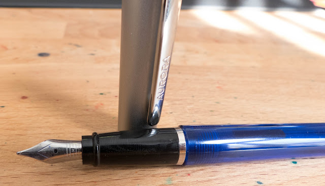
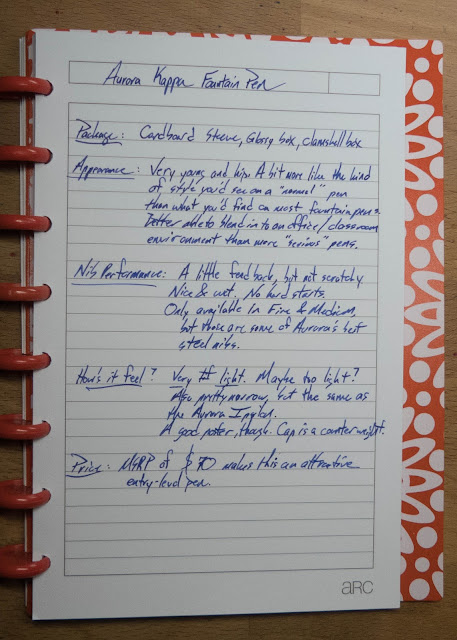
This one isn't like anything else that Aurora has in the lineup. It's light, translucent, and a little futuristic. It's all swoopy and angular like something from Speed Racer. The look is going to be polarizing. I'd guess that you already either like it or hate it.


One virtue of this look is that it sort of resembles the pens that you can find in the office supply cabinet. It'll blend in at the table when you're in a meeting and it won't draw a whole lot of stares from your coworkers or classmates. It's sort of flashy-stealth.


If you're not into the translucent blue barrel, there is a black version that doesn't appear to be translucent.

The section is curved, glossy, and a little prone to fingerprints. Obviously. It's a comfortable section. In fact, the section and the nib are identical to the Ipsilon.


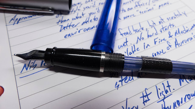
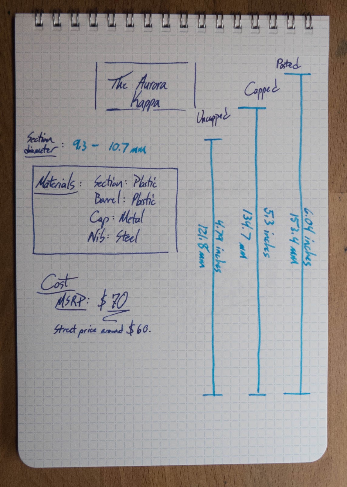
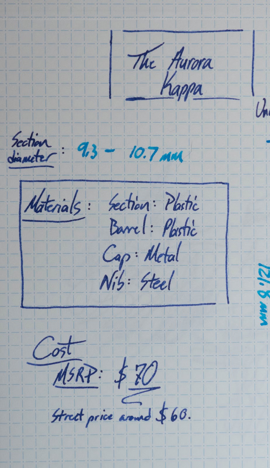
Here are a couple of shots of the nib, section, threads and the cartridge. That black band is actually Gorilla Tape. It's only there because the cartridge had a crack in it and it was leaking ink into the barrel. It's not standard. Also not standard with this pen: a converter. That's a disappointment  with this pen. At $70 MSRP, it ought to have come with a converter. Of course, the Aurora converters are pretty expensive, so the lack partially explains how they lowered the price.


The cap is actually really good. It's a metal shell with a plastic liner and a plastic inner cap. I've never had a problem getting this pen to start writing, and it hasn't dried out at all. Pretty impressive. That plastic liner also keeps the metal cap from scratching the plastic barrel when you post the pen.


Specs and Writing Samples!


Video Review!
It's always best to see a pen in action!


The Give-Away!

I'll have Rafflecopter pick a random winner on Saturday the 27th. Make sure you pay attention to the Rafflecopter for precise ending times and such.

  • I'll ship you the pen (and boxes) anywhere in the USA. (Sorry, no international shipping.)
  • The pen doesn't come with a converter and I can only include the (used) cartridge that it came with. Make sure you order some Aurora cartridges or a converter if you're the lucky winner! (I've found that a Lamy converter seems to work, but use it at your own risk. I don't know if there are real risks, but one never knows.)

a Rafflecopter giveaway


Thanks, again, to Federalist Pens for providing the pen for review and sponsoring the giveaway! 

Robert Oster's Tranquility

$
0
0

I haven't done many of these Oster inks yet, but there are lots of them in the pipeline for the summer. There are a zillion inks in the collection, so let me know if you've got one that you'd like to see. I have most of them in samples from Anderson Pens (that's where this one came from), and I'm trying to decide which ones to start with.

This is a good summer-y color. It reminds me of beaches, and maybe I'll see one of those this summer. There are several good colors like this in the collection, with subtle variations. I tell ya, Robert nails the turquoise color family.You can find these in bottles and samples at Anderson Pens.

If you're not familiar with Robert Oster and his inks, you should check them out. He burst onto the scene a year or so ago with a huge collection of inks. They're inspired by the wine country that he lives in in the Coonawarra district of South Australia and, judging from his inks, that must be a great part of the world.

Okay, enough chatter.


Written Review


Close-Ups!


Copy Paper Test


Pen Habit Currently Inked Journal


Ink Journal's Tomoe River Edition


Ink Comparisons

Okay, so I like this sort of color. I have several of them inked up right now, and there are some more coming.


Chromatography


Water Test and Video Review


I don't really have any complaints about this ink. Like the other Robert Oster inks I've used, it's really good. Performance is great, color is beautiful, just enough shading and sheen. No stains. Easy to clean out. What's not to like?

**This sample was provided free of charge by Anderson Pens. No guarantees are give, and no money changes hands. All you get is my honest review and a bunch of pictures.**

Wanna watch a long Q&A video?

$
0
0
Cool! I made one of those.


Leave your questions and I'll answer them next time.

The Aurora Kappa Winner Has Been Chosen!

$
0
0


Linda L.


Watch your email inbox for an email in your inbox!


Thanks for entering, folks. It's awesome to have so much participation.

Robert Oster Torquay

$
0
0
This ink sample was provided by Anderson Pens for review.

The Robert Oster trend continues with Torquay! It's another of the turquoise, light blue, blue-green inks that were calling to me from their little sample vials this spring, and I'm glad I got a chance to try it out. Read on below to check out this ink and decide if this is the light-blue-green that you need this summer.

 Written Review


This one isn't  as free-flowing as the others that I've used from Robert Oster. It's a little on the dry side, in fact. That means it didn't really get along well with my fine blade turk nib. It does mean that it performs well in the broad nib of the Franklin-Christoph p66, though, and that it would work well in your super wet nibs. It could tame them up for you, even.


Close-Ups

 Geeze. Sometimes my handwriting looks like junk. If you're out there thinking "I can't write things on the internet. My handwriting is too sloppy!" Well, sure you can. I do.

Copy Paper Test


There's some bleed on the copy paper with this ink, but not much feathering or anything else. 


Ink Journal Tomoe River Journal


Pen Habit Currently Inked Journal


Color Comparisons


Of the available inks in this color-space, this one isn't really doing it for me. It's fine, but it's not winning any prizes from me. 


Chromatography


Water Drop Test and Video Review


Yeah, no water resistance on this one.


***This ink sample was provided for review by Anderson Pens. No cash has changed hands, and no guarantees were given. Just their ink and my honest review.***
Viewing all 528 articles
Browse latest View live