Quantcast
Channel: Inkdependence!
Viewing all 528 articles
Browse latest View live

Papier Plume Garden District Azelea

$
0
0

This is the last of the New Orleans Collection from Papier Plume. Garden District Azelea is a soft pink ink that really captures the pink blossoms of an azelea. Thanks for sending this one out for review, Papier Plume!

It's a very limited edition, so if you want to get your hands on one of the 60 bottles that will be sold you should set an alarm for 11am CST on Friday 9/16 and click this link. 
 
This is Papier Plume's picture. Not mine. Fancy, right?


Written Review


Close-Ups


Yeah, I messed up the word "Vanishing" above. I forgot the last "n" and then messed up the "g" while was trying to shoe-horn it in there. Oh well. You get the idea.

There's a pretty big difference between the fine nib and the medium nib on those two pens, and you can really see a big difference in the appearance of the ink.


It's a nice pink ink, but it's a little thin, and so it ends up looking better on more average paper. Check out the Pen Habit Currently Inked sample below. The more-absorbent paper makes the ink look better, I think.


Color Comparisons


Chromatography
This is really cool. That streak of high-lighter yellow at the top was a total surprise.


Copy Paper Test

The behavior isn't great. It's got some bleed, feather, and spread on the 20lb copy paper. You're not all that likely to use an ink like this at work, though, so you'll probably keep it on better paper. So, not a huge deal.

Pen Habit Currently Inked Book
I think it looks best on this paper, really.

Ink Journal (Tomoe River)

You can really tell how thin the ink is on the Tomoe River paper, and its not a great look. It comes off under-saturated.


Bonus Action Shots


Video Review and Water Test


Spoilers!


Franklin-Christoph Urushi Red

$
0
0

 It's another new ink from Franklin-Christoph, and this one has a bunch of shading to it. Urushi Red is a dark reddish ink that shades from a thin pinkish red to a pretty dark brick hue. To my eye, it looks like some of the really awesome urushi pens out there.

If you're not familiar with what urushi is, well, it's lacquer. It's pretty hot in the pen world right now (and has been for a while) because the pens that are lacquered with urushi are awesome. The lacquer is applied in dozens of thin layers, and this means that you end up with an incredible depth of color on the pen. Sometimes different colors are used in those layers It also means months of hand-work per pen, and that means a high cost. The other thing is the that urushi lacquer work is meant to last for centuries. Those amazing Japanese lacquer paintings that you might think of when you think of antiquities are done in urushi. Yeah.

Expect to pay four figures for an urushi pen. I was really tempted by the one I linked above, but I didn't buy it. Four figures is about one figure out of my comfort zone right now. Maybe one day.

This is a picture from the Chatterly Luxuries site. They have lots of beautiful urushi pens.


I had this in three pens (and 4 nibs), and I never had any issues with the flow of this ink. No hard starts, and no skipping. It does seems a little thinner than I'm used to in a Franklin-Christoph ink. This was what made me a little skeptical of the ink at first. It's just not as satisfying as a really saturated ink when it hits the paper. I was underwhelmed.

When it dries, though, it looks really good. The shading and hue that you see in the pictures below is really excellent, and I shouldn't have been so hasty in my estimation of this ink.

Written Review


I'm just noticing that the bottom left corner of the above picture is out of focus. Darn. Well, you'll see the better pictures below anyway. Document photography ain't easy. 

Close-Ups!


I'm going to give you some different angles to capture the character of this ink.


There's just a little bit of sheen in the picture above, but I wouldn't expect to see that in your regular writing. Maybe if you used a dip pen or something, but I don't think that would work well.


Color Comparisons

 I don't like the nib that is in the Black Swan pen. It's just not been acting right. That's my excuse for the weird handwriting, anyway.

Various Papers

 These two (above and below) are in my Ink Journal with Tomoe River paper.
 The picture below is in a Currently Inked Journal from Pen Habit's Matt Armstrong. I think it's wheat paper of some sort.


Copy Paper Test

 There are some spots of bleed-through in this picture, but keep in mind that 2/3 of these nibs are broad, wet, stubs. That's pretty good performance for a wettish ink in a nib like that.

Chromatography


I didn't notice it before, but there's just a hint of violet at the top of that chromatography. Neat!

Water Test and Review Video


Yeah, really no water resistance. Not a shock. Most red inks don't have much of that for some reason.


Okay, so you can find this at the Franklin-Christoph web site for $12.50 in either the regular or the eye-dropper bottle (that's what I got, and you can see it in the video). Both (contrary to what I said in the video) are 2oz bottles.


***Special Circumstances: As you probably know, my wife works at Franklin-Christoph. I'm going to keep reviewing their pens and inks. You can, I hope, trust in my objectivity. In any case, what you see in the pictures and video is my experience with the ink, and I ain't gonna fake anything. This wasn't a review sample, though. It was just about the only thing I bought at the DC show.***

A Pen by Ryan Krusac

$
0
0

I didn't put this pen's name in the title because this model doesn't really have a name (you'll see one like it at the bottom of this link). It's design that I kept seeing at pen shows and I kept resisting. Then, at the end of the Raleigh show this year, I stopped resisting. This cool, hour-glass-shaped pen is made from cocobolo wood. I don't think I've seen anything made of cocobolo that wasn't really beautiful. It's a reddish wood that tends to be very durable and swirly. Plus, it's a fun name to say. Try it out:  "cocobolo."


So, check out this awesome Ryan Krusac pen!

Specs

Lengths:

Capped - 5.21"
Uncapped - 5.10"
Cap - 2.16"

Diameters:

Section closest to the nib: 8mm
Section just before the threads: 9mm

Top end of the cap: 17.4mm
Bottom end of the body: 20.4mm

Package

Ryan's pens come in these display cases. This sort of pen usually has a custom-carved hole in the foam to accommodate its unusual shape, but I got this one at a pen show, and it fits well enough in the slot that I didn't want to have him take the time to carve out the right shape. He offered, though.

  It's the only pen box that I've left out on my desk.


Appearance

In a word: beautiful. The wood is rich and reddish. It's very smooth to the touch but not slippery at all. the asymmetry of the design is really pleasing to my eye, and the chrome ends and waist break it up beautifully.


The section is metal, and it slopes down from the top to the bottom of the section. You can see the threads on the section there, but they're shallow and flat. Even if you grip on the threads, they hardly feel like they're there. A metal section is a no-no for lots of people, but the extra weight of the barrel and the width of that barrel really help to keep the section in my fingers. Anyway, it doesn't feel slippery. 


This is the only marking on the pen, and it's Ryan's logo. I love minimal branding. 


Here are all the of parts. It's  pretty standard on the inside. Metal threads, so don't eyedropper it. Also, I'm not sure that the inside of the pen is sealed, either, so you know. Don't do that.


Nib performance

It's a Dayacom nib, which I'm not familiar with. I don't thin I saw this nib on his other pens at the last show, so he may get the nibs from some other vendor or he may just be customizing the ones that he gets from Dayacom. I don't know the answer to that one.


Anyway, it's a smooth nib that never fails to start. I've actually had the same ink in this pen for a few months, but it's never dried out or evaporated, so the cap must have a really solid seal on it.


Check out the video review for a live writing sample.

How's it feel?

It's pretty great in the hand. It's weighty without being heavy. The nib glides. The wider end of the pen fits really well in the web of my hand.

Comparisons

From left to right: TWSBI Eco, Lamy Al-Star, Krusac, Faber-Castell Loom, Bexley Phoenix, Pilot Custom 74.

 You can't post this pen, so I didn't bother with a posted comparison shot. This pen is pretty much the same length as the most popular pens out there, though it's going to be heavier in the hand than either the Eco or the Al-Star.


Video Review


Wrap-up

I really like this pen. It's beautiful to look at, it feels nice in the hand, and it writes every time. What more can you want?


**I bought this. Not a review sample or anything. Just a cool pen. **

Diamine Magical Forest (Nibs & Nails!)

$
0
0
Ink sample provided by Anderson Pens.

Yep, Nibs & Nails are back! It's been a little while since we've done one of these combo posts, but we're back with another ink and nail polish combo. Hooray!

Magical Forest is a bright green that makes me think of golf-course grass or pine needles or AstroTurf. I really like the color, and it makes me realize how blue my (current) favorite green really is. This one is more of a pure green, far warmer than the Emerald 357.

And, of course, it's a Shimmertastic ink. This one might have the best behavior of them all. The silver shimmer in this ink doesn't seem to cause the stoppages that other Shimmertastic inks did. I've had it in the same pen since July, and I haven't had any issues with it in that time. The nib on this pen is slightly wet, and the feeds that Franklin-Christoph uses with their #6 nibs are really good so that helps. Either way, this ink didn't cause any issues.

Check it out below, and check out the nail polish version of this ink over at Audrey's blog:


Written Review


Emerald of Chivor looks really blue in this shot, but I think it's because I just dipped that nib for this sample, and I think it came out a little weird. Emerald of Chivor doesn't usually look like this. Oh well. At least it's not an Emerald of Chivor review.

Close-Ups


This last one is taken in some direct sunlight. The little dots are the shadows of rain drops on the window. It as a rainy day in the Magical Forest. Also, that's a hair from Mr. Nose. He's a silly cat and his hairs are inescapable. He also tried to jump on my lap while I was recording the video. I think you can hear me yelp from the claws. He loves, though.


That shimmer.

Comparisons

As I said above, the Emerald of Chivor is really heavy in this image. I dipped that nib and it is way darker and more blue than it ought to be. The Emerald 357 looks a little washed out, too, now that I look at it. The Aquamarine and Magical Forest look dead on, though.

Chromatography


Copy Paper Test


Ink Journal (Tomoe River)


Currently Inked Notebook (from Pen Habit)


Water Test and Video Review


If you're looking for a happy green ink with a nice amount of silver shimmer, then Magical Forest is probably going to be your jam.

**This ink sample was provided for review by Anderson Pens.**

Conklin's 2016 DC Pen Show Ink

$
0
0

 So, this is going to be a short review because you probably can't get ahold of this ink very easily. It was the ink that was given away in the swag bag at the DC Show this last August, and it doesn't seem to have a name. That's irritating, and it means that I don't know if you can get this anywhere else because I don't know what it is.

What I can tell you is that it works just fine. It's an okay blue that runs a little thin, and it certainly looks better from a wetter nib. It is only okay from the medium nib on my Vanishing Point, but it's actually really nice from the 1.1 stub on my Conklin. I think the issue is that the ink is a little on the thin side, so it just needs a wet nib to bring out the character. In thinner, drier nibs it's just kinda lackluster.


Written Review


Close -Ups!


Copy Paper Test

It works pretty well on the copy paper. There's just a little spotting on from the 1.1 nib, but that's not bad at all.

Chromatography!


In a PenHabit Currently Inked Book:


Water Test and Video Review


So, I'm kinda "meh" on this ink. It was worth every penny, but it's getting washed out of my vanishing point real soon. If you're going to make a blue ink, you've got to make an interesting blue ink. It's a crowded field, and this one doesn't quite cut the mustard. It does look really nice in my Conklin's stub though...

I'm not sure where you can find this ink, but if you find it let me know in a comment.

New Sailor Inks on the Horizon!

$
0
0
So many awesome new inks!

I got these samples from Brian and Lisa this weekend, and I couldn't be more excited. We lost a bunch of cool inks when Sailor released the last set, but these are just an addition to the line. Hooray! Check out the images below, and let me know which ones are on your must-have list.


Cross Violet

$
0
0
Ink sample provided by Anderson Pens.

 Check out this purple!

As soon as I swatched this one, I knew it was going to be the stand-out of the bunch.  (The Cross Blue-Black is really cool, though. Check it out.) This is a color that is hard to capture in words, as there are so many different variants of purple. This one is a dark violet. Not as dark as Dark Lilac, but perhaps neighbors. I really like this color.

Take a look at the pics below, and give the video a watch. Let me know what you think.

Written Review


Close Ups!


Weird that the swatch bled through the Rhodia a little bit. It doesn't bleed through copy paper, but this was kind of a lot of ink. Also, it dried really quickly. I usually film the swatching at regular speed, stop it, and start a new video as a time-lapse to catch the drying phase for Instagram. This ink actually dried so fast that I didn't have time to catch that second video. Pretty awesome drying time on Rhodia!


Copy Paper Test


Chromatography


Color Comparisons


Video Review and Water Drop Test


**This ink sample was provided by Anderson Pens in exchange for my honest review. The review is mine alone, and all YMMV. **

TiScribe-HL on Kickstarter now!

$
0
0


And now for something totally different!

This is the first highlighter that I've reviewed on this blog, and it's the first machined highlighter that I've seen or used. I don't know what the market is for this, but it seems to be present because the kickstarter is really funded right now.

Okay, so a little bit about the project!


You might remember the previous project from Kelvin, the TiScribe fountain pen. It was a small pocket pen made from titanium, brass, or copper and it was pretty good. It was a little small for me, and it didn't post, but the work was a good proof of concept, and I hear the larger version was very popular on Kickstarter.


Well, Kelvin has taken the size of the larger version, added options like clips or (really powerful) magnets to the cap, made it post, and made it into a highlighter. It's a cool idea, and the finished product is solid.


In the pictures above and below you can see what this thing looks like. It's got o-rings at top and bottom and a few in-between.  Mine has a neodymium magnet in the cap, and it's got the power to hold the entire pen perpendicular to the metal surface that you've got it stuck to. I didn't think it was going to work with this heavy copper body, but it totally does. I hear that the production version of the pen will actually have an even larger magnet. That'll certainly do the job.

 The threads at the end are not where you're going to put your fingers, so no worries about sharp threads.

 Internals and parts:

 An o-ring keeps the refill snug in the barrel, and keeps the metal parts separated and tight. There are no rattles in this pen.


It posts! Hooray!


In-Hand

Copper pens are always going to be heavy. If you want a lighter one, go for the Ti option. I think that we need to judge a copper highlighter a little differently, though. You're not writing with this for pages. You're highlighting a few words and moving on. Thus, I don't think that weight is much to worry about. 


The Montblanc highlighter refill is bright and it seems to work really well on printed things. The catch is that performance is going to depend on the printer you have, the ink, and the paper you're using. Expect the same issues you'd have with any other highlighter. This one is replaceable, though, so that's cool. 


Okay, so if you like what you're seeing, you can go check it out at Kickstarter for the next couple of weeks. 

Let me know in the comments if there's room for a machined highlighter in your daily carry or desk usage. This thing is tough as nails, and very well designed, so it could be filling that void for you.


Here's the Video Review:


J. Herbin 1670 Bleu Ocean -- Nibs & Nails!

$
0
0

It's another Nibs and Nails ink review! Hooray! So, go over to Right on the Nail to see the nail polish that was inspired by this neat blue ink.

The 1670 line of inks has been the perennial favorite in the fountain pen community. Each new ink has been met with much expectation. This one was a bit of an outlier. I think it was the second in the series (just after Rouge Hematite), and it wasn't an immediate hit. It didn't have as much shimmer in it, and it doesn't have a sheen to it. I know this is the second version of the ink (they did a re-formulation on it), and I know I like it. I think they added some more shimmer to the ink, but I'm not sure what else was changed. Anyway, I really like the base-color in this one. It's a really great blue. I'm probably not even going to shake the bottle next time I fill a pen from it.

Check it out below, check out the nail polish version, and let us know what you think.

Written Review


Close Ups


Copy Paper Test


There's a lot of bleed through on the copy paper from the broad nib, but much less from the medium. You're not super-likely to use this one on bad paper, anyway, so I don't think it's an issue.


Compare!


Tomoe River

Not all that much glitter in the Tomoe River samples for some reason. It's there, but you really have to look for it.


Bright Sunlight

I didn't want to use too many of these pictures, but sunlight sometimes really brings out the flash in these inks. I think it did less for this ink than some others. Probably because it lacks the sheen of some other 1670 inks.


Chromatography


Some of the shimmer traveled on this one. That's fairly rare.

Water Drop Test & Video Review


Sailor Kin-Mokusei

$
0
0

This is an ink that I know people are going to be psyched about. Kin-Mokusei is the sweet olive tree, and it's blossoms are supposed to smell like apricots.  Yep. Those apricots. There was much gnashing of teeth and rending of clothes when that ink was discontinued. Well, this one is pretty darn close. It's not as close a match as some might have hoped, but it's very similar.

Kin-Mokusei is a darker orange than Apricot was, and there are several examples below. The chromatography also shows a pretty big difference in the two inks. Nonetheless, it's close. In fact, I think it's better. While Apricot is a little on the light side for me, the more orangy nature of Kin-Mokusei is at least a little easier to read without sacrificing any of the cool.

Check out this new contender for "Best Orange" and let me know what you think in the comments.

Written Review


Close Ups


I included this shot above because it shows the interesting sheen at the edge of the smear. You're not going to see this when writing with a pen (unless your pen has nonsense-level flow), but it's still cool.

On the Tomoe River...


Other Papers...

 Above: Pen Habit Currently Inked Journal     Below: Maruman Word Cards

Copy Paper Test


Chromatography


Other Inks

 If you're looking to compare almost any ink to almost any other ink, check out the Anderson Pens Ink Tool. It's flippin' rad. Here's a link to a bunch of my favorite oranges.


 Video Review and Water Test


 Spoilers...


**Thanks again to Anderson Pens for sending this ink out for review. My review expresses only my own experience with this ink, and nothing else.**

Pelikan Edelstein Aquamarine (Ink of the Year 2016)

$
0
0

Hey folks! This ink was distributed at the Pelikan Hub event earlier in the Fall this year. I was really looking forward to it, but it turns out that I don't love it. The color is a little flat, it runs a little dry, and it just doesn't feel all that great on the nib. It's one that I think I'd skip unless I were a completionist about Pelikan inks.

I think both Iroshizuku Ku-Jaku and Sailor Yama-Dori are better inks in this range. Or Sheaffer Turquoise or Lamy Turquoise. There's too much competition in this color range to settle for  mediocre performance.

Written Review


Close Ups!


Tomoe River


Pen Habit "Currently Inked" 


Copy Paper Test


 Not terrible performance, but not great, either.

Color Comparisons


Chromatography


Video Review and Water Test


Sailor Jentle Rikyu-Cha

$
0
0

This new set of Sailor Jentle Inks is really good, but this is my favorite. Rikyu-cha is a pretty odd color. I totally admit that. I really like weird colors. I thought it reminded me of Stipula's Musk Green, but it's been a while and those two aren't alike at all(see below). It's a green, but it's a brown green with a little bit of blue in there. Cool.

Rikyu-Cha flows really well, dries pretty quickly, and performs pretty well on copy paper. Mostly, though, this ink is just cool. It even changes color as you write with it.

Thanks go to Anderson Pens for sending this ink sample out for review!


Written Review


Close Ups


There's just a smidge of sheen in this ink, but it's not something you're likely to see.


Copy Paper Test

There's a little bit of bleed and a little bit of feathering on the copy paper, but it's not too bad. I wish it were a little better, but it's fine.

Other Papers...
This first picture is of a Pen Habit Currently Inked Journal. It's a wheat paper of some sort, I think.

These next couple are on Tomoe River paper. You can see the color is much different on this paper. It doesn't look like this anywhere else, but it does let you see the slight sheen you get from this ink.


Color Comparisons


SO MANY COLORS.


Video Review and Water Drop Test


So, go check out this cool ink. It's rad.

Noodler's Colorado Spruce

$
0
0

Happy Thanksgiving, folks!

As far as I'm concerned, Thanksgiving is the earliest I can put up my Christmas lights, so it's also the right time to start thinking about Christmas trees. Some of those are spruce trees! See? It all links up! Alright, maybe a stretch, but I've only started my first cup of coffee while watching the Macy's Parade. It's a silly morning.

Anyway, this Noodler's ink was made for the Colorado Pen Show in 2016 and that's where I bought it. I got mine straight from Luxury Brands, the Noodler's distributor in the US. While it was a limited release, the Facebook page said they still had some bottles after the show, so you might contact them about where to find one for yourself.

This ink is a super-dark green that is so saturated that it could be a black. Some people like to dilute inks like this to bring out the color a bit more, and I bet you could do that to good effect with this ink. The saturation doesn't seem to affect the flow of this one, though, as I'd say it's a medium-wet ink. I had it in a couple of pens from Faber-Castell's Ondoro line, and those run a little bit wet.

The performance of this ink could have been a little bit better. These are pretty wet nibs, and there was some bleeding from the broad nib and some feathering and spreading all around. I think you might like this ink better in finer nibs. The other issue that I had was that the dry times were pretty long. Where the ink is thickest it can take quite a while to dry. You'll see some more of that below.

Also below: Chromatography! A video! A whole lot of color comparisons! More! Etc!

The Written Review


Close-Ups!


On Some Papers...

These two (above and below) are from a Pen Habit Currently Inked journal. (He's changed them since then, but I think it's basically the same paper.)
The image below is of the ink on Tomoe River paper in an Ink Journal.

Copy Paper Test


Color Comparisons!


The Maruman Word Card below had the worst dry-time. You can see a smudge and a finger print on the card. I thought it was dry after quite a long time sitting on my desk. I was wrong. The bottom edge of the swatch didn't dry for HOURS. Of course, most pens can't put down enough ink for this to be a problem, but dry times are generally long with this ink. Lefties beware.


Chromatography!


Water Test and Video Review


This ink has way more water resistance than I thought it would. Not perfect, but totally legible after being hit with some water.

This isn't going to make it into my list of favorite greens, and I guess that's okay. It's a limited release, so it's not like I could get more of it if I wanted to. The color is intensely sprucey, and the flow is good. Let me know your favorite green ink in the comments!

Hey! Thanks for reading to the bottom. I don't know how many people do that, but you did. Good for you!

A short Vlog about where I've been and what's coming up soon!

Robert Oster School Blue

$
0
0

This is the first of LOTS of RO inks that I have to show you. This is a brand that's very new (like, April?), and it came out in a big way. There are something like 40 of them in the collection, and I have samples of most of them. There are so many that I have no idea how this one guy (and I think it's a one-man operation) keeps up with all of them.

This is a blue that I loved almost instantly. It's got the perfect flow and the color is outstanding. It's a rich, blue that doesn't lean purple. There's some shading, but not too much. There's some sheen, but not too much.

On the other hand, it's not the most well-behaved ink out there. There's a little bit of feathering and a little bit of bleeding on copy paper with this ink in this nib. They probably wouldn't be a problem, but they would be even less of a problem if you used a drier or finer nib. It's slight enough (and the color is nice enough) that I'm willing to overlook it. You can see how it acts, below.

You might notice, if you scroll down far enough, that this post is presented in a slightly different order than they usually are. I've got a ton of color comparisons in this post, so I decided to put them all at the end of the post.

Thanks goes out to Anderson Pens for providing the sample for review!

Written Review!


Close-Ups!


You can see a little bit of the sheen in the picture above. There's not a ton of sheen, but it's a nice addition when it shows up on the page. It never seems to overtake the base color, though.


Copy Paper Test!

See?  A little bit of bleed and a little bit of feathering. It's not too bad, though. With a slightly sturdier paper you could totally use both sides of the page if you want to.

Pen Habit Currently Inked Journal!


I  had this ink in an FC Model 20 for a while, but I ran it dry pretty quickly and I kept track of some little squiggles as I ran through it. The final squiggle is from the dregs of that converter-full, and it's a good bit darker. I don't know why, but I suspect it was just a little dried out or condensed by that time.


I'm really into this shading.

Ink Journal Tomoe River!
I actually took this just after I wrote the sample. It's still a little bit wet, but it looked cool, so I snapped the picture. There's more sheen on Tomoe River, but even this paper doesn't let the sheen overwhelm the blue.


Chromatography!


Water Test and Video Review!


Nah, no real water resistance to this one. I wasn't expecting any, and it met my expectations.


The Color Comparisons. LOTS of them. 


***This sample was provided for review by Anderson Pens in return for my unbiased review. Everything here is mine, and YMMV.***

A smattering of inks to come!

$
0
0
Hey folks,

I've been doing a whole lot of grading recently, and so I've been procrastinating a bit. One of the things that I do when I procrastinate is that I make ink swatches. Yeah. It's weird. It also helps me to catalog the inks that I have in my collection. These are all from the Robert Oster ink set, and they were so good lookin' that I had to take some pictures and share them.


Yeah, I'm really excited about these inks.

Diamine Golden Sands -- Nibs & Nails!

$
0
0

 It's been a little while since the last Nibs & Nails post, so thanks for being patient. As with the other inks in this series, the sample was provided for review by Anderson Pens, and the nail polish inspired by this ink is posted over at Right On The Nail. Go check them out!

This is a really golden ink. Perhaps the most golden ink you can find that works in fountain pens. You can get some really metallic inks that work with dip pens, but this is the closest I've seen for fountain pens. Even better, this ink seems to behave itself much better than some of the others in the series. I've had some of these bind up a bit in medium-length writing sessions because the shimmer seems to clog up a little bit sometimes. The Golden Sands, though, they keep flowing. It also seems that the shimmer mixes into the ink more readily than some of the others. It looks really cool in the sample vial. Sometimes I just tilt it back and forth to watch the swirl. It's neat-o.

Check out the review below. Get a sample of the ink for yourself. Go visit Audrey's blog to see the nail polish. Check out my YouTube Channel. Go out to the Patreon page if you want to help support the efforts at the blog and YouTube channel.

Let me know what you think of this one in the comments.

Oh! I put the color comparisons at the end of the post again. There are quite a few, so keep scrolling to find them. 

Written Review


Close-Ups!


I think it's a pretty rad ink. It did look very different in each of the pens I was using it in, though. The Unica puts down about as much ink as the L-Tech, but it's a smaller nib, so I think it puts it all in a smaller space. That makes it look darker. That's just a guess, but the other option that comes to mind is that there was ink left in the Unica that mixed with the gold of the Golden Sands. It's possible, but I don't think that's what's going on. I clean these pens really thoroughly before I use them again. Some ink could have hidden in the feed, but the ultrasonic cleaner does a really good job at making sure that doesn't happen. Thus, my guess about the difference in nibs.


Look at that shimmer!


Video Review and Water Test


Yeah. No water resistance at all. None. Don't address an envelope with this one.


Color Comparisons!


Montblanc Miles Davis Jazz Blue Limited Edition

$
0
0

Hey folks! Happy New Year!

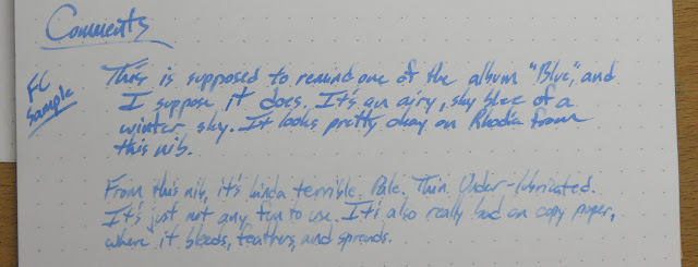
How about we start off the new year with a limited edition Montblanc ink? I hope you said "Yes!" because that's what we're doing. This is the second-newest LE ink from Montblanc: Miles Davis Jazz Blue. According to the Montblanc site, the ink is inspired by Davis' album "Blue." Maybe they meant "Kind of Blue"? That's a pretty sweet album. If there's one called "Blue", then I don't know it.

Anyway, Jazz Blue is a really pale blue. It's performance is kind of okay. The flow is wet enough, but it's also really thin. As if it were diluted too much or something. It also bleeds, feathers, and spreads on copy paper. 

In short, this isn't an ink that I'd buy again. At $19 for 30ml it's just not good enough. The blue is too pale, the performance isn't great, and it's not the kind of blue that I'd identify with great jazz.

Written Review


Close-Ups


The Bottle Shots


Copy Paper Test

 This isn't great for Montblanc ink. Most of the others that I've tried have behaved themselves just fine on copy paper, but this one bleeds, feathers, and spreads. Another strike against this ink.

Other Papers
 
The below is from a Pen Habit Currently Inked journal. It doesn't bleed or anything, but it just doesn't work well. It's really light and watery. The three squiggles in the Panther sample were done at various times during the last month. It seems to get darker as time goes on, and that's just evaporation, I think. When I refilled it the ink went right back to the way it started out.


The next two are from a Tomoe River Ink Journal. That paper really brings out the life in some inks, but this one isn't in that category. 


Color Comparisons


Just Foolin' Around


In short, this isn't an ink that I'd buy again. At $19 for 30ml it's just not good enough. The blue is too pale, the performance isn't great, and it's not the kind of blue that I'd identify with great jazz.Weak sauce, Montblanc.

If you see something you like here, then act quickly to get your hands on a bottle. It's not my favorite, but there's a chance it'll go fast. Their LE inks always seem to go fast. I bought mine at Anderson Pens, and you can too.


Water Resistance and Video Review


There's a bit of a blooper at the end of the video. I may have have had an "oops, there's ink on my hands!" moment.


In short, this isn't an ink that I'd buy again. At $19 for 30ml it's just not good enough. The blue is too pale, the performance isn't great, and it's not the kind of blue that I'd identify with great jazz.

Pen Show Dates!

$
0
0
Hey folks,

My buddy Cary has posted all of the pen shows for this year with their dates and links to the various sites. It's a really cool list. Click the image below to go to there.

I'll probably be at a few of these. I'm planning to go to Philly this weekend, so find me and say "Hi!" if you see me. I'll probably be in plaid. Or a thick coat. I dunno. It's cold right now. OR A PLAID COAT. I totally have one of those...

I'll probably also be at Atlanta and DC, and certainly at Raleigh. Maybe others. I dunno yet.

http://www.fountainpendays.com/showdates/


http://www.fountainpendays.com/showdates/

Franklin-Christoph Ink '17 - Philly Pen Show Limited Edition

$
0
0


It's January, and that means it's time for the first pen show of the year! Hooray!

The Philly Pen Show starts today, and that means a special ink (and some other things) from Franklin-Christoph. Hooray for special things! In orange, even! 

This is Franklin-Christoph's first orange ink, and it's a fairly dark, serious kind of orange. Sort of a Fall Leaves kind of orange. Check it out below, and let me know what you think in the comments.

Full Disclosure: My wife works for Franklin-Christoph, but I don't. They gave me this ink for review, but, of course, they know I'm just going to give my honest appraisal and show you what it's like. That's how I roll. None of these pictures has been altered in any way.


Written Review


Close Ups!


Yeah.  I was writing faster than I should have, and I didn't write all the words I meant to. Then I went to correct that and put my hand all in the still-wet ink. It dries reasonably quickly on Rhodia, but it wasn't dry when I put my hand in it. Good times.


Other Papers:

This is the ink (and Sheaffer Skrip Red) on Tomoe River paper in an Ink Journal. It looks reall nice on this paper, and you can really see the difference between the Wah-Eversharp's very-wet, semi-flex nib and the much more moderate nib in the TWSBI.


Above, Below, and More-Below: This is in a Pen Habit Currently Inked journal.


Copy Paper Tests:

You get some fairly pronounced bleed and some very mild feathering on this office-quality paper. It's expected with the really wet nib, but you still get some from the TWSBI. It's not terrible, but it's there.

Chromatography


Color Comparisons


Water Test and Video Review


Spoilers:


So, yeah, not much water-resistance. Come to think of it, though, I don't think I now of any water proof oranges. Do you?


Just for fun:


Viewing all 528 articles
Browse latest View live