Quantcast
Channel: Inkdependence!
Viewing all 528 articles
Browse latest View live

Anderson Pens' big Giveaway!

$
0
0
Folks, if you're not watching the Anderson Pens video podcast then you're missing out. The Andersons are great folks, and I always look forward to seeing them at pen shows. They've got an online and a brick/mortar store now, and their 100th podcast is coming up.

You'll want to check out this giveaway. The Franklin-Christoph pen they're giving away will be awesome, and worth the price of a stamp.

I usually miss the live podcast and catch it later in the week on YouTube, but I might skip trivia night that week to have a chance at that pen.

That's them. The Andersons. 


Wordless Wednesday: Nibs & Nails

A Colibri Pen (Model = Mystery!)

$
0
0
So, today I'm showing a pen that I can't tell you much about. I know. It's weird. I didn't even know that Colibri made fountain pens, but apparently they do (or they did, anyway).

There's no model number on this pen, and I don't really know it's heritage. I found it at an estate auction last summer, and I bought it without seeing it. They said "Fountain pen in a fancy box!" and I jumped at it. I think I was bidding against one other person, and it was a lot of fun. If you've not been to an auction, then you should go to an auction. Bid on something. It's a rush!

Turns out that this pen was given to someone who bought a Cadillac. I guess they used to give you gifts when you bought fancy cars?

Anywho, here are a few pictures.

 It's a pretty unassuming pen. It's actually the only pen in my collection that has a gold-colored trim. As you can see, the cap is the largest part of this pen. It's also where the weight is, as the barrell is a pretty light (but not cheap-feeling) plastic.
 The clip is going to be polarizing. It's not my favorite, but some people like bold clips. The real problem with it, though, is that it's way too stiff. It's crazy-stiff.
 The "COLIBRI" stamped into the cap-band is pretty classy.
 These two pics show the pen posted. It's most comfortable to write with this way, for me. It's slightly too light, otherwise. The problem is that it's not all that good at posting. You've got to really cram the cap on there to make it stay. It will, though.

Ah, the nib. I actually really like this nib. It's very fine, and the look is a good one. The two-tone blends into the gold bit at the end of the section, and I like the simplicity of this design. Nothing crazy. Just a brand name and a two tone. Good stuff.


 I haven't been able to pull the nib or section on this pen, but I haven't really needed to. It's been easy to clean out.

It's a cartridge pen, but I think that a converter would probably fit in the barrell. I haven't tried it, though.

How does it write? Well, it writes well. Take a look at the review below to see an extended sample. It's one of my grading pens, because it's fine enough to write lots of notes in margins and it will keep your ink from bleeding through the paper. 


Wordless Wednesday: Nibs & Nails

Monteverde's Artista Crystal

$
0
0
Audrey first picked one of these up at the Triangle Pen Show last year, and she had to get one. She was also looking at the Pilot Prera, as they're a very similar style, but the price jump between the two pens ($36-$58) is pretty extreme and she went for the Artista. (Her pen is the pink one at the right.) I liked it so much that she got me one for Christmas this year.

These come in a variety of colors, so there's something there for everyone. Well, everyone who wants a demonstrator, anyway.


The Look


The Artista always comes as a demonstrator. The cap and the barrel are both entirely transparent, giving a good view of the nib and the converter/cartridge. As you'll see below, the section of this pen is all-metal. It looks flashy, but the eyedropper lovers out there aren't going to like it because you can't convert this pen to an eyedropper. (That's fine with me, though. I kinda hate eyedroppers.)

The plastic that these Artistas are made from is a heavy, stiff sort of plastic. It's not nearly as light as the plastic used on most of the other demonstrators that I've used. I'd compare it to the plastic TWSBI 540, but it has a sturdier feel to it. I've not heard anyone say that the Artista cracks, though, so perhaps it really is harder.

The barrel is smooth and the pen has a slight taper from the middle down to the end of the pen.


The nib is decorated with little swirly vine-like designs and an "Iridium Point" marking, and for the medium nib. It's a little crowded, but it's not a big nib, so it's not overwhelming. 

The sections are chromed, and it can be a little difficult to hold on to if you have sweaty fingers (or you've got lots of lotion on or whatever). It could have done with some texture on the section, but it's okay as-is and it looks really nice.


Branding on the pen is limited to an unobtrusive "Monteverde USA" engraved around the ring on the cap...

 ...and a small Monteverde symbol on the clip.

Excuse my dirty fingernail. I've been diggin in the garden today. Hooray Spring!

The feed on these pens is clear. I really like that. It's not all that noticeable once you fill it with a dark ink, but if you've got a bright ink in the pen, or you're cleaning it out, you really notice. It can be stained by some inks, but I really doubt that you'd notice since it spends most of its time in the section of the pen. 

 The pen posts very solidly, and you can use the pen with the cap posted or not. My hands are large, so I like the pen posted, but I can use it unposted without problems.
Here it is unposted. It fits well in the web of my hand. 


The Nib

This is a really nice nib. I've been using it a lot, and the medium nib is pretty fine. It's a very smooth nib, and I can always count on it to start-up when I start using it. That's actually a little more rare for me than for others, given that I will sometimes set a pen aside for several days at a time. This one is reliable.

It's a nail, though. It's not "special," but it's a good steel nib.


I just realized that I don't have pictures of a writing sample with this pen. For now, the couple of pictures below will have to do, I suppose. (I've actually had this same ink in my Artista ever since I got it.)


The Parts & Packaging

Here's a broken-down look at the pen. It's a cartridge converter pen, and it comes with both options in the box.

The converter is a pretty average converter, but it's perfectly functional. The action is smooth, and it holds enough ink to keep this medium-fine nib going for quite a while.

 The box comes inside a cardboard sleeve, and all of the Monteverde pens I've had have come in the same box.
 Inside the box is a satin-ish card to hold the pen. Underneath that card is a box with a couple of cartridges and a converter. Nothing super-fancy, but it's a perfectly serviceable box.

Here's how it compares, size-wise to some other common models of pen.


Get your own Artista Crystal from these, and many other, fine retailers. 

Anderson Pens: $36
Goulet Pens: $36
Jet Pens: $38 (A little more expensive, but free shipping.)


Nibs & Nails

Busy times at the Inkdependence house!

$
0
0
Hi folks,
If you're here looking for new content, then you're going to be a little disappointed. Things have been so busy around here that I haven't found time to do photography or video, and so I've had nothing to show you in a while. It's the end of the college semester and I'm as busy as a cat in a room full of rocking chairs. There's grading to be done, exam writing to be done, frantic students to wrangle, and the soil place dropped off an "almost" surprise load of soil last week. I've been gardening up a storm (when it's not raining on me), and I hope to get some veggies out of my new raised bed later this summer. I don't really like veggies that much, but I like growing things, and fresh veggies makes the wife happy.

I'll be back soon (probably the end of the week) when things calm down a bit. 'Til then, enjoy some pictures of my nacent gardens.

Word.
Mike

I had a huge patch of lilies that had to be broken up, and now I have a ton of lilies. I hope they bloom this year, but I'm not sure they will. There are also some celosia, mums, a couple of juniper rugs, and a bush that explodes with pink flowers (but I can't make my mind spit out the name right now). There's now some Dusty Miller and a couple of peonies in there as well. 

Broccoli, cauliflower, snow peas, strawberries, radishes, and tomatoes in this raised bed.

The garden is about 9' x 5' and 8" deep. That was a lot of wheelbarrows-full of soil.

I went to the Mebane Shrubbery Market and came home with all sorts of things. Then I went to Lowes and found some more...

Noodler's Texas Pecan

$
0
0

I'm a big fan of this ink. It's a great brown ink that has no start-up problems and it feels great on the nib. I've been hearing from some people lately that Noodler's inks are prone to clogging and overs-saturation. I don't have that feeling about them at all. This ink, anyway, is pretty great.


It looks just like a pecan, to me. Not so much the nut itself, but the shell of a pecan. They're sort of striped with light and dark browns. They're also a little bit dull. They're not shiny, they're sort of matte. This ink is matte, too, and I don't find that in many inks. It's going to be a turn-off for some people, but I really like that kind of look.


Texas Pecan is one of the (relatively) few inks that I have a whole bottle of, so I thought I'd show it off. I think this ink only comes in the small 1oz bottle so, per volume, it's a lot more expensive than the regular Noodler's inks. It's exclusive to Dromgoole's in Houston, and you'll have to call them up to get some of this ink. They'll ship it, but they don't really do website sales. 


Another thing to notice with this ink is that it doesn't have the reds and other colors in it that you get in some browns. It's also dark enough to use for most purposes, though I don't know how people would feel about it in an office environment. I can tell you that it's perfectly readable. 


I think the pictures say it all for this ink. Want a brown ink? Get this one.

Here's the water test video. I can tell you this: I was really surprised.


J. Herbin Cacao du Bresil

$
0
0

The hue of this ink is unlike anything else in my (kinda huge) collection. It's a gray-brown ink that tends to shade from one to the other as you write. Here are a few examples.

 You can see the brown and grey bits in the smear above and in the text below. It's a neat trick, and not something I've seen in an ink before.

 I was curious about what might be making up this color, so I did a little bit of chromatography on it. This isn't terribly scientific, but it does show the different parts of the ink, and it's fun to do, occasionally.


The qualities of this ink are pretty solid, too. The flow is great, there aren't any bad habits like bleed/feathering or spreading. I've used it on all sorts of papers, and it always works well.

It's dark enough to be formal-ish, but no one is going to think that you're using a boring ballpoint when you use Cacao du Bresil.

This is one of my favorite inks. I've only tried a few J. Herbin inks, and I've rarely been disappointed. I'm not 100% sure that I would have bought this one for myself, but my wife got me a bunch of samples for xmas, and this was one of them. I tried it first because I'd never heard of it, and it has been in that pen ever since. I'll certainly be getting a bottle of this stuff at the next pen show.

I have no idea how to say the name of this ink. I assume that there's a French pronunciation for these words, but I don't know it. Anyway, you'll get to hear me butcher it in the video below.


Pilot Blue Black

$
0
0


This is the first of the "Pilot Ink for fountain pen" branded inks that I've tried. It was on my wish list, and Elaine over at JetPens was nice enough to send me a bottle to try out.

They come in a really nice 70ml bottle, that isn't as fancy as the Iroshizuku line and isn't as shallow as the Namiki line. I have looked around online for these inks on non-Jetpens sites, and I can't find them. So, as far as I know, there are only 3 colors of this ink. The Blue Black that Jetpens was nice enough to send me, a Black, and a Blue.

All of these bottles are deep and they all contain a small ink well. I've seen these in some Levenger bottles and a couple of others, but they're not super-common. It's a nice feature, and it makes it must easier to fill up pens that have big nibs or use pistons, levers and other interesting filling systems that don't play well with a syringe.


It's got pretty solid performance, as well. It is a little on the dry-side, so I've been using it in a fairly wet nib. It's a real blue black without the green shades that you find in lots of other blue blacks. You do see a fair amount of shading in this ink. The wet nib I'm using makes it prone to bleed a little bit, but I'm not sure that a slightly drier nib wouldn't control that little bit of bleed and keep the ink flowing. I know that I tried this ink in a finer nib and it wasn't very impressive. Your mileage may vary, I guess.


 As you can see, I've got a lot of blues inked up right now. It's one of my favorite hues, but this is the only blue black that I've got going on right now. You can see the telltale streaks of a rather dry ink in the scribble above-right. You can also see just a hint of a sheen in the smear above-left.

I know that this ink is going to be a little too boring for some people. Lots of ink-o-philes want something that is really going to stand out, and this ink isn't doing that. This is more of a business-casual ink. It's not just a blue or a black, so it'll give your writing just a little extra without really calling any attention to itself. That's going to be ideal for lots of people who use their fountain pens in a more formal setting than I do.


For me, this ink is a little on the expensive side, but at 70ml you're getting quite a bit of ink and a neat bottle without getting into Iroshizuku territory.

If you're looking for an ink that is competent without being flashy and blue-black without being green, then head over to Jetpens.com and check out Pilot's inks.

Water Test and Review Video

Here's the video for Blue Black. It's a little longer than usual, but it was super late, and I may have rambled a little. Anyway, I was surprised by the ink's water-resistance. Enjoy!


**This ink was received as a media sample. The opinions expressed here are all my own. No money has changed hands, and no promises were made.**


Ink Drops: April & May!

$
0
0
I totally forgot to post the Ink Drop last month, so I'll post both of them right now. Out of the 10 inks, I think there's only one I wouldn't use. Gird yourself for a glut of pictures!

April! 


May!


These two sets of inks have a lot in common. Both of them are bright and flowery. Really nice colors for spring and summer.

J. Herbin Perle Noire

$
0
0
This is another ink given to me, for review purposes, by the lovely folks at JetPens.

I haven't used all that many J. Herbin inks. I've only actually reviewed one on the blog so far, but I'm sure I have must have a couple more in the stack of reviews. I generally like their inks. The Cacao du Bresil is one of my favorite inks, and there are a couple of others that I'm really liking from this brand. 

Unfortunately, Perle Noire just isn't for me. The color is only okay. It's sort of a light black or a really dark gray. It's not bad, exactly, but I don't care for it. 

The behavior on paper is only okay. It bleeds just a little bit on office papers, but it seems to be okay otherwise.

The behavior in the pen, however, is atrocious. I really tried to like this ink. I've put it in different pens and different nibs and it always has the same problem: it won't freakin' start. It's just one of those inks that is a hard-starter regardless of what pen I put it in. If you stop writing with your pen, it's going to stutter before it starts flowing again. If you cap your pen and set it aside for a day, you're going to have major problems getting it started again. If you leave the ink in your pen and don't use it for a week? Forget about it. You're going to have to fiddle with the converter or put fresh ink in the pen or something. It's just not any good for me. 

I actually asked Reddit's fountain pen sub what they thought of it, and the response was really positive. I thought maybe I'd done something wrong and so I fiddled with my Lamy Nexx for a bit and put the ink in my Monteverde Artista, as well. Neither of these pens likes this ink. I love my Artista's medium nib, and the Lamy's fine nib is very reliable, but Perle Noire just doesn't want to play ball. 

In the interest of fairness, maybe you can dilute this ink. That's not something that I've ever tried. I want to review the ink as it is in the bottle, and not after I've had to tinker with it. Also, you might try this ink as a dip pen ink. That might work out okay. I don't know. I don't have any dip pens. 

I can only tell you that I couldn't make this one play nicely with my fountain pens. It's not dangerous, or anything, it's just finicky and frustrating. 

 The above and below were taken in different lighting. The top is in the shade of my porch and the bottom is in full sun.

This swatch above actually makes this ink look pretty nice, but it doesn't do this in a pen. See the picture below to compare this ink to a really dark back. The pic was taken in full sun, so it's a little bit washed out, but you can still tell Perle Noire from a true black like Black Bat. Also, check out the sheen on Sailor's ink there, and on Salix. Niiice.

So, finally, this ink isn't really for me. I can't recommend it to anyone for use in a fountain pen because it just wouldn't work. Maybe you have a really wet nib with a very secure cap that can keep this ink wet and flowing, but I don't think I do.

Find it at JetPens for $9 in a 30ml bottle.


Water test and video review:


Spoiler:


It's not exactly water proof, but I've seen worse. 


**This ink was received as a media sample. The opinions expressed here are all my own. No money has changed hands, and no promises were made.**

Scribal Work Shop Bunny Washable Damselfish Blue

$
0
0
I'll tell y'all at the top of the page: I'm just not a fan of this ink. That name...it's way too long. There are just way too many words in there.

The Scribal Work Shop is a really interesting company. They appear to be focused on historical inks and scribe-ery. That's neat. I'm a fan of small ink-makers, and I want them to do well. I really wish I liked their inks.

Damselfish is a darkish blue ink with brighter-blue highlights. The swatch below is pretty great, and it shows all of the hues in this ink. If I could ever have gotten it to look like this from a pen, I would love it.


The problem, for me, with this ink is that it dries way too fast and tends to clog up the nib and give me hard starts. It skips and is generally unpleasant. I wanted to give it every chance to shine, so I put it through two of my reliable Kaweco nibs. The first squiggle below is a broad nib, and that broad is usually really wet. You can see, where it started, that there was a skip, and there was a bit of hesitation before it even skipped. It felt dry in the broad nib, and that's a first. The second squiggle is from a medium nib which has a really even and predictable flow. Damselfish was balky and felt rough even after I got it started on another bit of paper. You can see a few inconsistent bits and how it almost skipped on the last flourish. Once you get the ink flowing, it's fairly okay. Don't stop writing, though, or you'll get a hard start almost immediately.


My only idea for making this ink work well is to use it with a dip pen. I don't have any of those, but give it a try if you do. The smear looks great, and I have to think there's a way to use this ink.

If you wan to try this ink out, then go get some from AndersonPens. They have 1oz bottles and 3ml samples.

Here's the water test video. It came out a little weird. The iMovie version was sideways (and I don't know why) and when I corrected it in YouTube it made it all small. Weird. Even the video for this ink didn't work out for me. :-/


Here's the unsurprising result from a washable ink.


Noodler's Texas Blue Bonnet (Eternity)

$
0
0
Hello, there, folks. The last couple of inks I reviewed, I didn't like that much. This one is the exact opposite. It's pretty super.

This is one of the Dromgoole's exclusive inks, that you can only get from the store itself. They don't have much of a web-presence, but they do ship things if you call them up. I encourage you to do so.

This ink is labeled "Eternity," and that line of inks are supposed to last forever. They're not quite as forgery-proof as the bulletproof inks, but they're still pretty darn hard to get off of paper. They might fade, but they're not going away. Be careful what you write with one of these. It's sticking around.


No skipping in this title or swoosh. The Franklin-Christoph broad nib that I wrote this with is a bit wet, and this ink is on the wet side, so the ink comes out bold and the shading really shows.


You can see the difference between the nibs at different ends of the spectrum in the picture above. It's much darker from a broad nib, but the colors are still excellent, and they both shade on Rhodia.


Thoughts? This ink is great. It's going to live in my TWSBI 700 for a while. I don't get tired of the color, and the performance is pretty super. I think you should get a bottle. 


Yep. It shades.


Blue Bonnet is a light-to-medium blue, and it's going to have a place in my rotation for a long time. 

The water-test video:

I ditched iMovie on the iPad, and just did this one with the regular video app. It worked out just fine.


The Triangle Pen Show is coming!

$
0
0
Well, the pen show has really crept up on me this year. It's less than a week away, and I haven't even really thought about what I should look for. I'm kinda looking for something from Pelikan or Sailor, but aside from that I'm going to wing it. You never know what you'll find at a show! I do need to get a couple of Sheaffer desk pens fixed up. They were my Grandma's, and I've heard that they're a pain to fix yourself, so I'll be looking for someone to do the work. I might have more luck in DC, though. Are any of you folks going? What're you looking for?

Noodler's Blue Steel

$
0
0
Here's another Dromgoole's exclusive ink from Noodler's. I'll be posting Black Bat in the next day or two, and Alamo's Sunset and Live Oak are forthcoming. 


The swatch above is still wet when I took the picture because I forgot to include a swatch on the original review. It's looking a bit more blue than it does in real life. It dries to a color that is just about the same as blued steel. It's sort of like a blue ink with a bit of green to it, and a bit of a sheen. 


This nib is a little bit dry, and it still shades beautifully.


This is (despite the shading) a pretty saturated ink, and it can be a little hard to get started. This nib is also a little bit dry, so it's not a good combination if you want your pen to start every time. Once it gets flowing, though, you're good to go.


Here's the video and water test:


Parker Quink Black

$
0
0
Hi Folks. Today's ink isn't in the Noodler's Texas line (though I have more of those). I want to take a little break to show a pair of black inks. Parker's Quink is today's ink, and Noodler's Texas Black Bat is tomorrow's ink.

So, Quink is billed as the first fast-drying fountain pen ink. That's the "Q" in the name. I did notice that it dried quickly, and it's better behaved than other fast-dry inks that I could name.

I used this ink in a reliably medium-flow pen, and I'm just now thinking that I should have put it in my Parker 51, which has a much wetter flow. I don't think I have enough left to do that right now, though. Anyway, this ink was a little on the dry-side, and it came off as more of a dark grey than a black. As you can see in the smear above, it is black if you get enough of it on the page.


Here's the Quink compared to a few other blacks. It's a bit grey. That's really the only problem with this ink. It's not striking or exciting. I want a black ink to really pop on the page, and Quink doesn't do that. It is a perfectly competent ink, but it's not going to be the ink that blows your doors off.


Find it at Anderson Pens.

So, how does it do when it's exposed to water? I'm glad you asked! Scraggles the Dog also makes a brief appearance in the video

Water Test Video:


Noodler's Texas Black Bat

$
0
0
Okay, back to the Dromgoole's exclusive stuff. I'm happy to say that I really like this ink. In fact, I kinda stuck the Quink in before this one just so that it's obvious how good this black is. 

The swatch at the left, here, was done on Rhodia, and I really smeared it around. This ink does have a long dry time, but it's very black on most papers. I never saw any shading with this black. It was just black, and smooth, and beautiful. I'm not usually a huge black ink fan, but this one makes me happy. 

The draw-back to this ink is that it's really saturated. Maybe a little too thick, if anything. It doesn't flow well if you don't use your pen on a steady basis, so you'll get some hard starts. It's worth it, though. 


This ink doesn't spread, and it doesn't feather. It does have a little bit of bleed on filler papers, but it's fine on anything else.


Here's the water test and review video. Check it out. 


The bottle doesn't say anything about it being water-fast, but it certainly is. 

Raleigh Pen Show, Day 1

$
0
0
Audrey and I were at the pen show for about 5 hours today, and a good time was had by all. We got to spend a fair amount of time talking to the notorious Pendleton Brown, Scott and Jim from Franklin-Christoph, the good folks of Van Horne Pens, and (of course) the Andersons.

We were so wrapped up talking to these folks that we completely forgot to break out the camera. I'll be going back to the show tomorrow, and I'll be taking pictures. I held off on getting much of anything for myself today, but Audrey came away with some treasures. She's not going back with me tomorrow, so it was her day to shop.


Audrey found a few pens that she really liked at the Anderson Pens table. She got a Monteverde Impressa and a Monteverde Jewelria Mini. She also couldn't leave without a Pilot Metro in White Tiger with a fine nib. I inked all of these up for her tonight, and all of them write very well. That Pilot is a very fine nib. 


We also got three of these excellent notebooks from Franklin-Christoph's table. They're factory seconds, but they're all in very good condition. They're a leather-ish vinyl with a nice bookmarking ribbon and 90gsm paper made from sugarcane. Niiiice.

The following are some pictures of the spoils.


Lisa Anderson also insisted that we take a couple of their Proper Pads with us, and I really liked the little graphic on this one.


And here's Audrey with her Mini Jewelria. It's a tiny little pen that'll fit nicely in her purse or pocket.

Days 2 & 3 of the Raleigh Pen Show

$
0
0
I fully intended to post about Day 2 last night, but I got home from the show and fell asleep before 9pm. Slept for 12 hours. It was awesome.

I also didn't really intend to go back to the show for it's final day, today. I did though. Audrey said "You should go back to the show today" and I said "You know what? I should." And I did.


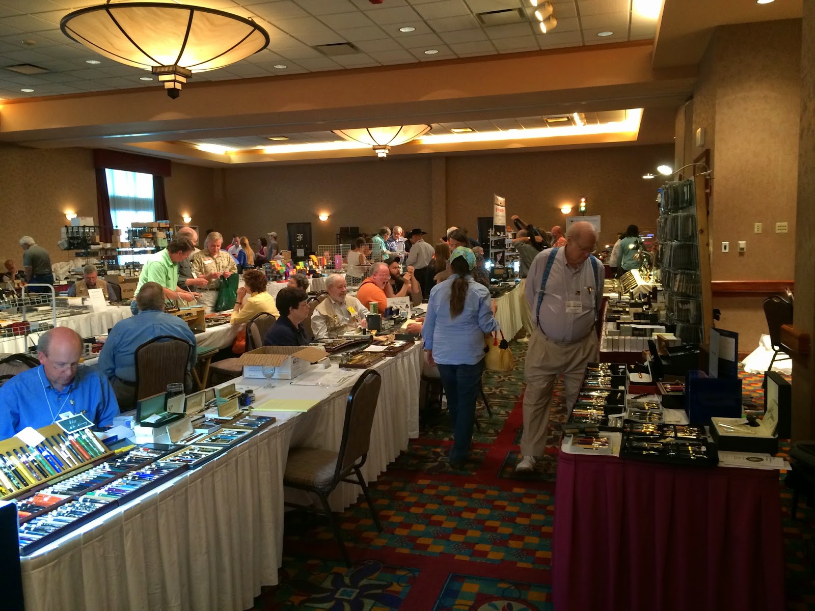
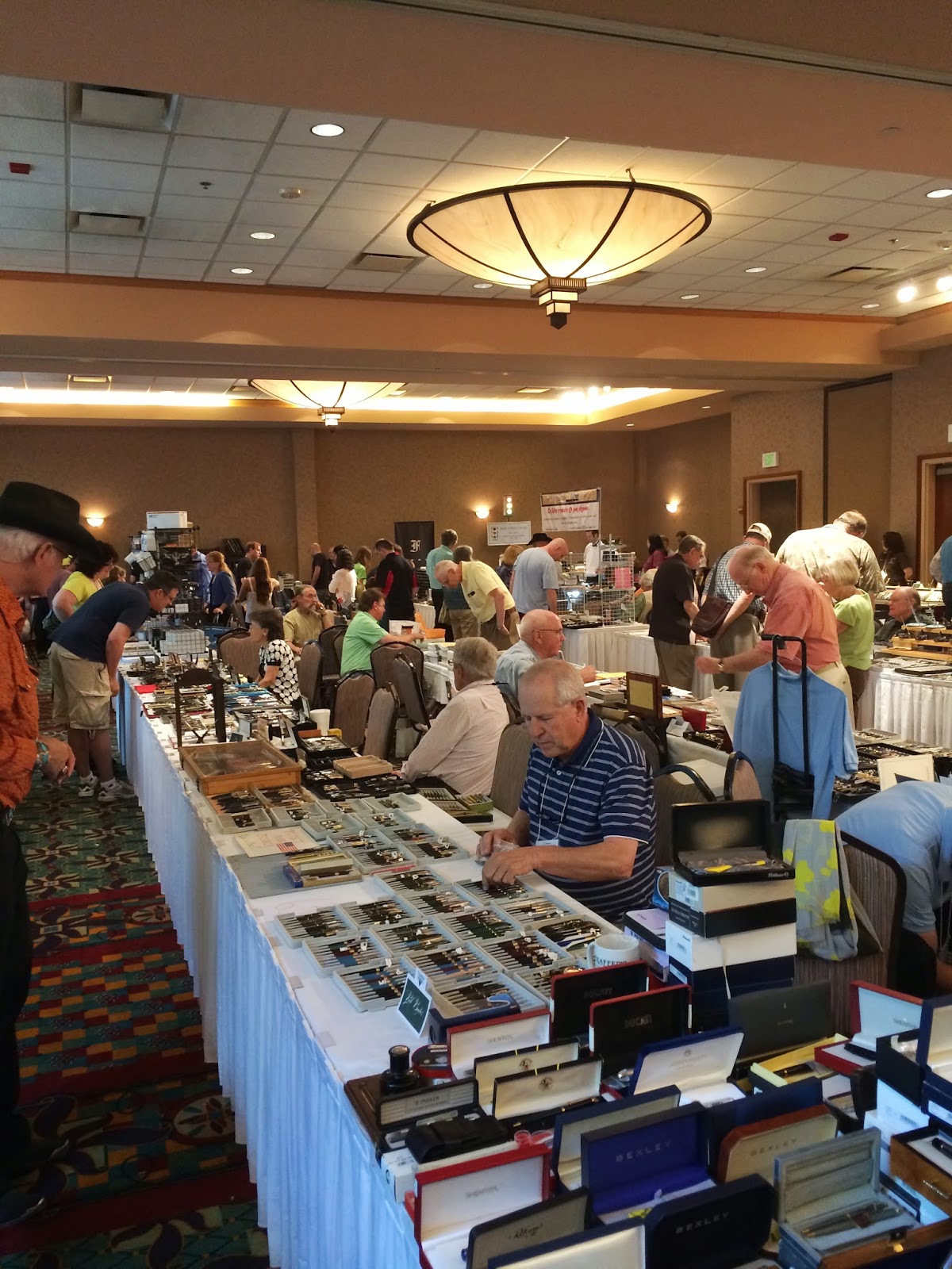
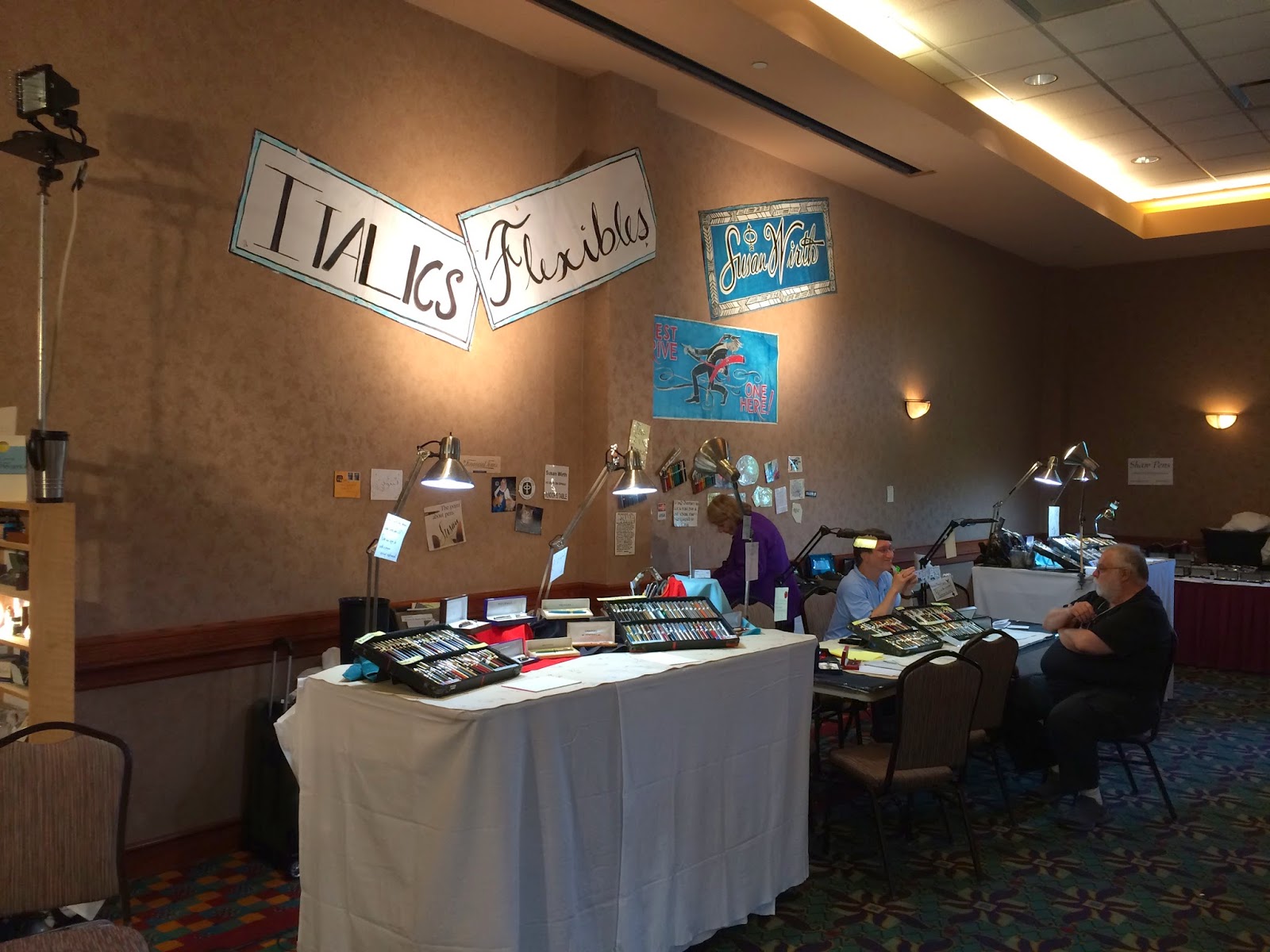
First, some pictures of the ballroom.


And here's Pendleton Brown. The first picture is what he looks like when you walk up to his table. Notice the tell-tale magnification goggles of the professional nib-smith.


And here's what happens when you say "Hey Pendleton!" He stops what he's doing, greets you warmly and gives you a fist-bump (or a hug, if you're Audrey). He's such a nice dude to talk to at these shows. He also grinds some really nice nibs. Those grinds have crazy names, but they're also really good.


The next few pictures are the work of Ryan Krusac. Every time I see Ryan at a show, he's got something new and cool. There are pens made from interesting woods, some with inlaid mother of pearl, and pens that bear Ryan's original artwork. He's super-talented, and y'all should check him out.

This one is my favorite. The combination of the dark wood cap and the lighter barrel is stunning. I was afraid to ask the price on this one. 


I learned a lot about Sheaffer vacs from this next fellow. Gerry Berg is rumored to be the authority on (and best fixer of) these pens. I found a pair of these desk pens in my Grandma's desk, and I've given him one of them to restore for me. They're (apparently) a bear to restore, and I don't think I could do it myself. I can't wait to get it back in working order.


These are some of the pens that Gerry has restored. 

Look at the stripes on these. Some of the best looking pens ever, I think.
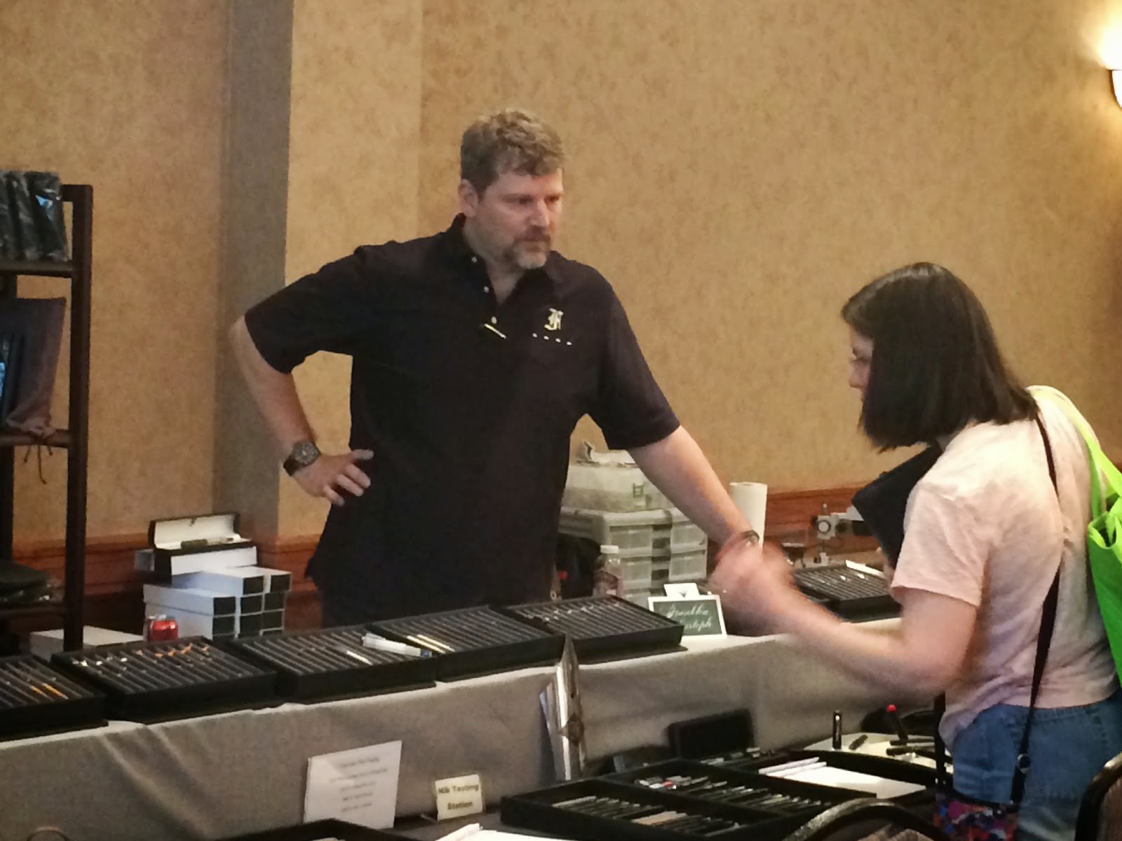
Franklin-Christoph make some of my favorite modern pens. Scott runs the joint, and he's local, so it's always cool to talk to him. We're always excited to see the new things that he has on the tables. I've heard rumors that there are new things in the pipe from Franklin-Christoph, so stay tuned. 

I'm pretty sure that the lady in this pic is Lori. I spent a while talking to Lori about pens and ink and such on Sunday. (If that's not you, Lori, then let me know!)

I told Scott to look mildly pleased, but also a little surly. It worked. 

Franklin-Christoph's tables cover most of a wall at the show. There are 4 trays of pens available to try out all of the nibs that they offer. LOTS of nibs. Go to a show and try them.
Next up: Rainey Horne of Van Horne Pens. He is another custom pen-maker who is always trying something new. Audrey and I talked to Rainey and his wife for a long time about all sorts of things. Teaching, small-block engine competitions, feathers, and pens. He's a really interesting dude. 


Needa hand-made pen for that cigar-lover in your life? Get one from Van Horn. When you screw the cap on, it looks just like a cigar. 

This line of pens actually has feathers worked into the acrylic. They're beautiful. 

Audrey really liked this one. It's made with a sort of Japanese paper in the lacquer, and there's something like a gold leaf worked into the paper. I didn't end up capturing the shimmer of that gold in these pictures, but I didn't know that until I'd gotten home. 


These pens are a custom acrylic. They pour the plastic themselves, so the designs are totally unique. 


I also met a reader at the show. That doesn't happen all that often, and Brandon is a good guy. We chatted for a while, and I just kept running into him all weekend. I hope to see him around.


There are some people that I didn't get pictures of, so I'll just have to mention them here. Jim from Franklin-Christoph didn't end up in any pictures that weren't hopelessly blurry (I was having some focus problems for some reason.) And, of course, the Andersons. Lisa and Brian are a highlight to every show we go to, and Audrey and I spend hours distracting them from their sales. If you want to get great pens at a good price while supporting a real mom & pop shop, then you need to look them up. They've recently opened up a brick&mortar in Appleton, WI and Audrey and I are going to visit them at the end of the month. It's going to be lots of fun to hang out with them without a pen show table between us.

So, what'd I get at the show? Inks, mostly. I don't buy all that many bottles of ink, but sometimes I love a sample enough that I have to have a bottle (as with 54th Mass, Salix, and Cacao). Other times, the ink is one I've not seen before (the two bottles of Duke), or limited edition with a color that I have to have (like Leonardo).


I also picked up a pen that I've been wanting for a long while. It's a Pilot Custom 74, and it's pretty darn sweet. I haven't had time to use it much, but it's very smooth and I really like the feel of the pen. I'll review it in the future when I've had some time with it.


Well, that's about it. 2014's Raleigh Pen Show. It was a great one, and I'm looking forward to the DC show in August.

Word.
Mike
Viewing all 528 articles
Browse latest View live