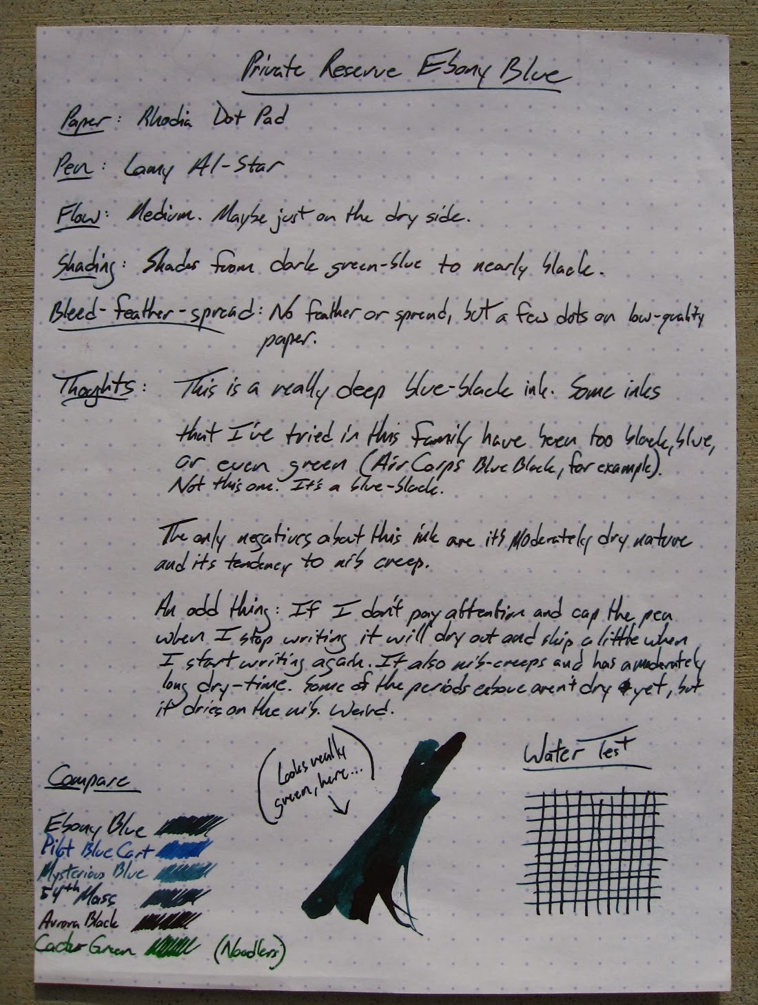
Diplomat is a German company that doesn't seem to have a very large distribution in the US. I've seen them at the Raleigh and DC shows, and it's always the same two reps. I sort of get the impression that they're it for the American side of Diplomat, though I don't know for sure. They're very nice folks, and they always remember us when we see them.
This is a pen that my wife bought at the DC Pen Show in 2012. I've been meaning to write a review of it ever since, but it's her pen and I don't use it very often. I think Diplomat pens sort of fly under the radar, and I'd like to see that change.
There are two pens that share this look.
The Esteem is a larger pen that seems to be aimed at the male crowd, and
the Traveller (sic) is the slim version of the pen. It certainly fits my wife's hand better than it does mine.
The LookThe Traveller comes in lots of colors and a couple of different finishes. Audrey went for a nice, soft green that they call "Lapis Spring Green." The finish is a satiny green that looks matte and feels smooth but not slippery. You can also get this in a lacquer finish and a silvery finish that look more shiny and, perhaps, more slippery.
The green body is broken up with a silver ring above the section, a silver clip, and a plastic finial (I think that's what the very top of the pen cap is called, anyway) with a Diplomat teardrop snowflake in it. The clips on Diplomats are distinctive. They're teardrop-shaped, and they have a small teardrop carved out of the middle. It's a classy little pen.
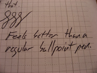
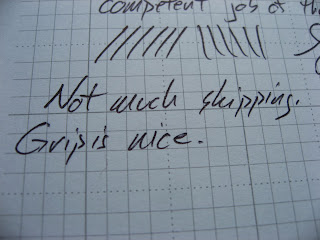
The section is black plastic with a very small step from the section to the barrel. There's a little flair at the end of the section that keeps your fingers from sliding down to the nib, but there's nothing much there for grip. My wife reports that she doesn't find the section slippery when she's writing with it for extended periods, though.
(The following pictures are a little rough. I took a million pictures of these nibs, sections and other pens, and every one is a little blurry. I've had it. I ain't takin' any more.)
The StatsThis section will be a little slim on hard data. The reason that I don't have many stats on this pen is that the website doesn't have them. Their site is functional, but not very detailed. As I mentioned above, I don't think they really have much in the way of staff, here in the States, and that is probably reflected in their web design.
The body and cap are both metal, and I'm guessing they're aluminium. The section is plastic. The cap snaps on pretty well (with an audible click) but I don't want to clip it to a placket. It's fairly secure, but I would worry a bit about the pen falling inside my shirt and making a mess. (I haven't had that happen, but I would worry about it.) Audrey prefers that her pen caps snap rather than screwing on, so this is a feature she likes.
The clip is metal, and quite stiff. The end of the clip turns up a bit, so I don't have a problem putting it on a pocket, and it's not going anywhere once it's on there.
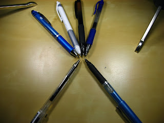
I don't have a scale of the sort that would be helpful, so I'll just say that the Traveller pen weighs in somewhere between the Lamy Vista (which is all-plastic) and the Pilot Metropolitan (which also has a metal body and a plastic section). It's slightly heavier than the Vista and a bit lighter than the Metropolitan.
The cap can be posted, and this gives the Traveller a slightly back-heavy feel. It's not uncomfortable for me to write like this. That's a good thing, because I have large hands and the slim and short nature of this pen means that I need it to be posted to use comfortably.
Capped length: 5 1/4"
Uncapped length: 4 5/8"
Posted length: Just a touch over 6"
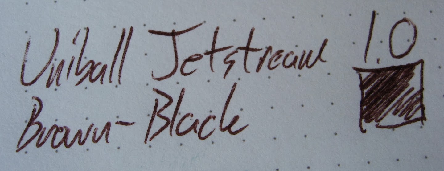
Nib: Steel. I've used medium and fine.
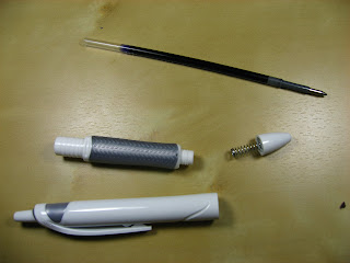
Filling Mechanism: cartridge or converter
Cost: $50-$65
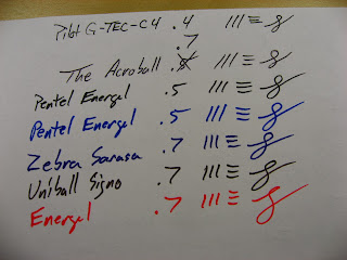
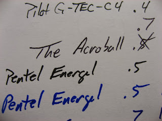
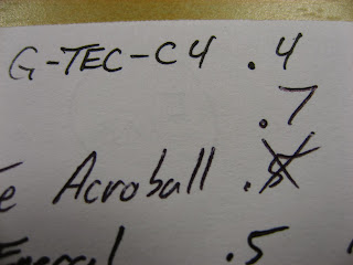
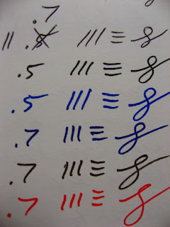
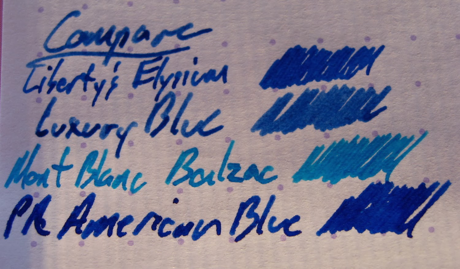
![]() |
| The Diplomat is in the middle, though the color is a little washed-out. |
The NibThe nib is steel, and it's stamped with the Diplomat symbol and "DIPLOMAT since 1922" in addition to the F (or M). It's a small nib, and I think I would have included fewer words on the nib. In fact, it would have been okay to leave the words off altogether, but the pen doesn't say Diplomat anywhere but the nib (and the converter) so I suppose it's okay that they include it here. The branding on the pen is pretty obvious (with the clip, finial, and nib), but it's not obnoxious.


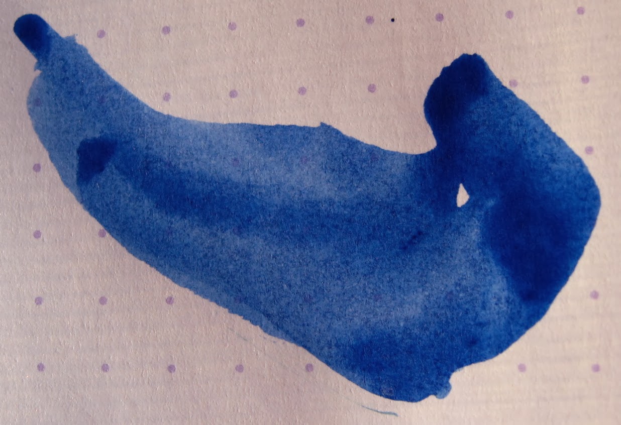
![]()
The nib in this picture is a fine nib, and I don't see that option on this pen on the website. They seem to only offer it in medium at this point. I bet that they'd switch one out with a fine nib, though, since they have them available on some other finishes. The pen actually came with a medium when we bought it, but there was an issue with the section cracking and when I emailed them to let them know, they offered to send me a whole new nib/feed/section kit. That was more than I'd asked for, and I asked them for a fine nib. Audrey usually likes the fine nibs better, but this time she prefers the medium.
The nib is steel, but there is some flex to it. It's not a lot of flex, but it's not a nail like most of the other German steel nibs I have. It writes quite well, and the feed has no problem keeping up even when I flex it a bit.
DurabilityWe had a small problem with this pen. The plastic section cracked from the bottom (near the nib), and that led to a fair amount of ink being on my fingers. It appears to have happened spontaneously. As I said above, the issue was sorted quickly.
The other issue is a small one. There's a little chipping developing in the paint at the bottom of the cap. The picture below is a super-close-up of the ring where the cap meets the barrel. The reps said that if the chips get any bigger, they'll replace it. It's pretty hard to see this issue, but I'm a little critical.
The Final WordAll of the women that I've had test this pen have liked it. My mother was just in town, and she liked it best of all the pens that I have. The section is really narrow, and the weight is light, but substantial. It is too light and too narrow for me, though I do see the appeal. I'd encourage the dudes out there to look up the Diplomat Esteem (or the new Aero, which is super cool).
The nibs that these come with are really pretty good. They're the best part of this pen, and I encourage people to test them out if they have the opportunity.
Whoops. I forgot to post the pictures of the packaging. It's worth seeing, so here they are.
I keep most of my packaging (so far, anyway), but this one is actually worth keeping, I think. The metal clamshell is classy and durable.