Quantcast
Channel: Inkdependence!
Viewing all 528 articles
Browse latest View live

Montblanc JFK Navy Blue (Limited Edition)

$
0
0

Okay, day 2 of the Montblanc Limited Edition Week!  This is another ink sent to me from Appelboom Pennen in Netherlands. 

The JFK ink is an interesting ink. It's a dark blue whose colors vary depending on the paper and pen that is used. In the Delta Unica I had it in, the wet medium nib made it look so deep that it was almost black until it dries. The trick is that  this ink needs some space to breathe, I think. It's a great dusky blue, but it needs some space to show off that character.

It's an understated ink, and I think that goes well with the JFK pen. I don't usually go for the limited edition Montblancs, but this one is cool. 


It's not wild, but it's quietly awesome. I think it actually looks much better in person, but this picture isn't bad. Anyway, on to the ink!

Written Review


Close Ups!


And now, to show it on a different paper, here it is on one of my Proper Pads from Anderson Pens.The paper on these is more absorbent than the Rhodia that I use for most of my reviews, so it shows off the color a bit more in this case.


Copy Paper Test


There's just a little bit of bleed through from the Delta Unica. That's a wet nib, though, so it's going to be more prone to bleeding through.

Compare

It's just a bit different to all the blue inks that I have in pens right now. I've seen it next to Montblanc's Blue Black, and it looks really close, but I don't have that one to compare it with.


Chromatography

Blue and grey make up a dark navy blue, huh? Interesting stuff.


Video Review


This ink is almost a blue black if you have a wet-ish nib, but it really shows off that dusky blue in a wide nib on moderately absorbent papers. 

I don't see this ink on the Appelboom website anymore, but perhaps they're just out of stock.  or at Anderson Pens for $19 in the 30ml bottle.

The ink for this review was provided free of charge, but no money has changed hands and my review reflects my own experience with this ink. All opinions are mine.

€14.80
€14.80
€14.80


Montblanc Daniel Defoe Palm Green

$
0
0
 A year or so ago I reviewed a weird grey/green called Swift Seaweed Green. It was a Montblanc Limited Edition that I just don't like all that much. I'm happy to report that this new Limited Edition green is far better.


This one is a dark green that reminds me of avocado. It's supposed to be a palm green, but I don't have much palm-tree experience. Either way, there's some great shading in this ink. This one doesn't masquerade as a black ink or anything, it's a green ink and that's rad.

Keep in mind that this is a limited-time ink, so get some while you can.


Written Review


Close-Ups!


This last one is taken in bright sunlight. 


Ink Comparisons

There are a couple more greens that I sampled next to these in the video, so check out the video for some bonus content. I had more greens on hand then I thought that I did. 


Copy Paper Test


You'll see a few spots of bleed in the bottom picture, but that's a very wet nib, so I'm not shocked. Bleed-through will be minimal in most pens.


Chromatography


Interesting how there are so often grey hues in green inks.


Video Review and Water Drop Test


It's note especially water resistant, but that's the only problem with this ink that I know of. It's a cool color, it behaves well in wildly different nibs, and it behaves well enough on copy paper. It's out of stock at Anderson Pens, but when it's in stock you can get it for $19 for 35ml. Check it out.


Pilot Acroball

$
0
0

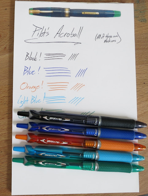
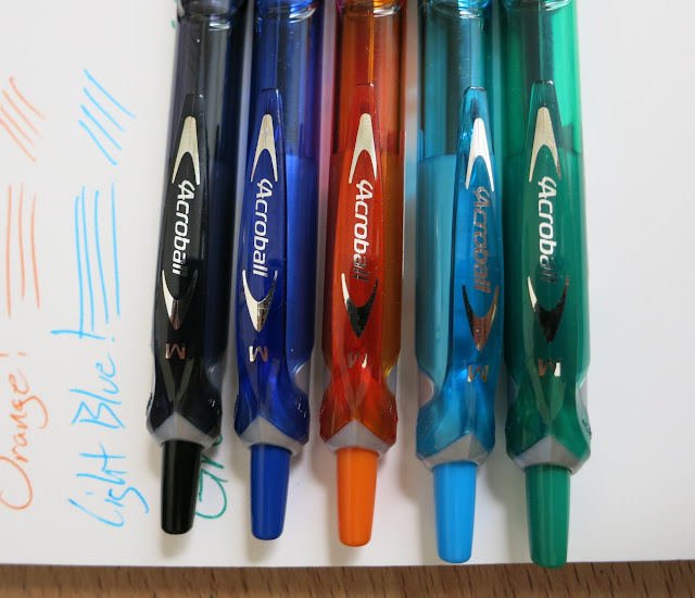
 Ready for some ballpoints? You know...those things that you sometimes use when a fountain pen just won't work, or those things that you had to other people when they ask to borrow a pen? Well, some of them are much better than others. I'm a fan of these Acroball pens. Originally I could only find them in black (Pure White was the model that I had), and then I found the translucent blue ones. Now, though, there are lots of ink colors

The grips are nice. The knock feels good. The ink is consistent and opaque. I don't know what's not to like. If you've got to write with a ballpoint, then these are darn good.


I think the styling is pretty solid. It's not got a lot of chrome colored accents. There isn't any faux carbon fiber.  It's just kinda clean and muted.


The clips are solid and they don't feel fragile at all. 


As I mentioned above, the grips on these pens are excellent. The contour and the grip pattern make for good control and comfortable writing. 


The Acroball pretty much has the same internals as other ballpoints. 


Writing Samples:


Uni-Ball Signo 307

$
0
0

So, I'm on a roll with non-fountain pens this week, and I have a TON of them, so I'm going to keep this rollin'.

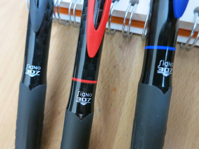
This is a new model of the popular Signo. Signo has been my favorite gel pen for a long time, and I'm sure everyone is familiar with the 207 pens. The new 307 line improves the older model with better writing on slick paper, less skipping (read that as "no skipping"), and more coherent color. These are a bit more expensive and a bit harder to find, but they're worth it. Actually, I think I've only seen these at Target stores. If I remember correctly, they were about $6 for the 3-pack. 


 Those lines are dark enough to be a rollerball or liquid ink pen, but they're not. They're gel.


 The body of this pen is basically like the 207, so if you like that form you'll be pleased. The barrel is opaque and there's a hint of a carbon fiber pattern in there.


So, yeah. Get some of these if you see them. They're great. I really hope they get more popular and Uniball keeps them around. They're a solid upgrade to a great gel pen.

Coming soon on the blog:

$
0
0
 Franklin-Christoph inks! Yep, they've got 6 new inks for me to show you, and they all look kinda rad. One blue/black, one blue/green, two browns, a green and a red? That's a solid collection of inks. There's no black here, but that's okay with me. There are plenty of excellent blacks out there, and I appreciate the more interesting colors that they've gone with. I don't have any idea who makes the ink for F-C, but they bottle it in-house.

Anyway, I'll have these coming up on the blog in the next week or so.  Enjoy the sneak-peek!


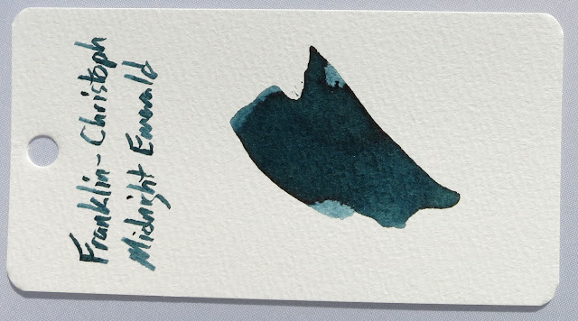
Franklin-Christoph Midnight Emerald

$
0
0
So, as promised, here's the first of the Franklin-Christoph inks. They had some a couple of years back, but this is an all new set. Different colors, different properties. They're still made by someone else and then bottled at Franklin-Christoph's facility in Wake Forest, NC. (That's a really cool place, and I hope to visit it again in the near future.)

 All of the inks in this set were provided by Franklin-Christoph for me to review. I always do my best not to allow that to sway my reviews, but it is something that I always have to put upfront in sponsored reviews.


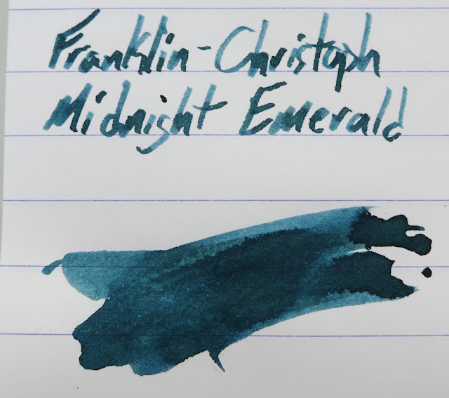
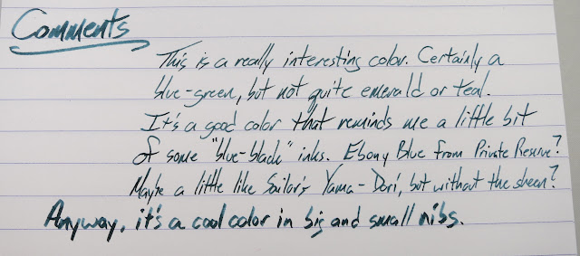
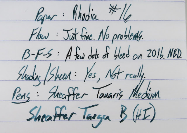
This first one is called Midnight Emerald, and it's a bit of an enigma. I can't really figure out what to call this color. It's definitely a green/blue of some kind, but I can't put a name on it. It's a cool ink, though, and it's not much like the other blue/greens that I've got in my collection. It reminds me of some inks in the blue-black range, but it's not quite like any of them. It's more green than inks like Noodler's Air Corps or Private Reserve's Ebony Blue. It's closest to Sailor's Yama-Dori, I think, but it lacks the sheen. It's its own color.


Written Review


Close-Ups


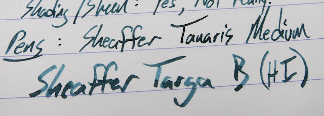
 That Targa has a nib like a paint brush, and this ink looks much different in that one than the tiny"medium" on the Tanaris. Both write smoothly with this ink.

Copy Paper Test


Mnemosyne Word Card


Ink Comparisons

Midnight emerald is much more green than the Air Corps below it, and it's lighter in tone than the Cadillac Green, as well (though that one is unusually dark in that pen)


Chromatography

 Lots of blue, right? There's certainly a band of green in there, though.

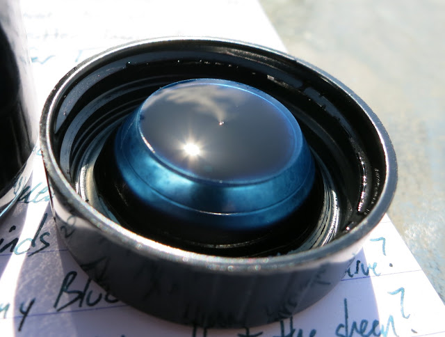
Bonus Bottle Pictures

This ink definitely looks more blue when it is wet than when it is dry. It looks like a straight-up blue when you look in the bottle, but it's certainly got green in its heritage, and that shows more when the ink dries. 


This might seem kinda silly, but I really like the plastic insert in the cap of these bottles. I don't know exactly what it does, but I like it. 


If there's one quibble about this ink, it's that the name on the bottle could be easier to read. It's legible here, but this is really bright sunlight, and it's harder to read inside a house. 


Video Review & Water Drop Test


You can find these inks at Franklin-Christoph's site for $12.50 in a 2oz glass bottle. Midnight Emerald is a unique ink, it behaves well, and it would be a good addition to your ink rotations.

This ink was provided to me for review purposes, but all of my reviews reflect only my own experiences and opinions of a product.

Franklin-Christoph Noir et Bleu

$
0
0

 This is the second of the six Franklin Christoph inks that I have to show. This one is a deep blue-black that verges on purple. It's far darker than most blue-blacks, I think, and it doesn't tend towards green like many of those do. This one verges on purple, if anything.

Like the rest of this set, these bottles were given to me free-of-charge for review purposes.

 Long story short, this is a cool ink that flows well, doesn't bleed significantly, and feels very smooth on the nib. Check it out below.
 Written Review


 Close-Ups

 This ink has a good amount of lubrication to it, and it's a little too slick for some nibs, I'd think. This new L-Tech is a really smooth nib (maybe too smooth), and it tends to skate a little on the Rhodia. I didn't have any problems with the Rotring, though, so I don't think it's the ink's fault. Both pens felt good on regular papers. Remember, an ink's performance often has as much to do with the paper and the nib as it does the ink itself.


Ink Comparisons

Just like the last ink, this one is unlike the others in my collection. I'm always happy to find an ink that is unique. What does this one remind you of?


Chromatography

See that purple? I think that's what makes it so dark and keeps 


Copy Paper Test

 There are a few spots of bleed there, but hardly anything to worry about.


Water Drop Test and Review Video


You can find these inks at Franklin-Christoph's site for $12.50 in a 2oz glass bottle. Noir et Bleu is a unique ink, it behaves well, and it would be a good buy for anyone looking for a serious blue-black. This one would not be out of place in any environment.

This ink was provided to me for review purposes, but all of my reviews reflect only my own experiences and opinions of a product.

Franklin-Christoph Emerald 357

$
0
0

My new favorite green ink? Yep. this one is a bright, rich green that works perfectly well even on copy paper.  I've not used it in a fine nib, yet, but it works really well in mediums and huges (the 1.9mm Christoph nib).

I realize that this isn't going to be the ink that everyone reaches for when they want to write something serious. Probably most offices won't encourage you to write in green. If you're writing notes, letters, shopping lists, etc then you're going to like this ink.

Written Review


Close-Ups


I thought that the different nibs deserved a bit more of a close-up. Even the two mediums are quite different. Really good shading, on these, though. 


The shot below is one that I took last year when we got Audrey a Franklin-Christoph with the music nib. I really liked the green ink they filled it with, and I'm nearly sure it was this one. It was in a cartridge, I think. 


Copy Paper Test


There's just a little bit of bleed on the music nib sample. That's pretty impressive for a nib that big. Well done, Emerald 357. 


Chromatography


I really like that blue at the top. It's kinda like the old Sailor Sky High. If this is an ink color then take my money!


Ink Comparisons
 
This one isn't really close to any of the "green" inks that I have loaded up. I don't have any true greens in pens right at the moment, but these three near-greens will have to suffice. 


Water Test and Video Review


You can find these inks at Franklin-Christoph's site for $12.50 in a 2oz glass bottle. Emerald 357 is a fresh green, it behaves well on copy paper, and it would be a good buy for anyone looking for an awesome green to brighten their day (or page, whatever). This is one that I would have bought if I didn't already have a bottle. So good.

This ink was provided to me for review purposes, but all of my reviews reflect only my own experiences and opinions of a product.

Do you like this blog? Want to help support it? Well! Head over to Patreon to find out how you can lend your support to this blog. 

Franklin-Christoph Red 187

$
0
0

 I'm finishing up the inks from Franklin-Christoph this week, and two of my favorites are in this set. Today's is one of those inks.

Red 187 is a straight-up red. It's not bloody and it's not dark or brooding or off-red. It's red. It flows well, a little on the wet side, and it doesn't behave badly on 20lb paper. That's an important feature in an ink I'm going to use for grading papers. Check out the review below.

Written Review


Ink Comparisons
I inked up a pen with Kaweco Red to compare to this ink because my mom called me up and asked me how they compared. Fortunately for her, I had one cartridge remaining of that color. In comparison, 187 is much more pure red than the Kaweco ink. That one is more pink when it goes down and more maroon when it dries. 187 is just a bright red. 


Chromatography


Copy Paper Test

 There is a little bit of bleed, but it's really minimal. Not enough bleed for me to worry about.


Compared to Kaweco Red on a Word Card
 

Water Drop Test and Video Review


You can find these inks at Franklin-Christoph's site for $12.50 in a 2oz glass bottle.Red 187 is great looking red, it behaves well on copy paper, and it's a good bet for anyone looking to add a red to their inventory. This is another ink that I would have bought if I didn't already have a bottle. So good.

This ink was provided to me for review purposes, but all of my reviews reflect only my own experiences and opinions of a product.

Do you like this blog? Want to help support it? Well! Head over to Patreon to find out how you can lend your support to this blog.

Franklin-Christoph Dark Chocolate

$
0
0

 Hey! A brown ink! I love brown inks. This is one of two brown inks in this collection, and it's a deep brown. Probably as deep a brown as you can get and still call it a brown. It's also smooth-flowing, a little wet, and it could pass as dark enough to use in pretty much any setting. Check it out below.

Written Review


Close-Ups


In the picture above you can see the difference between the super-wet Faber-Castell and the dry-running Metro. One of them is way more brown than the other, right? The look of this ink is really going to depend on your pen.  There's some detectable shading, though.


Word Card Swatches


It looks like it's a hair's breadth from having sheen, but it doesn't quite have it. 


Ink Comparisons


I was asked to show how this one stacked up to Sailor Doyou, so I did. Where Doyou is like a brownish grey, Dark Chocolate is definitely a brown. It's just very dark in a wet nib. 


Chromatography


Copy Paper Test


Water Drop Test


You can find these inks at Franklin-Christoph's site for $12.50 in a 2oz glass bottle. Dark Chocolate is a super-dark brown, it behaves decently well on copy paper, and it's a good bet for anyone who wants a little personality in their ink but needs to remain professional. This isn't my favorite brown in the collection, but it's a close race. Stay tuned for my favorite brown tomorrow.

This ink was provided to me for review purposes, but all of my reviews reflect only my own experiences and opinions of a product.

Do you like this blog? Want to help support it? Well! Head over to Patreon to find out how you can lend your support to this blog.

Franklin-Christoph Brown 732

$
0
0

Well, there it is. That's the last of the Franklin-Christoph inks that I have to review. (Though I hear that there are a couple more coming out in the near future.) This is one of my favorites. I love brown inks, and this is right up my alley. You'll notice that the swatch is different than it usually is. I had actually forgotten to swatch it when I went outside to take pictures, so I did it with a finger. I've probably got that brown mark on my finger in the last three videos on the site, and that's the price of being a fountain pen ink reviewer.

Anyway, this is a fantastic brown ink. See below.

Written Review!


Close-Ups!


Word Card Shots!

I obviously took this picture when the smear was still wet. It looked so good that I couldn't not take a picture of it. Also, Katy Purry is in the background. She's slightly less fuzzy in real life.
Add caption

Compare!

This is clearly the brownest of the 4 browns that I have in a pen right now.


Chromatography!


Copy Paper!

There's very slight bleed from the broad italic nib, but that's not totally unexpected.


Water Test and Video Review!


You can find these inks at Franklin-Christoph's site for $12.50 in a 2oz glass bottle. Brown 732 sounds like the call for a football play, but it's actually a really great brown ink. Buy this ink.

This ink was provided to me for review purposes, but all of my reviews reflect only my own experiences and opinions of a product.

Do you like this blog? Want to help support it? Well! Head over to Patreon to find out how you can lend your support to this blog.

The Uni-ball Air Rollerball

$
0
0

This is a pen that came out around the same time as the Signo 307 pens that I talked about here.  It's a rollerball, but it claims to have the same kind of "Super Ink" as the 207 and 307 pens. They only appear to come in three-packs, and they're a bit expensive (probably just because they're new), but I thought it was a good idea to try them out.


I think it's a nice looking pen. It's light and comfortable to hold. The pattern is an interesting geometric that isn't distracting or crazy-looking.  It won't be out of place in a serious setting.


I say that it only sorta writes at any angle because there's a noticeable drop-off in ink flow. That's kind of a good thing (see below), but it might be a problem if the ink supply gets low. I definitely haven't used this pen long enough to know what happens when the ink gets low. 


The tip of this pen is actually difficult to see. It's  black on black.


This bleeding is the only real problem. It comes through this Anderson Pens Proper Pad paper, and that's fairly heavy stuff. It's not bulletproof like the Rhodia paper I usually use, but it is closer to copy paper (which it bleeds through like a boss).


I'd say you should only really use these pens on things you'd want to write on one side of. 
Post-It notes are a prime example. Despite the bleed, there isn't really any feathering, so it looks sharp on the page even when it does bleed through. Checks, cards, stationary, envelopes. All sorts of things only get used on one side, so there are plenty of uses for the pens. The Super Ink makes this one suitable for those things.


I went ahead and made a video for this pen, and I test the water-proofness of the ink in there, so check it out. Also, my face is in this one.


You can find these at the sorts of places that you will find non-fountain pens. Not all of them, though. I've only really seen them in Target (maybe Wal-Mart?), and they were going for about $6. YMMV, though.

If you'd like to help me out with the blog expenses, head over to Patreon to find out how you can contribute. 

Word.
Mike

Pelikan Edelstein Amethyst

$
0
0

I almost forgot about this ink! It's one that Appelboom Pennen sent me back when I reviewed the Montblanc Pink and JFK inks. I put it off when I did the others because these Ink of the Year inks are generally more available than the Montblanc Limited Editions. They are a bit limited, though, so if you like what you see, pick up a bottle of this ink.

Look, I don't really like purple inks most of the time. I might be coming around on them, though. This ink is really solid. It's a deep, rich purple that flows super well and behaves itself on copy papers. It's purple enough to be interesting, but it's dark enough to be subtle. I bet you could get away with it in most settings as long as you use a slightly wet nib.

Check out the review below.

Written Review


Close-Ups!


Ink Comparisons

I don't have any other purples in pens right now, but that Akkerman #4 goes down pretty purple. The Amethyst is much more purple in this picture. This was written with the TWSBI 540's dry-ish fine nib, so more of the purple is showing up.


Chromatography


Copy Paper Test

There is some bleed with a wet, broad nib, but not a whole lot.

The Flacon
Pelikan calls this bottle a "flacon". That's old French for "flagon" and I like that usage. I don't know if this is a legitimate flagon, but it sure is a nice bottle! 


Video Review and Water Drop Test


Get this ink in cartridges, if you like. They come in a pretty rad metal case.

There's also a matching Pelikan M205 in Amethyst coming out soon.


Noodler's Air Corp Blue Black

$
0
0

This is an ink that I reviewed a long time ago. I think it was actually one of my first. I really don't want that to be the only time that I visit this ink, though, so I'm re-reviewing it now in my current style.

This one is called Blue Black, but it's really a green black to my eye. The shading is great, and it's got a little bit of an iridescence, but I wouldn't really call it a sheen. In a wet enough pen, this will look like a black that shades over to green in the thin spots.

The interesting color, smooth flow, and excellent behavior on copy paper make it one of my go-to inks over the last few years. Definitely check this one out.

Written Review

Apparently I forgot to fill in a couple of my blanks before I took these pictures. I didn't notice that until I took the video, so I filled them in live on the air. Exciting, right? Anyway, it shades, it doesn't bleed/feather/spread (unless you're using a big nib, then there's a little bleed), and there's no real sheen to speak of.


Close-Ups


Color Comparisons

Fortunately I'm addicted to blue, so I've got several to compare this one against. It's not quite like any of these.


Chromatography


Copy Paper Test


The Bottle


Water Test and Video Review


As I said, this is one of my go-to inks. I really like it. Check it out at Anderson Pens for $12.50 in a 3oz bottle (filled to the top, most likely) or in a sample.

No disclaimer on this one. I bought it ages ago, and I'll buy more when this one runs out.

Montblanc's Blue Hour Limited Edition

$
0
0

Another Montblanc Limited Edition? Yep! This one is a stand-out, too.  It's a blue that's supposed to remind us of twilight, and I suppose that it does. I do know that this is an excellent ink with a bit of shading and a bit of sheen (if you lay it down thickly enough).

One interesting thing about this ink is how different it can look from different nibs. All of these nibs were mediums, but they have different flows, and that's reflected in the hue of the ink.

Check it out below.

Written Review


Close-Ups


 I couldn't resist putting up a couple more images of this one. It's too good.


Packaging

A cool box that surrounds a pretty cool bottle. A bottle, I might add, that comes with a little, plastic hat. 


Copy Paper Test
 And it doesn't bleed on copy papers! Hooray! Even with the wet Ondoro nib, it stays on its side of the paper.


Chromatography

These are both the same ink. The top was laid down with the Ondoro, and the bottom with the Esterbrook. I was actually concerned that I'd used some other ink in the Ondoro, but I didn't. It's Blue Hour. It's just a lot more Blue Hour.

Comparisons

Since I had these cards handy, I decided to do some side-by-sides. First, the last two LE inks to come out. I like Blue Hour a lot more. JFK is a fine ink, but it doesn't have a lot of personality.


Next, a few inks that are in the same color range. I think Blue Hour is closer to Yama-Dori, but they're not exactly twins. 


Water Drop Test and Video Review


Whoops. I said that this ink is $18 per bottle, but it's actually $16. This ink is thoroughly good, and I recommend a bottle if you can find one. It's a new LE ink though, so it sells like hot cakes, and you shouldn't wait to get a bottle.

If you enjoy the blog, then (maybe) think about contributing to the blog. It's donations like these that keep the blog ad-free. Check out Patreon to find out how to become a patron of the blog.

A visit to Anderson Pens in WI!

$
0
0
Hey folks!

I know, I've been gone for a week or so. We were on a road-trip with the family that went from NC to TN to WI to OH and then back through TN to NC. It was a whirlwind tour, but we got to see some of my wife's family in those states and we got to hang out at the Anderson Pens store in Appleton, WI.

Wisconsin: A great place to visit. In the summer.
 
It's a pretty great store, and it's very cool that we've gotten to visit a couple of times. Aside from sponsoring (enabling) my ink-dependence, Brian and Lisa have become our good friends.

Audrey took most of these pictures for me, as I was too busy jaw-bonin' to take pictures. 

These cases are full of Pilots, Deltas, Cross (including the new Peerless with Sailor nibs) and probably some other things I'm forgetting. There's also a Sailor case in the background (the reddish one) and cases of Sheaffers, Lamy, TWSBI, Retro51, all sorts of things.


The other wall of the store is covered with six-foot shelves of ink. I don't think that anyone carries more ink than they do, but I've never seen a wall like this before. It keeps going off the left-side of the picture, but you get the idea. It would take a panoramic to capture the whole thing. 


These are the new Hugo Boss pens, and some of them look pretty promising. They're not super-expensive, but they're in the "fancy groomsman gift" price range. 


There are a couple of these pens (you can see them below) which remind me of the Porche Designs pens. They're a sort of woven metal barrel that comes off looking more expensive than their price tag. I haven't tried any of  them, but I'm interested to hear from those who have.


 There are lots of VPs out there, but that red bamboo one is pretty special, I think. I'm tempted to get one, but the limited-edition price is pretty high.


You like Akkerman inks? Well, here they are! The Andersons aren't allowed (by Akkerman) to advertise these online, but if you give the store a call they can tell you what they have and they can mail them out or add them to an order for you. I haven't used hardly any of them, but the ones I've used are solid inks. Also...that bottle...whoa. 


This is the paper corner, and it was hard to resist buying one of everything. I need to use up some of my paper before I go on a paper-bender, though. Will power, Mike. Will. Power.


Speaking of cool paper, these Paperblanks notebooks are really nice. The covers are really ornate and the paper inside is quite good. At least, it seems good from a casual examination. I can usually tell by feel if the paper will be good for fountain pens, and this feels good. 


I meant to pick up some Field Notes, but I kinda forgot. Maybe I'll get some at the DC show.  That Verge De France paper is really good, by the way. I use it when I want to be fancy.


Lastly, Tomoe River is coming to the store soon. I've heard lots about this fantastic Japanese Paper, but it's another thing I haven't had a chance to try out just yet.

Lisa is less blurry in real life. I don't know why I couldn't focus this one. I totally took it, though. Not Audrey.
Annnnd...I came home with a boat-load of ink samples. I think some more might have been added to this pile before we left, but it's a LOT of inks. Pretty much everything from Akkerman, Montblanc, Iroshizuku and a smattering of other things that I haven't tried out yet.  So, what's coming to the blog? EVERYTHING. :)


Audrey took this action-shot where I look extra-wide. I blame Culvers and Chesters and brats all through Wisconsin. I may have gained 10 pounds, but that state knows how to eat!


And then I looked over and ruined an otherwise great candid shot. You can see Dave in the background there. Such a nice guy, Dave. There's just an aura of calm around him, somehow. I don't know how he does it. 


Anyway, those were the only pictures we got from that visit. We should have taken more, but Audrey is the only reason that there were any at all. I don't know what I'd do without that woman. She's the best. Also, if you like nailpolish, go and check out her blog: RightOnTheNail. She's been at it for years, and she's got the best nail pictures around (if I say so myself).

Lamy Blue (cartridge)

$
0
0
Lamy Blue

This is an ink that most everyone has, I bet, but I don't know if most really use it.  I know I hadn't used it until just recently. We ended up with one more Lamy than we had converter, so I popped in the cart that came with the pen. It's actually a pretty nice blue. It's not blowing anyone's doors off, but it does the job.

The color is nice enough, and there's a bit of a sheen to it if you lay it down heavily.  My Lamy pens tend to be just a bit on the dry side, so I don't see this in the writing. It behaves itself on common papers, and actually looks a bit better than it does on Rhodia. I think the somewhat thin nature of this ink makes it look anemic on Rhodia whereas it soaks in more to the regular papers and looks more saturated.

If you're a cartridge user, this one is just fine. I like the turquoise better, but the Blue is pretty good.

Written Review
Lamy Blue

Close-Ups!

Lamy Blue

Lamy Blue

Lamy Blue

Lamy Blue

Lamy Blue

Compare Colors

Lamy Blue

If these, the Lamy ink is the weakest. The others are certainly darker, with the Montblanc being barely a blue at all (once it dries). 

Lamy Blue

Copy Paper Test

Lamy Blue

If nothing else, the Lamy ink is very well behaved on copy paper. 

Lamy Blue

Chromatography

Lamy Blue

Lamy Blue

Water Drop Test and Review Video


So, in the final analysis, the Blue from Lamy is a perfectly fine ink, if not a super-impressive one. It gets the job done much better than most other included cartridges, I think. I'm generallynot all that excited by the cartridges that come with pens, but these are totally usable.

Find it in bottles, cartridges, and samples at lots of stores including Anderson Pens. (The Andersons didn't give me this ink, but they're friends of the site, so tell 'em I said "Hi!" if you order from them!)

Akkerman #04 Nassaus Blauw

$
0
0
Akkerman #04 Nassaus Blauw

The first of many Akkerman inks!

I was given this sample a really long time ago by Celeste from our Triangle Pen Club, and I'm only just now getting around to using it. Thanks for the sample, Celeste!

I'm only just getting started with this brand, and I have to say that the three of these inks that I've used so far are pretty great. This one is a color that I shouldn't like as much as I do. It does down on the page a little on the purple side. It dries to a dark blue or blue/black, though, and that's totally my jam.

 This ink is also really smooth. I just enjoy the way that it feels on the nib. It helps that this nib is extremely good, but this is an extra-good feeling ink.

Anywho, this isn't going to be my favorite of the Akkerman blue inks (Shocking Blue is coming up soon...), but it's a darn good one to add to your collection.

Now, a note about the color in these pictures. I could not make it reproduce the color faithfully. I just couldn't. I tried all sorts of settings and lighting set-ups, and it always comes out looking brighter in pictures than it should be. This ink is dark. It's a purple-ish blue/black. It's not a striking blue that you are seeing here. Honestly, this is the first time I can remember having this issue, and it plagued both my camera and my iPhone. It looks closest to real on the video, so check it out there.


Written Review

Akkerman #04 Nassaus Blauw

Close-Ups

Akkerman #04 Nassaus Blauw

Akkerman #04 Nassaus Blauw

Akkerman #04 Nassaus Blauw
Of course, it is weird that this doesn't look b/b, but you're going to have to take my word for it.

Akkerman #04 Nassaus Blauw

Wet/Dry

Akkerman #04 Nassaus Blauw
This one looked cool wet, and this is pretty close to the actual color. I took this one with an iPhone.

Akkerman #04 Nassaus Blauw
You can see some of the sheen in this picture. You won't see a lot of that, though, and the color is still wrong. Check out the video for a more color-correct image.

Compare!

Akkerman #04 Nassaus Blauw
You can tell that it looks more purple than the Visconti Blue beneath it, so take that as a guide for the actual color.

Copy Paper Test

Akkerman #04 Nassaus Blauw

Akkerman #04 Nassaus Blauw

Chromatography

Ah, there's that purple that was hiding in there. It's all at the bottom of the chromatography. 

Akkerman #04 Nassaus Blauw

Video Review and Water Drop Test


This ink is a little expensive, and it can be hard to find. Anderson Pens has it the cheapest in the US, though, so give them a call or send them an email to find out about which ones they have and costs and such.

It's a darn good ink, and it's in a very cool bottle (that you can only get from one source), so I might have to pick up a couple of bottles at the DC show.

Franklin-Christoph Model 02 Intrinsic

$
0
0

I've got a couple of Franklin-Christoph pens to show you this week. These are my wife's pens, so I hadn't had all that much time to use them. She left them with me this last week, though, so I've had the chance to play with them. As always, Franklin-Christoph has done a really good job with this one.

Audrey got this 02 Intrinsic at the DC Pen Show last year, and she's always had this Christoph music nib in there. I've always meant to review this pen, but I just haven't gotten around to it.

Let's take a look at this interesting pen.

This shot is kinda artsy, and I like it. The cartridge in there is the one from a Pelikano. Its mouth cracked, though, so I switched it to a converter before I took the rest of the pictures.
One of the most distinctive things about this pen is its shape. As you can see below, the end of this pen is much skinnier than the cap. It's got a choke that happens around the place that the converter's silver band can be seen through the body. This feels nice in the hand, and it allows you to post the cap very deeply, keeping the weight in your hand and preventing it from feeling back-heavy when posted. My Panther 40 has this sort of shape (vaguely) and it's not something you see all that often.


This pen comes in a variety of colors, and you'll often see these pens as frosted "ice" eyedropper pens filled with colorful inks. I'm not an eyedropper fan, so I haven't done that to this one. They do look nice that way, though.


One thing about these translucent pens is that you can see any ink spots through the cap and body. I bet that these would rinse out of there, but I left them in as a demonstration. 


Another thing that I really like about this pen is that the threads are at the end of the section. You won't notice them when you're writing with this pen unless you hold right at the end of the section. I tend to hold really low, but it hasn't bothered me. Also, notice that the threads are really wide, so it doesn't take many turns to remove the cap. At the same time, the cap always feels secure to me. This is a feature that will be popular with folks that cap and uncap their pens a lot.

Also, check out that nib. It's huge (1.9mm!), but it's thoroughly good.

The picture below shows the pen with the barrel removed from the section. The pen is inked, so I didn't take off the converter, but the inside of that section looks like every other section. These take standard cartridges and converters and they can be eyedropper pens if you're into that sort of thing.


In the Hand


I've got large hands, and this pen fits me nicely. It's fairly light, but it isn't a feather-weight that feels like it's going to fly out of your hand. I've photographed this pen posted because there's really no reason not to post it. It doesn't unbalance the pen, it doesn't make it too wide at the top, and the cap won't damage the barrel of the pen.


Compared to Other Pens


From left to right: TWSBI 700, Pilot Custom 74, Franklin-Christoph 02, Franklin-Christoph 20, Lamy Al-Star.

As you can see in these pictures, the 02 is a full-sized pen on par with the TWSBI 700, but you can post the 02 comfortably, and I think it's more comfortable to write with because of the thread placement.


Oh, hey, nibs.


End-caps.


Here you can see the threads on the 02. They're big, flat, and right at the end of the section. That's a great place for threads.


Video Review


These pens run around $165 (+$20 for the Masuyama nibs), and that's relatively expensive. These are all hand made and impeccably finished, and I don't mind a premium to support that kind of work. You can only find them at Franklin-Christoph's website.


Franklin-Christoph Model 20 Marietta

$
0
0

 As soon as I saw this pen, I knew my wife was going to have to have one of them. She uses her pens for notes, and that means sporadic cappings and uncappings. This slip-cap pen is kinda perfect for her uses. This was the only one that they had in this Tiger Red acrylic, and she snapped it up right away. At the time, this was a 1-of-a-kind pen. This pattern is going to be released at the DC show, though, so you may be able to get your hands on one soon.


 Simple lines, clean engraving, and just a couple of subdued embellishments at each end make it a stylish pen. 

The next couple of pics really show the form and color/pattern of this pen. It's very dark, but the pattern is fairly visible up close. We've got some really bright sunlight to bring it out in this picture, but it's more muted in general.


The 20 is a cartridge/converter pen that can also be an eyedropper if that's what you're into. There are lots of threads on the section, and that's great for eyedroppers, I'd think. (I don't do eyedroppers, but that's my guess.)


Comparisons


Like the 02, the 20 can be posted comfortably. That post is secure enough that I don't have a worry about the cap coming off accidentally. There's no click, but it feels solid and it works.

Size-wize, it's in the same class as the Pilot Custom 74 and the Lamy Al-Star. The section is a little narrow, but it's very comfortable in my large hand and even better for my wife's smaller hand.


Details!


Nib

 I'm fairly sure that this is a #6 nib (though I'll ask Scott about it when I see him this weekend), but it's set back into the section so it looks smaller than it is. That's great because it keeps the nib from looking huge in this relatively small pen. I want to see more of this.


There's the inside of the cap. Nothing there. It fits securely on both the section and the barrel, but there aren't any threads or inner caps. 


Video Review

So, I have tried to make this video (and the one for the 02) for a few days now and I just couldn't get the lighting right. I finally balanced the laptop on my foot and faced my window to get some light. It was precarious and the angle gives me extra chins, but the pen looks better than it would be otherwise.


The 20 is a great pen, and I totally endorse it. It runs $165 (as most FC pens do), but the crafts-person-ship is excellent and the design is on point. Check this one out if you get a chance.

Also, I hear that there will be a pocket version of this pen at the DC show in small quantities. I'll have pictures (at least) for you when I get back from the show.
Viewing all 528 articles
Browse latest View live