Quantcast
Channel: Inkdependence!
Viewing all 528 articles
Browse latest View live

Graf von Faber-Castell Moss Green

$
0
0
This sample was provided for review by Anderson Pens.

Let's see some more Faber-Castell goodness. This time, we've got Moss Green, and it's a dark moss. This rich green is worth trying out if you're looking for a really dark green. In fact, this ink is probably dark enough that you could use it in a fairly formal setting. The green will peek through, but not all that much. 


See what I mean about the green peaking through? I really like the effect. 


Copy Paper Test:


This is another of the inks that is called "partially document proofed." It certainly behaves well on copy paper. No bleed, feather, or spread. These are solid inks.


Chromatography:

The chromatography on this ink is oddly short. The color just didn't travel all that much, though I did it the same as I always do. It's a nice variety of blues with a top note of bright green.


This is a totally usable green. I like that it's dark and that it works really well on cheaper paper. 


Check this ink out at Anderson Pens where it sells for $30 per 75ml bottle.  (3ml samples are also available.)


Video Review and Water Drop Test


Partially document proofed? Yeah, this one might be more partially than some of the others. More of this ink came off of the page than with their Carbon Black or the Stone Grey. I've heard that it's difficult to make a water proof green, though, so I'm not surprised. Still, most of it sticks to the page.


The ink for this review was provided free of charge by Anderson Pens. The review was all mine, however.

Graf von Faber-Castell Garnet

$
0
0
This ink sample was provided for review by Anderson Pens. 

This is one of the two Faber-Castell inks that I'm not really sold on. It's a fine ink, but it's not special. The color is something like a light maroon. It brings Sailor's Oku-Yama to mind, but it's too flat. As you see in the smear above, it's got a matte sort of texture to it.


 These two pictures are taken in different lights. The above picture was taken indoors under daylight fluorescents and the below was taken by indirect morning sun through a window. (Sounds romantic, right?)


I tried this ink out in my Lamy's 1.1 nib, and it wasn't very satisfying. It stayed in that pen for a long time because I didn't hate the color, but it was just sort of dry and...lame. There was no spark with this ink. It didn't behave as well as the "partially document-proofed" inks in the line (though I'm out of town and I've lost the regular-paper pictures, so you'll just have to trust me on that one for a couple of days).


BEHOLD THE CLOSEUPS!


I sorta wish that I had more reds inked up to compare to this one. Check out some of the other red reviews I've posted to compare with this one.


In the end, this ink just doesn't hold up. It's not special, and it doesn't perform all that well. Stick to the other ones, if you ask me. There are plenty of other reds and maroons out there that are better than this one. The pen I had it in is a little on the dry side, but it only performed marginally better in the wet nib of my Skyliner 50. Some sheen or higher saturation might have saved this one.

Chromatography!

This one is kinda interesting. It looks like it has a blue-grey base that sticks around after the reds, pinks, and oranges rise to the top of the paper.


Check this ink out at Anderson Pens where it sells for $30 per 75ml bottle.  (3ml samples are also available.)

Video Review and Water Drop Test


Spoilers below!


The ink for this review was provided free of charge by Anderson Pens. The review was all mine, however.

Delta's Limited Edition Unica for Anderson Pens

$
0
0

This is my first foray into the Delta brand, and I think I'll be back. In fact, it's my first Italian pen of any kind. You might be familiar with the Unica in its other colors (blue, white, and hot pink). I think the white one is the best looking white pen around, and I probably would have gotten one if this red model didn't exist. Just look at that acrylic. Awesome.

Stats

Body: Acrylic Resin (translucent).
Nib: Steel in fine, medium, and broad.
Hardware: Chrome
Length: 5 1/4" (capped) 4 3/4" (uncapped) and 6" (posted).
Filling System: Cartridge/Converter (both of these are included)
Price: $85


Looks

I think this is the best looking of the available colors. The red acrylic looks really deep and there's a lot going on inside that resin. There's really minimal branding on the pen, with just an engraved "DELTA ITALY" on the bottom of the cap and a subtle "AP" on the back of the cap with a number. Mine is 37/50. That's right, there are only 50 of these things being made. It's a limited edtion, not a special edition like the Franklin-Christoph pens that they have (or are coming soon). I actually didn't notice the brand's name on the pen until this morning.

There's minimal hardware to distract from the acrylic, and I like that aesthetic. I'm a fan of really funky design but, sometimes, you don't want the distractions of facets and hardware. This pen has a chrome clip with a little roller at the bottom. It's a great feature that i wish more pens would have. Secure in the pocket, but easy to clip and remove. The only other hardware on the pen is a chrome ring that sits below the edge of the cap.

Please excuse the finger nail in the above picture. I was cleaning brown ink out of another pen, and my nail is a little stained. The perils of pen maintenance and macro photography. 

The top of the pen is unadorned, aside from my finger prints. 

The section unscrews right below the threads, so it never unscrews the pen when you're trying to remove the cap. The fit/finish is so tight that you don't see the seam, either. 

The nib would be a little busy if it weren't for the satin finish. As it is, I think it looks rad. You can also see the black of the feed and the silver of the threads in this picture if you look at the very bottom. The acrylic is translucent if you look closely. 

Dat acrylic, tho....  Also, a very functional clip. 

I wanted to show the sunlight through the cap, and I think it came out nicely. Almost blinded myself. Don't look at the sun, kids. 

I really wanted #42 of this pen, but Brian and Lisa didn't have it at the table. Oh well. If you've got #42, then you're a lucky duck and I envy you. Wanna trade caps?

The picture below is the break-down pic. As you can see, the threads inside are metal, and that's going to stop this from being an eye-dropper, though that doesn't bother me at all. The threads on the section are smooth and not sharp on your fingers, and the metal threads inside are really well fitted so that they don't scrape or grind as you unscrew the pen. Good fit/finish.


Comparisons

The nib stands out in my collection. The only other nibs I've seen with this finish have been titanium, and I don't have any of those just yet. One day. 

Capped, this pen is on the small side of average. Perfect shirt-pocket size.


Uncapped, the pen is the same length as a Skyliner or a Parker 51. It's a little longer than the TWSBI 540, and shorter than a Lamy Vista. The weight is really low, though, due to the material of the body.


 It's comfortable for my large hands either posted or not. The cap doesn't really add any weight, so it's nothing to worry about. 

 Side-view comparison of the Unica and a Lamy Vista.

Writing experience and sample:

I really like writing with this pen. The fine nib was a little too fine, but the medium is jus tright for me. It's on the finer side of medium, and it's very smooth and slightly wet. I'm using the limited edition Delta Skeleton ink that they were giving away at the DC show, and I really like it in this pen. It starts every time and doesn't seem to dry out at all. The nib is steel, and it's not particularly stiff. There's some nice give to it, though I wouldn't call it flex.


I'm a big fan of this pen, and I urge you to jump on one if you have any inclination to do so. It's a limited edition, so I don't know how many are left, but all three nibs seem to be in stock at press-time. The only draw back is that this pen is in the high-medium range for many people. It does come with a converter, though, and the LE pen is only $9 more than the regular Unica which lacks a converter. I think $85 for this pen is a good price point for a LE pen of this quality.


I bought this pen, and was not compensated for the review. 

Graf von Faber-Castell Cobalt Blue

$
0
0
This ink sample was provided, free of charge, by Anderson Pens.

Only a couple more of these Graf von Faber-Castell inks left to show, and today we've got the blue of the collection.  It's nicely wet in my Wahl-Eversharp Skyliner 50's nib, and it's very smooth. The color is a purple-ish blue that tends to show some shading and sheen when you lay it down heavily. As one of the document proofed inks, it doesn't have any bleed, feather, or spread on average paper. 

All of these are excellent qualities, but there's something about this ink that just makes it not for me. I think it's the heavy purple influence in the blue. If you like a purple-ish blue, then this one is excellent. 


Close ups!


Xtreme close-up!
Chromatography!

The chromatography of this ink shows the purple base layer of this ink, with a really nice bright blue floating to the top of the strip. I'd like an ink that was just that blue layer, though the water resistance would be nil, I suspect.


Copy Paper Test

There's some show-through, but no bleed with this ink. Impressive from a fairly wet nib with a fairly wet ink.


Check this ink out at Anderson Pens where it sells for $30 per 75ml bottle.  (3ml samples are also available.)

Video Review and Water Drop Test


The ink for this review was provided free of charge by Anderson Pens. The review was all mine, however.

Graf von Faber-Castell Hazelnut Brown

$
0
0
This ink sample was provided, free of charge, by Anderson Pens.

This is it, the last of the inks from Graf von Faber-Castell. So, let's finish with what is probably my favorite from the set. I was taking an interesting poll that was posted in the fountain pen sub on Reddit, and I was surprised that "brown" wasn't an option for "Favorite ink color" and I was surprised that I wanted to pick it. I think I really like browns right now.

Anywho, this Hazelnut is an excellent ink. The flow was excellent in my sometimes-dryish Lamy, it behaved very well on copy papers, and it exhibits some shading. There's no sheen, but that's okay. (I don't actually know of any brown inks that have a sheen. Do you?)

This picture kinda spoils the water-test, but my original pictures turned out a little green. Oh well. 

This is certainly a brown brown. It's not yellowish or greenish, and it's not so dark that you'd think it was black. If you're looking for an office-brown, then this isn't the one for you. (Check out Sailor Doyou for an awesome brown-black.) If you want an ink that's clearly a brown, then you should give this one a try.


I didn't have any other browns inked up when I wrote this review, but Copper Burst is kinda close. I think Hazelnut Brown is more brown than copper, though. 


Copy Paper Test

Excellent performance from this ink. It's a fine nib, but there's nothing coming through the other side of the page. I sorta doubt that there would be a problem with bigger nibs. This isn't one of the partially document proofed inks, but it performs like one when it comes to bleed-feathering-spreading on cheaper paper.


Chromatography


Neat combination of dyes in this ink, huh? I expected to see the reds, browns, and the dash of yellow, but I didn't expect to see the blue in there.

Check this ink out at Anderson Pens where it sells for $30 per 75ml bottle.  (3ml samples and cartridges are also available.)

Video Review and Water Drop Test


 There's not a lot of resistance to this ink. So, not document proofed, but still dang good. 

The ink for this review was provided free of charge by Anderson Pens. The review was all mine, however.

Birthday Post!

$
0
0
Hi folks,

It's my birthday, and I've been a little bit of a slacker on the blog. That's coming to an end tomorrow. I'll have a bunch of Caran d'Ache inks to show off from Anderson Pens. They've been really good to me.

When I got home today, there were some boxes waiting for me on the porch. One was from the Andersons, and it had all sorts of ink samples in it. All of  the Toucan inks are going to show up on the blog (eventually). I missed an FPN group-buy for these inks a while ago, and I'd really regretted it. Fortunately, my good friends Brian and Lisa are the exclusive North American distributors of this Australian line, and they've hooked me up.


I've also gotten my first box of things from the Pen Boutique. They contacted me about writing some review for them recently, and I've got some really interesting paper as a first-up. These are both made from Lokta paper which is made, by hand, in Nepal. It'll be coming to the blog as soon as I've had a chance to play with it a bit.


Anyway, that's a little bit of a preview of what will be happening on the blog in the near future. I hope you've had a good Mike's Birthday. I have.

And I haven't even opened any presents from family yet!

Caran d'Ache Vibrant Green

$
0
0
This ink sample was provided, free of charge, by Anderson Pens.

I'm slow to get on the Chromatics train. These inks came out a while ago, and I'd always meant to try them but I'd never gotten around to it. I've heard that some people were upset that they cancelled the previous line of inks, but I never got to try those, so I can't comment.

I think that it was the high per-bottle price tag that kept me away. It's fairly steep. A 50 ml bottle goes for $36 at Anderson Pens. That's $.72 per ml. That's more than the Graf von Faber-Castell inks I just reviewed, and more than Iroshizuku. It's also more than Montblanc's limited edition inks. So, these reviews are likely to be...colored...by that fact. Ya gotta expect a lot from an ink with that price tag.

Here's the bottle-shape:
I linked this picture from FPquest.com, which is an excellent blog, if you don't know it already. 
I only have samples of these inks, so I don't have a bottle for them. The bottle and the box are really neat. The bottle is angled at the bottom which should let you get more fills out of the bottle before you have to start to use a syringe. It also looks cool, so there's that. The box has a corresponding angle, so it looks like it's sitting up straight when it's in the box. I'm sure that has something to contribute to the prices.

Alrighty, enough with the packaging and price. How about the ink?

The Ink


I'm a fan of this green. It's bright and it's really, really green. I do love green inks. This one feels great on the paper, and the color is good. It shades a bit on good paper, but don't expect to see that on average papers. As I mention above, Vibrant Green does tend to bleed just a little. It's not a huge deal, but it's enough that I have to mention it. There's not really any feathering or spreading, so that's good.

Also, this ink isn't the best at resisting water. You can see that in action on the video at the end of the review, but you can see the damage above. Sorry for the spoiler, folks.

Close-ups!


Chromatography

You can see the really faint line at the right-hand side of the paper below, and that's where the ink started. You can also see that it's almost entirely gone. Not going to be much left once water hits this ink on a page. At the top, though are some really nice color bands. It's green tempered by blue. Again, give me that blue! What is this blue ink that so many of these manufacturers start out with?


Average Paper Test

 Not much bleed through, but there is some. 


Water Drop Test and Video Review


The Conclusion

So, do I recommend this ink? Sorta. I like the color, and I like the behavior. As far as true greens go, this is a darn good one. I've found that a good green is kinda hard to find, and they're often not cheap. This particular one reminds me of Noodler's Hunter green (I should really re-do that review, it's really showing its age!) and the Franklin-Christoph ink that I just showed off with the Christoph nib. The Noodler's ink is a little over half the price, and for the F-C ink I don't know the price per ml. 

If you have a place to display cool bottles, then this is a very cool addition. If the price tag doesn't worry you, then this is a good ink. There are cheaper alternatives, though, so maybe check them out. Certainly get a sample of this one, though. 


The ink for this review was provided free of charge by Anderson Pens. The review was all mine, however.

Caran d'Ache Organic Brown

$
0
0

The next installment in the Caran d'Ache series is this chocolaty brown. It's also sort of a rich, loamy brown, I think. Maybe I've been digging in the garden too much, though.

The first nib I had this in was the Franklin-Christoph music nib, and it worked pretty well. I actually wrote the top portion of the review, got distracted, and didn't finish it until the next day. The first line next to "Thoughts" is sorta weird. I think the ink got a little dried up in one side of that three-prong nib, and it just wasn't flowing well. I blame the TWSBI 700's feed. It just wasn't meant to feed this nib. I also had the choke closed on the pen, so that'll do it.

Anyway, the shade of this ink is great in that huge nib. It's rich and it's solid.


And...I totally forgot to fill out a couple of the spaces in the review. There's no real problem with the flow. It got going again, even in the music nib, and it worked out fine. There's a little bit of feather and bleed on the copy paper (you'll see it below), but nothing major.

Close-ups


Not pictured, below, is the Graf von Faber-Castell Hazelnut Brown. I'd already taken it out of my pen by this point. I think I like Hazelnut a little more, but you can decide for yourself.


Chromatography


Copy Paper Test


It behaves pretty well, but not as well as the Hazelnut I reference above. It's not a huge difference, but it's there.

Check this ink out at Anderson Pens and other fine retailers.


Water Test and Review Video


The ink for this review was provided free of charge by Anderson Pens. The review was all mine, however.

Caran d'Ache Ultra Violet

$
0
0

Next up, here's an ink that I didn't think I was going to like. It was actually one of the last of these inks that I put in a pen. I don't like purples. As I was using this one, though, I was won-over. It's a solid ink. The performance is super. No bleeding, feathering, or spread on my copy paper. The flow is great, even in the italic nib on this Lamy which tends to be dry.

The color, though, is not as purple as some people might prefer. It's a dark purple, and it could probably pass in a more formal situation. If you're looking for a lighter purple, then you'll want to look else where. This is no shrinking violet.

Check this ink out at Anderson Pens and other fine retailers where it sells for $36 per 50ml bottle.

 Close-ups


Copy Paper Tests

 Excellent performance on this common paper. 


 Chromatography
 This is a solid purple. There's nothing but purple in this ink, and a bunch of it stays at the bottom of the strip (at the right side of these pictures).

Comparisons

So, I didn't have anything purple inked up, but this Cosmic Cobalt. that's a very blue purple, and nothing like the slightly wine-colored Ultra Violet. Ignore the Aurora Black on the bottom. That had been sitting in that Esterbrook for far too long, and it wasn't working right. I just don't use that pen enough.


Water Drop Test and Video Review


Far more resistance than I would have thought I'd see from a purple, but it does bear out what we saw on the chromatography.


The ink for this review was provided free of charge by Anderson Pens. The review was all mine, however.

Inkdependence is on Patreon

$
0
0
Hi folks,
I've been running this blog for a few years without any ads at all. I've never had any advertising on the site, and I want to keep it that way. I want to control the content of the blog, and I don't want to worry about an ad service placing ads that I wouldn't want on my blog. Add to that the suspect behavior of some ad services. That left me with a bit of a dilemma. How can I monetize the blog without giving away control over my content?

It would be awesome if this blog were to be self-sustaining, and Patreon seems like a good way to try and do that. Patreon allows people to become patrons of content creators who make things that they love. Sign up at the link above (or in the side bar), and you will be allowed to contribute as much or as little to the blog as you desire.

Don't worry. This blog will always be free. No content will depend upon your becoming a patron. If you don't want to contribute, that's okay. You'll continue to get the same great content that you've come to expect from Inkdependence.

If, on the other hand, you love Inkdependence, and you appreciate my work, you've got the opportunity to contribute to the blog. Any kind of donation will help me to continue to bring awesome content to this blog. I'd love to upgrade my camera equipment, add more video (with a real video camera, even), and grab the newest/coolest things to hit the market as they hit. That'd be awesome.

So, please, consider heading over to Patreon and setting up a monthly donation. Any little bit would be greatly appreciated.

Thanks folks, and I'll see you on the blog.

Word,
Mike

Caran d'Ache Magnetic Blue

$
0
0
Looking a little more blue on my screen than it appears in real life.

This is the other ink in the Caran d'Ache collection that I wasn't sure I would like. It's a dark blue, and I just didn't think that it was very interesting from the swatch. It turns out, though, that it's a pretty good ink. The color is sort of a blue-black, but it also has a sort of dusty look to it. Like an older blackboard that has seen a lot of chalk, but someone cared enough about it to wash it a bit and spruce it up. In fact, the more I used it, the more I liked it.


The behavior of this ink is a real winner. It didn't feather or spread even from the big Christoph nib. That's a lot of ink hitting the page, but this ink maintained tight lines and didn't bleed through significantly. 

Close Ups


Chromatography

 The chromatography betrays the grey that will stick around, and the violet/blue that will wash away. Interesting color combination with these.

Copy Paper Test

 See? Good work, Caran d'Ache.

The price of this ink keeps me from issuing a strong "BUY!" recommendation, but you should get a sample or some cartridges to see if you like it.

Check this ink out at Anderson Pens and other fine retailers.

Water Test and Video Review


This ink sticks around on the page, but it doesn't stick around as a blue. It remains in a grey form that doesn't really look bad at all. Maybe a great ink for ink-wash folks?


If you like what you see here, then please head on over to Patreon to see how you can help support Inkdependence.com.


The ink for this review was provided free of charge by Anderson Pens. The review was all mine, however.

Monk Paper Lokta Notebooks

$
0
0
This is my first review for the Pen Boutique, so thanks to them for providing the notebooks reviewed here. I'd never seen this kind of paper, and it's not something that you're going to find in your neighborhood paper shop (at least, I don't think so).


According to the internet, lokta paper is hand-made from bushes that grow in the Himalayan forests of Nepal. That's pretty neat. It's also billed as eco-friendly and durable. Its' a really thick paper, and it does feel pretty sturdy.


Interestingly, the paper is really light. The notebook below (mine is a different color than the current offerings) is listed at a mere 9.7oz. That's really light for a 6x9 notebook of paper with that thickness.


This notebook would be really interesting for a journal or something of that nature. The strip of bamboo across the top of the page isn't tied to anything, it just seems to be glued to the first page. It does look neat, but I wish it had something to do with the binding. Could also be very cool to pull out when you become a reporter for the Daily Planet.


This paper is smooth on one side, and rougher on the other. The rough side might be good for some brush-work or an art notebook. Pencil, maybe? The other side is smooth, and that's going to be the side that you'll use for pens. I'll have more on the kinds of pens that are best on this paper later in the post.


The hand-made nature of this paper is going to be a big part of its draw. The paper is textured, and there are, occasionally, irregular areas and inclusions like the one below that make it feel pastoral. It's also eco-friendly (non-polluting and renewable), and acid-free. There are all sorts of reasons to check this paper out.


Pen Performance

Like lots of other papers, it really matters what you write with. This paper isn't particularly FP friendly, but it works well with gels and ballpoints. I think, due to the texture of the paper, that a wider point is going to be your friend on this paper. Very fine points are going to hit a ripple and dig-in while a wider point is going to roll right over them. It's also rough enough that pens with a ball-tip are going to be preferable to a fountain pen. I kept getting fibers in the tines of my Sheaffer desk pen (a fine-ish nib).


Another reason not to use a FP on this paper is revealed on the reverse side of the paper. Don't use a porous point pen (Stabilo Point 88, Pilot V-Razor, and the like) on this paper, either. Even a Sharpie Pen (which hardly ever bleeds through) went through this paper.


Gels and ballpoints, on the other hand, were just fine. A fine point rollerball might also be okay, but the fine point didn't feel nice on the paper. That digging-in thing, again.


 The binding in the book-format is a nice, sturdy string binding. It doesn't lay flat, but the light paper is easy enough to hold down while you write. It's probably not going to bug many people.


Some neat Lokta paper facts:


Germ-resistant paper! How about that? I kinda want to test that, but I don't really know what it's supposed to mean. Paper hardly ever gets ill. It does get mouldy, though, so that's probably what it means. According to the internet, this is the paper that political and religious documents were printed on because it tends to last a long time.

There's a lot of ink on the back of this information sheet, but it's not bleed-through. I'm curious about what sort of inks they used when they printed this card. The ink on the back is transfer from the sheet printed immediately before this one, I'd wager.


So, go to Pen Boutique and check out some Lokta paper. It comes in singles and in pads of various sorts, and they seem to be in the $15 range.

Thanks, again, to the Pen Boutique for sending out these notebooks. While these materials were provided at no charge, the review above is entirely based upon my impressions and expressions.

If you'd like to lend your support to Inkdependence.com, please check me out on Patreon.com.

Kickstart the Airfoil Click Pen by Masterstroke

$
0
0
I'm glad that I saw this pen on someone's Instagram, and I'm really glad that Grant (the man behind Masterstroke)  happened to see my comment about how rad the pen looked. He was kind enough to send me a prototype pen to play with and review. 

There are fingerprints in the photo above. Please don't use futuristic tech to reproduce my fingerprints and rob banks, leaving my prints behind instead of yours. That'd be rude.
The new Airfoil Click is an improvement on the original Airfoil, I think. The original pen was much more obviously air-frame inspired, and the fins seem like they would have been uncomfortable to use for very long. In contrast, the new Airfoil Click sports only three ribs, and they're broader and smoother than the original design. The ribs that you'll see below are broad, and they have a rounded edge. Pretty comfortable, I think. 


Also gone is the twist mechanism. Apparently people were clamoring for a click-version of the pen that would accommodate a gel or rollerball refill. Grant sent me a Schmidt rollerball, but I've been using a G2 refill in it, and it works really well. There's no tip-rattle on this pen, and I really appreciate that. 

This picture is from the Kickstarter page for this pen. 

The knock used is the same as the one found in the Retrakt and some other pens you might have seen on Kickstarter. It's a good knock with a smooth, quiet action. For some, that action is going to lack the satisfaction of a solid click. The picture below shows that knock in the depressed-stage. It's a handsome bit of hardware, I think. 


The version that I have is the matte black anodized model with an aluminium clip, sliver knock, and a brass-colored tube in the center. You can see a raw aluminum one here, and here, a glossy black here. My matte black is really nicely finished. Everytime I've used this one in public someone comments on the pen. They're surprised by the weight of the pen, and almost everyone has found it to be comfortable to use. Most of the weight is down near the tip, so your hand doesn't actually have to bear that weight when you write with it. That's the proper balance, if you ask me. 

The only problem with this pen is that the clip is aluminum. It's a little to soft and likely to bend, for me. for an extra dollar, you can get a stainless steel version, and that one will be way better.  A bomb-proof pen like this one needs a bomb-proof clip, I think. 

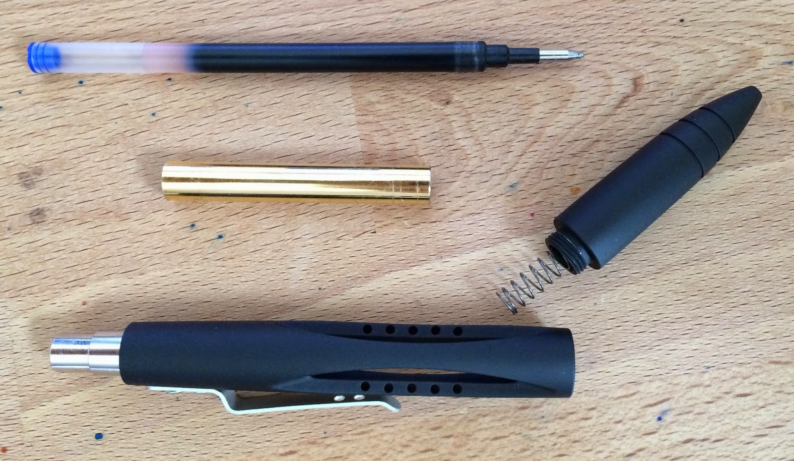
Here's all the parts of the pen, taken apart. 


A close-up of the clip with the "Airfoil" and brand lasered into the metal.


Long story short, I like this aerospace-inspired pen. It's got a great design that will appeal to lots of folks who want a technical or tactical look to their hardware, and it's likely to please those who want some weight to their writing instruments. It's also manufactured really well, without any gaps or loose parts. Check out the kickstarter (for the next 8 days) at this link

Want to watch a video about this pen? Check this one out. I made it. (I don't know why it's vertical. I assume something in the new OS on my phone needs to be adjusted.)


Caran d'Ache Hypnotic Turquoise

$
0
0
Whew, I'm back! It's been a busy weekend with family in town and lots of work to do. So, let's have a look at another Caran d'Ache ink.


 Hypnotic Turquoise is a really nice turquoise ink. I'm not sure why they went with that name. Maybe they're thinking of the drink? It looks like tropical water, to me. It also looks like some other turquoise inks.

This version of turquoise behaves really well. It's a bright blue that shades a little bit on good paper, but not elsewhere.


Close-ups


Chromatography


Color Comparisons


This comparison shows my only real issue with this ink. It's too similar to other inks that come in at a lower price point. If you get Hypnotic Turquoise, then you won't be disappointed. On the other hand, you won't be blown away by the originality of the ink, either. 

Check this ink out at Anderson Pens and other fine retailers, where it goes for about $36 in a ml bottle.


Water Test and Review Video


If you like what you see here, then please head on over to Patreon to see how you can help support Inkdependence.com.


The ink for this review was provided free of charge by Anderson Pens. The review was all mine, however.

Caran d'Ache Idyllic Blue

$
0
0

The big picture above is pretty cool, right? There's some major sheen around the edges of the smear, but I never saw any of that while I was writing with this ink. That's a little disappointing, but we'll manage.

Idyllic Blue is much more blue than the other blue in the collection (Magnetic Blue). I quite prefer it, I think. The texture is a little matte, which is a cool effect.


Close-Ups


Color Comparisons


These three blues...


Chromatography

Nothing here but blue. Might be the first time I've seen that. 

Copy Paper Test

 It behaves pretty well. Not as well as some, but the few dots that show through aren't that big of a deal.


If you like what you see here, then please head on over to Patreon to see how you can help support Inkdependence.


The ink for this review was provided free of charge by Anderson Pens. The review was all mine, however


Video Review & Water Drop Test


Caran d'Ache Delicate Green

$
0
0

This Caran d'Ache ink isn't going to make it into my rotation. It's a bright, springy green that would really pop off of the page if it were a bit more saturated. It is a bit darker on regular copy papers than it is on the Rhodia paper, but it still looks kinda thin. It's just not doing anything for me.


Close-Ups!


Ink Chromatography

 Cat hair, free of charge. 

Copy Paper Testing

 This behaves pretty well on copy papers, As I mentioned above, this looks a bit better on regular paper than it does on FP friendly paper.

Ink Comparisons

This picture is a little blurry at the bottom, but Delicate Green looks a lot like Vert Pre.


This ink isn't going to suit my writing, but if it strikes your fancy, then you can find bottles and samples over at Anderson Pens. A 50ml bottle goes for $36.

Video Review and Water Drop Test


If you like what you see here, then please head on over to Patreon to see how you can help support Inkdependence.


The ink for this review was provided free of charge by Anderson Pens. The review was all mine, however

Caran d'Ache Cosmic Black

$
0
0

Black inks are a staple in any line of inks, and Caran d'Ache's black is a really good one. In the fine nib of my Lamy Nexx, this ink was smooth and a little on the wet side. I kept it in this pen for quite a while, and I never had any problems with hard-starts or skips. It was also really easy to wash out of the pen.

Yeah, I think I fell asleep in the middle of a sentence. It happens. 


Close-Ups! 


You'll see some sheen in the picture below, but that's a feature of there being so much ink on the page. I don't think that you're going to be seeing that from very many nibs. 


Chromatography

 Like many other black inks, Cosmic Black is a mixture of different colors. This time, it's black, violet and a really light turquoise. I'm not sure why they put the turquoise in there, but it must serve some function.

Copy Paper Test

 No problems on copy paper from this nib and ink combo. It might be a little more bleedy with a bigger nib, but there weren't any problems with the fine nib.

Comparison


I'm not sure why Infinite Grey looks to dark in this sample. As you'll see in a future post, it's not usually that dark. Perhaps I'd just primed the piston or something.


Water Test & Review Video


This black isn't going to beat out the staple-blacks (like Noodler's Black or Aurora Black), but if you're looking for a new black that behaves well on cheaper papers and looks pretty solid, then you can find bottles and samples over at Anderson Pens. A 50ml bottle goes for $36.


If you like what you see here, then please head on over to Patreon to see how you can help support Inkdependence.


The ink for this review was provided free of charge by Anderson Pens. The review was all mine, however

Check out this Pantone Online Color Challenge!

$
0
0
I found this linked in a Reddit post, and it's a pretty sweet test. Give it a shot and see how well you do. I'd love it if you posted your score in the comments. Don't worry if it's not perfect, mine isn't either.

Online Color Challenge

A UK-only giveaway for my UK readership.

$
0
0
Hi folks, I was asked by Brooks of the Post Office Shop Blog to let you know about a giveaway on their site. It's only open to UK folks so, if that's you, head over there and enter to win a book about stationary. It looks pretty interesting, and it's free to enter.
Word.
Mike

Caran d'Ache Infinite Grey

$
0
0

This one is a weird one. The text at the top of the page (below) is a lot like what I was normally getting when I wrote with this pen. I primed the piston a little bit, and it looked a bit better. On copy paper, this ink tends to run somewhat dry, but it can be a little wet on Rhodia. I don't know what's going on with this one, but I'm not a huge fan. the steely grey that you see in most of the text is very cool, but you can see in the shading areas the really light color that you get most of the time. 

I'd say to get a sample of this ink before you commit to a whole bottle. My experience with this ink might not be typical, or perhaps you have a pen that this will work really well with. Maybe something that is extra-wet would suit it, but I don't really have anything wetter than this Skyliner (except maybe my Custom 74, but that pen is kinda difficult to clean out). 


 Close-Ups!


 Comparisons!

Chromatography!


Mnemnosyne Card!

 Copy Paper Test!


Water Drop Test and Review Video!


This is an ink that might be awesome. I'm not sure how I feel about it, but that dark, steely grey is pretty slick if you can get your pen to put down enough ink to show it off. You can find bottles and samples over at Anderson Pens. A 50ml bottle goes for $36.


If you like what you see here, then please head on over to Patreon to see how you can help support Inkdependence.


The ink for this review was provided free of charge by Anderson Pens. The review was all mine, however.
Viewing all 528 articles
Browse latest View live